Hi Excel Fans,
Today I am posting the Friday Challenge a day early to give you time to try it out.
Here the user story on what we are trying to do:
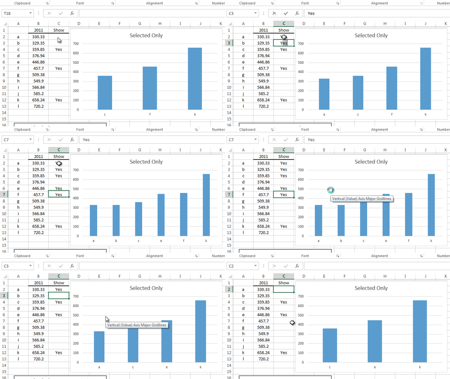
‘As an Excel user I want to leave all my data intact (i.e. not delete or hide any rows) and I want to conditionally show the data points in an Excel column chart by typing in “Yes” next to the data.’
Here is what I mean with pictures:
(See as I type in a Yes in column C, then the data point is added to the Excel Chart and as I delete the Yes the column is removed from the graph.)
Here is the data set (Copy and paste it from this table to cell A1 in your test spreadsheet:
Excel 2012
| A | B | C | |
|---|---|---|---|
| 1 | 2011 | Display | |
| 2 | a | 330.33 | Yes |
| 3 | b | 329.35 | |
| 4 | c | 359.85 | |
| 5 | d | 376.94 | Yes |
| 6 | e | 446.86 | Yes |
| 7 | f | 457.7 | |
| 8 | g | 509.38 | |
| 9 | h | 549.9 | Yes |
| 10 | i | 566.84 | |
| 11 | j | 585.2 | |
| 12 | k | 658.24 | Yes |
| 13 | l | 720.2 |
There are probably several ways to complete this task, so lets see what you got. If you want to contact me to send in how you did it, leave me a comment below (it asks for your email) and I will contact you for the file.
Good luck!
Steve=True


