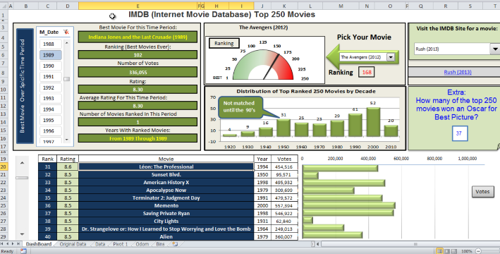
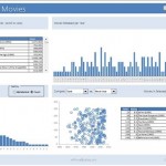
Top Movies – Excel Dashboard – Brian’s Friday Challenge Entry
This was our final entry in the most recent Friday Challenge for the Internet Movie Database Top 250.
Below you can download an awesome Excel...
Case Study: Executive Dashboard Chart Creation – Follow-up
The Problem
In a recent post:
“Case Study: Executive Dashboard Chart Creation” (https://www.exceldashboardtemplates.com/?p=1612)
I presented some basic data that you may have in your company that you...
How-to Build a Plan vs Actual Excel Dashboard
Hi All, I wanted to share with you a great post from a fellow Excel creator and teacher. Mynda Treacy has just released a...
IMDB Top 250 Movies of All Time – Excel Dashboard Tutorial
In our last Friday Challenge, we presented a data set of the Top 250 Movies from IMDB and asked you to create a dashboard...
Friday Challenge – Analyzing Attendance Records with Charts and Trend Line
For this Friday Challenge, lets see if we can help this user with their data.
Read it over, but really, the last line of the...
Presenting Metrics Data – How would you create a chart for this data?
In my last post I asked how you would create a chart for this request:
Presenting Metrics Data
Trying to find the best way to...
How-to Recreate a NYT InfoGraphic Mustache Grouping Chart in Excel
I love trying to create an Excel chart that was originally drawn with an Infographic software package. Back in 2011 I saw a New York...
How-to Create an Excel Dashboard Column Chart with 2 Axis Groupings
Recently I saw this in the MrExcel Forums. The title “Weird Charts with 3 Axis” intrigued me.
I determined that they were looking to put...
2008-2012 Summer Olympics Medal Count Dashboard Part 2
Wow, what a Summer Olympics. the 2012 medal count is so close. China and the USA are neck and neck in terms of total...
How-to Create a Sick Leave Excel Dashboard Chart
Okay, I got an email from a SUPER FAN of my sight. She even donated some money to help cover the costs of that...

