This is a great technique that you can use to create dynamic charts that will change when your users change the values from the picklist. I detailed how you can create a pick list (drop down list) in Excel in my last post. You can check it out by clicking on this link. It is a complete tutorial and video:
Creating Pick Lists in Excel for your Dynamic Dashboard
This tutorial will take you from just after you have created your picklist to creating a chart that changes when you change the picklist. Also, at the bottom of this post, you can go directly to the video tutorial.
The Breakdown:
1) Create Your Data Set
2) Create Your Pick List
3) Create Chart
4)Change Vertical Axis
5)Remove Legend
6)Add Dynamic Title
7) Create Named Range for the Chart
8)Update Chart Series with Dynamic Named Range
Step-by-Step Tutorial
1) Create Your Data Set
First we need to set up our data. This tutorial has the data series in a column format. Here is how my data looked:
2) Create Your Pick List
I have created my pick list in cell F1. My last post details this technique using Data Validation in Excel. Check it out here:
Creating Pick Lists in Excel for your Dynamic Dashboard

3) Create Chart
Now that we have the basics set, now lets create the chart. We don’t need to create a complex chart only to have to delete several data series, we only need to create a basic chart with one data series. So highlight the horizontal axis categories (months and the first data series ($A$4:$B$16).
Then go to the Insert Ribbon and select the 2-D Clustered Column chart from the Column button: 
Your chart should now look like this:
4)Change Vertical Axis
Now since we are going to use the same chart for 3 different data series, we don’t want the Vertical Axis to keep adjusting to the current data being displayed. We want it to be a fixed amount so that the data can be compared across the data points and will not confuse the users. You can learn more about why Excel is doing this here:
Problems with an Excel Dashboard Goal Chart
So what we need to do is right click on the Vertical Axis and select Format Axis.
Then from there we need to change the Minimum and Maximum values to Fixed:
Make sure that these values are 0 and the Maximum of all the chart data points that you may display. Your chart won’t change after this as we chose the data range that has our maximum in it already.
5)Remove Legend
Also since we are only showing one series, the default from Excel to create a legend doesn’t make much sense, so lets delete that. Just select your chart, then select the legend and press your Delete key. Your chart will now look like this:
6)Add Dynamic Title
Since users will be changing the data series that is displayed in our Dashboard Chart, we don’t want to have the Chart title fixed as just one value, but we want it to change as the user updates the picklist. To understand the dynamics of this step, check out this post:
How-to Make an Excel Chart Title Change Dynamically
7) Create Named Range for the Chart
Here is where we get into the real meat of this technique. We need to use the Offset formula with our chart to make it dynamically choose the right data series. Here are a few tutorials that will show you this technique in great detail:
Case Study – Creating a Dynamic Chart in Excel Using Offset Formula
Create a Dynamic Excel Pie Chart
For this step we need to create a named range. Go to the Formulas Ribbon and press the Name Manager button.
From there press the New button and enter the following formula in a name titled “ChartColumnSeries”:
=OFFSET(Sheet2!$A$5,0,MATCH(Sheet2!$F$1,Sheet2!$B$4:$D$4,0),12,1)
Here is a breakdown of the offset formula:
=OFFSET(Sheet2!$A$5,0,MATCH(Sheet2!$F$1,Sheet2!$B$4:$D$4,0),12,1)
=Offset(starting point, move starting point down how many rows, move the starting point how many rows right by matching the value in cell F1 to the range of B4:D4, how many rows in the range, how many columns in the range )
You can learn more about the offset function here:
This is the Bomb: or How I came to love the Offset function
8)Update Chart Series with Dynamic Named Range
Now this is the last step in creating our drop down list chart for our company dashboard
How-to Make a Dynamic Chart Using Offset Formula
First select your chart and then right click on the chart to launch the “Select Data” dialog box:
Now select the “Revenue” Legend Entries (Series) and press the edit key:

Then change the “Series Values:” to the named range you created in the earlier step:
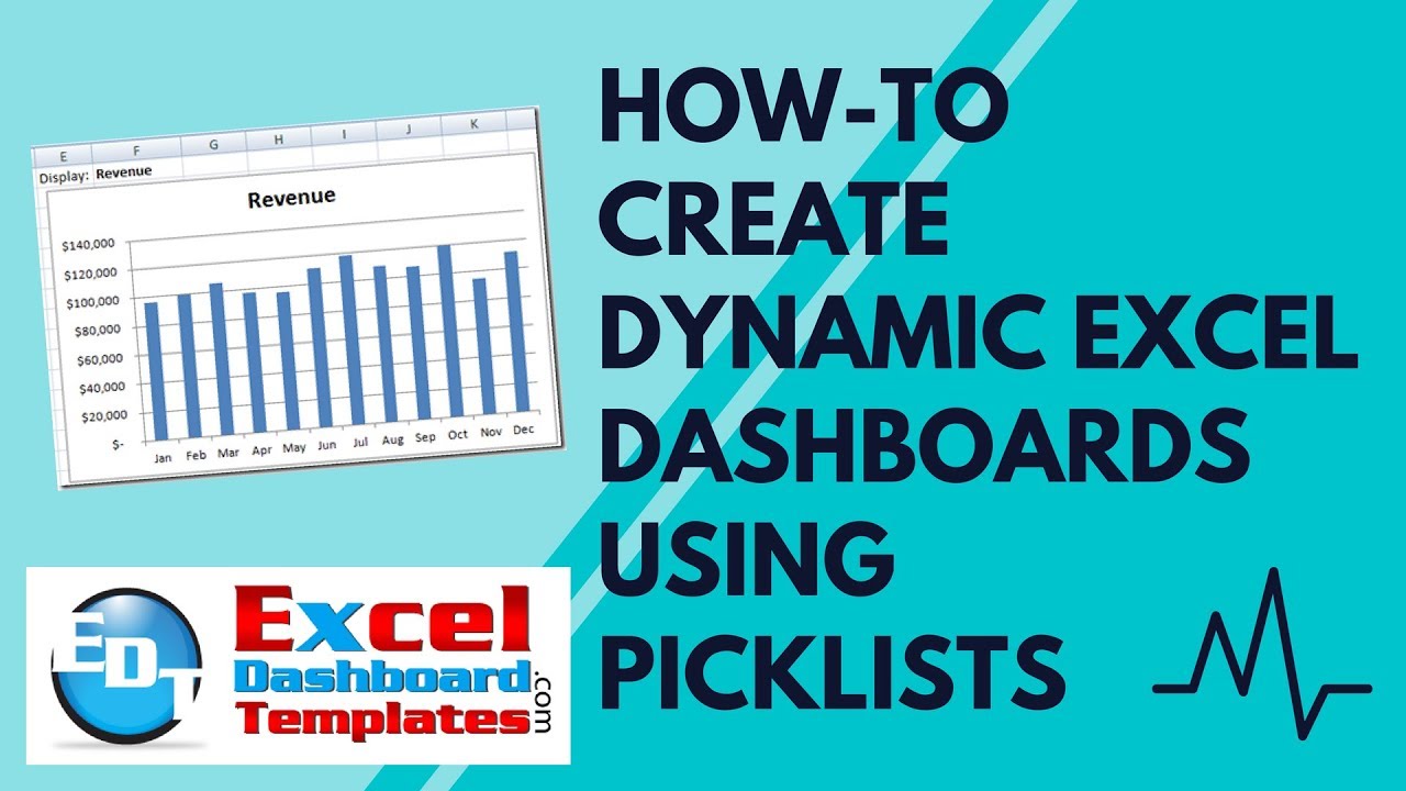
We are now done and when you change the drop down list your chart should look like this when you select Revenue in cell F1:
And like this for Expenses:
And like this for Net Revenue:
This basic technique can be used to make your company dashboard shine and make you look like an Excel Master.
Video Tutorial
Check out this video where you can see me recreate this dynamic chart using pick lists here:
How do you use Picklists in your Excel Spreadsheets? Let me know in the comments. Also, don’t forget to sign up for my blog and also my youtube channel so that you get the next post delivered directly to your inbox.
Steve=True


