Friday Challenge Answer – Create a Percentage (%) and Value Label within 100% Stacked...
Last week I posted a Friday Excel Challenge!. Fun times. How did you do? Spoiler alert, if you don’t know how to create this...
Dashboard Chart of Tiger Wood’s Money Ranking List and Golf Earnings
With the upcoming Open Championship (also known as the British Open) in Royal Lytham & St. Annes Golf Club, I wanted to see how...
IMDB Top 250 Movies of All Time – Excel Dashboard Tutorial
In our last Friday Challenge, we presented a data set of the Top 250 Movies from IMDB and asked you to create a dashboard...
2008-2012 Summer Olympics Medal Count Dashboard Part 2
Wow, what a Summer Olympics. the 2012 medal count is so close. China and the USA are neck and neck in terms of total...
How-to Make a Wall Street Journal Horizontal Panel Chart in Excel
In a recent Wall Street Journal article I saw the following chart regarding Dropbox, YouSendIt and Box.com. The graph describes how many people use...
Case Study – Creating a Dynamic Chart in Excel Using Offset Formula
A YouTube video subscriber Mili, wanted to know more about creating a Dynamic Excel Column Chart using Offset function. So Mili sent me the...
How-to Create Sales Quota Threshold Horizontal Lines in an Excel Column Chart
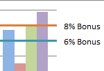
Sales executives are always pushing their sales teams. They typically do this by setting sales quota’s for their salespeople. Quotas are thresholds or minimum...
Add Multiple Percentages Above Column Chart or Stacked Column Chart
I recently posted a tutorial on how you can put a percentage at the top of a Stacked Column Chart. You can see the...

