Last week I posted a Friday Excel Challenge!. Fun times. How did you do? Spoiler alert, if you don’t know how to create this type of chart yet, DO NOT read on. Click on the logo in the top left and then find the previous post. Then after giving it a try and leaving me a comment on how you did it, then come back to this post. If you are the “I always read the last page of the book first in case I die” then read on my friend.
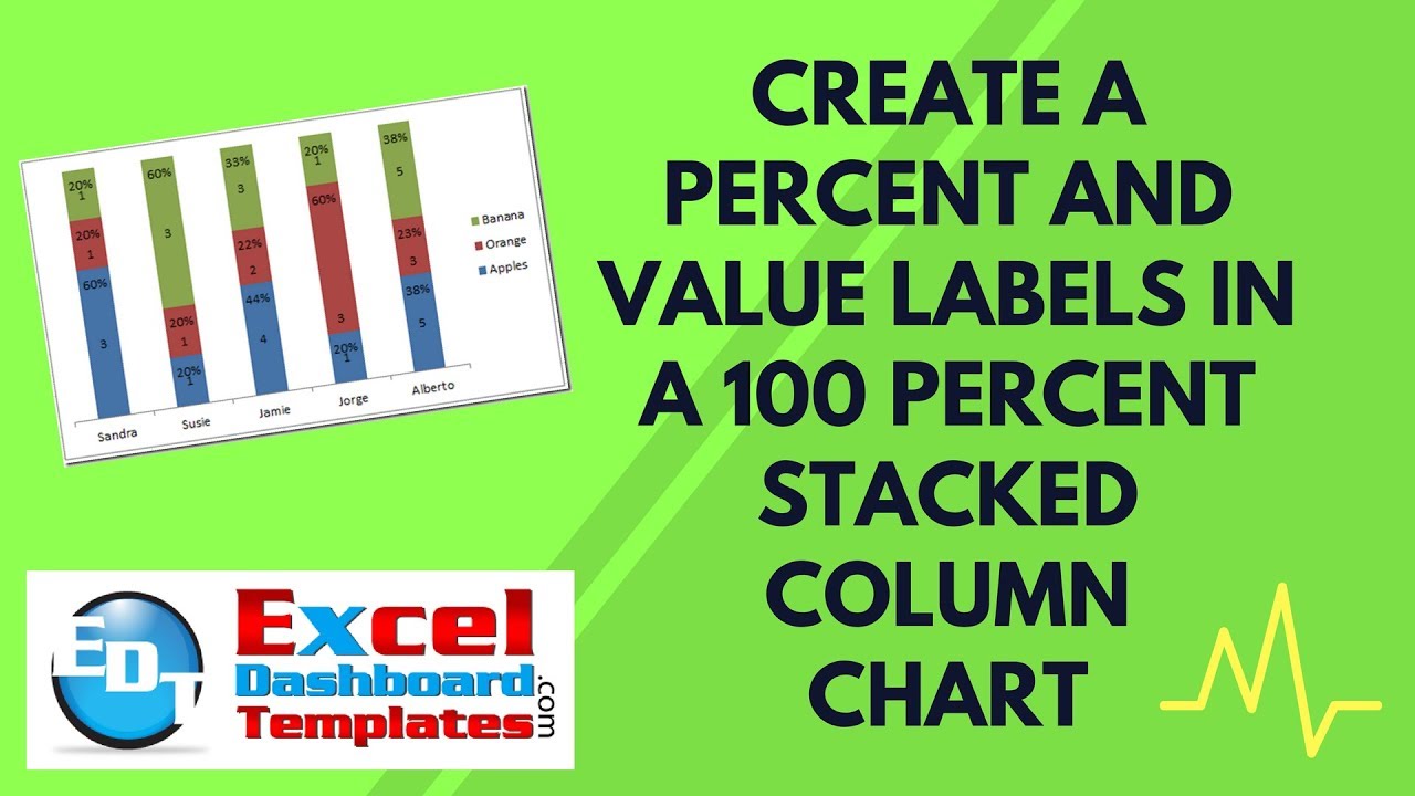
Here is the final chart we are trying to make:
It is a 100% Stacked Column Chart with two labels of a percentage and the value. Here is how we got here:
On Friday, I posted this question from an Excel user forum and asked my readers to give this type of chart a try.
The Challenge:
% and Number within 100% Stacked Chart?
Is it possible to list both a numeric value and its percentage within each block of a 100% stacked chart? For example let’s say I’m trying to show how many Apples, Oranges, and Bananas (Y) that Sandra, Susie, Jamie, Jorge, and Alberto each have (x). If Sandra has 3 apples 1 orange and 1 banana, can I show within each block of her stacked chart 3 (60%), 1 (20%), and 1 (20%) respectively as opposed to only a number or only a percentage? Thanks a lot for any help!
Sample data:
| A | B | C | D | |
|---|---|---|---|---|
| 1 | Apples | Orange | Banana | |
| 2 | Sandra | 3 | 1 | 1 |
| 3 | Susie | 1 | 1 | 3 |
| 4 | Jamie | 4 | 2 | 3 |
| 5 | Jorge | 1 | 3 | 1 |
| 6 | Alberto | 5 | 3 | 5 |
I had one super fan (PETE) that got this right and he taught me a thing or two by saving me a step from my original posting. Here is what Pete sent me via Email:
From Pete:
“I copied the set of provided data into my workbook, and then made an identical table next to it to show the relative percentages. Assuming my original data table started in cell A1 and my new data table starts in cell F1, my new data table values have formulas like this: =B2/SUM(B$2:B$6) and the values are formatted as a %. This gives me the percent of the total each person has of each fruit type.
Next I made a 100% stacked column chart from the new data table. Then I copied (CTRL+C) the original data table and pasted it into my chart as a new series…right click on the chart and select paste, the new values will appear in your chart.
This added them to the stacks, which is not what I wanted…so I moved the new information to a 2nd axis. This causes it to overlap the original chart exactly. I added data labels so now both % and values show. I had to move the labels around a little so they did not overlap. I also formatted my chart to get rid of the chart junk…I removed the grid lines, removed the axis lines, and changed both vertical axis labels to white text to hide them. As a final touch, I changed the series colors to match the fruit…yellow for bananas, orange for oranges, and red for apples.”

I also had another great but different entry by David.
From David:
You probably have a more eloquent technique, but I ended up with: Use text as your series labels. I have the counts in a table, I have the percents in a table, then I make up a table of text entries using an equation like this: =TEXT(LEFT(B4,2)&”, (“&LEFT(A11*100,2)&”%)”,0). Then I use those results as my labels.
That is brilliant too!! Mine is very similar if not exactly the same as Pete’s, but David’s was very ingenious use of the Text function and Excel charts.
Let me walk you through my solution below with a complete with a video tutorial.
The Breakdown
1) Setup Chart Data Range for Percentages
2) Create 100% Stacked Column Chart
3) Switch Rows/Columns
4) Add Data Labels
5) Change Percentage Data Label Position
6) Move Percentage Chart Series to Secondary Axis
7) Clean up chart junk
Step-by-Step
1) Setup Chart Data Range for Percentages
There are two tips and tricks regarding this challenge. The first is the data setup. Notice that we have 2 data labels. The first is the number value and the second is the percentages. You can only make a 100% Stacked Column chart in Excel with one or the other. So to fix this, we need to add 3 more series:
So we need to add 3 more series that display the percentages. Here is are the data points and formulas in the Chart Data Series:
| A | B | C | D | E | F | G | |
|---|---|---|---|---|---|---|---|
| 1 | Apples | Orange | Banana | Apple Precentage | Orange Percentage | Banana Percentage | |
| 2 | Sandra | 3 | 1 | 1 | 60% | 20% | 20% |
| 3 | Susie | 1 | 1 | 3 | 20% | 20% | 60% |
| 4 | Jamie | 4 | 2 | 3 | 44% | 22% | 33% |
| 5 | Jorge | 1 | 3 | 1 | 20% | 60% | 20% |
| 6 | Alberto | 5 | 3 | 5 | 38% | 23% | 38% |
Worksheet Formulas
|
These additional series will provide us with a dynamic chart series for our Excel chart data labels.
2) Create 100% Stacked Column Chart
Now that we have our chart series data range set up, we need to create our 100% Stacked Column Chart. To do this, highlight the range of data from cell A1:G6
Then go to the Insert Ribbon and choose the Column button from the Charts group. From there, choose the 100% Stacked Column Chart

Then your chart should look like this:
Not the way we wanted to show the data, but we can fix that.
3) Switch Rows/Columns
If you want to know why Excel formats your chart this way, you should check out this post:
Why Does Excel Switch Rows/Columns in My Chart?
So to make the chart the way we want, we need to select the chart and then go to the Design ribbon and from there choose the “Switch Row/Column” button from the Data group:
After you perform this step, then your chart should look like this:
This looks more like the chart we are looking to create.
4) Add Data Labels
Now is the time to create the data labels we seek. To do this, select the chart and then go to the Layout ribbon and choose the Data Labels button in the Labels group. From there, select the Center choice. Your chart will now look like this:
5) Change Percentage Data Label Position
Getting really close, but we need to move the data labels for the percentages to another area so that they don’t overlap the values data labels when we complete the final stages of the chart. To do this, select a set of data labels for any of the percentage data series (in this case, I choose the Banana Percentage data labels:
Then press your CTRL+1 keys or right click on the labels to bring up the Format Data Labels dialog box:
Then DO NOTE CLOSE this dialog box and select the other two data percentage data labels and make the same selections on those series. Your chart should now look like this:
It doesn’t look that different, but it will with the next step.
6) Move Percentage Chart Series to Secondary Axis
This step is where everything lines up for us. Select any of the NON-percentage data series and then press CTRL+1 to bring up the Format Data Series dialog box. You can also get to this dialog box by right clicking on the data block in the chart column and then select “Format Data Series…”. There is also other ways that I know of that are really fast when selecting a data series. Check out these postings and video tutorials:
The Quickest Way to Select an Data Series in an Excel Chart
How-to Select Data Series in an Excel Chart when they are Un-selectable?
When you have this dialog box open, move the data series to the secondary axis:
Repeat this step for all of the NON-percentage data series. When you complete this for the NON-percentage data series your chart should now look like this:
Awesome, we are almost there to the final chart. Now one caveat, this chart will work find for you as long as your data series are not too small. If they are too small, then the percentages will overlap the 100% Stacked Column values.
7) Clean up chart junk
Just one last step. We need to clean up the chart. Too many percentages and legend entries. So do the following:
a) Select the horizontal grid lines and press the delete key
b) Select the left vertical axis and press the delete key
c) Select the right vertical axis and press the delete key
d) Select the legend and then select any percentage legend entry and press the delete key (Repeat this step for all of the percentage legend entries)
Your final Excel chart has arrived. Here is what it should look like:
I think this is a cool tip and trick with Excel 100% Stacked Column or 100% Stacked Bar charts and graphs. Let me know what you think in the comments below and any other tips/tricks that you want to learn.
Free Excel Template File Download:
100% Stacked Column Chart with Percentage and Value Labels
Download here: Show Percent and Value 100 Percent Chart
Video Tutorial:
Also, don’t forget to subscribe to my blog and video channel so that you are sure to get the next post delivered directly to your email inbox.
Steve=True


