Today marks the 100th anniversary of the tragic sinking of the RMS Titanic. On that fateful day, over 1,500 people died when the Titanic struck an iceberg and sank in the North Atlantic Ocean.
Since this is a very historic event, I went to Wikipedia and looked up any statistics I could find and wanted to see if I could make an Excel Dashboard on this subject.
http://en.wikipedia.org/wiki/RMS_Titanic
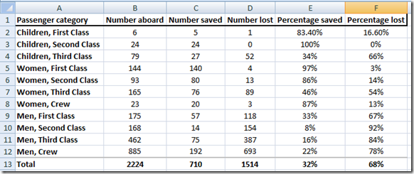
I found and used this data to build my Excel Dashboard Template:
(Note, there appears to be an error on the Titanic data table. I believe the correct number of men aboard should be 885, not 865 based on the other data columns.)
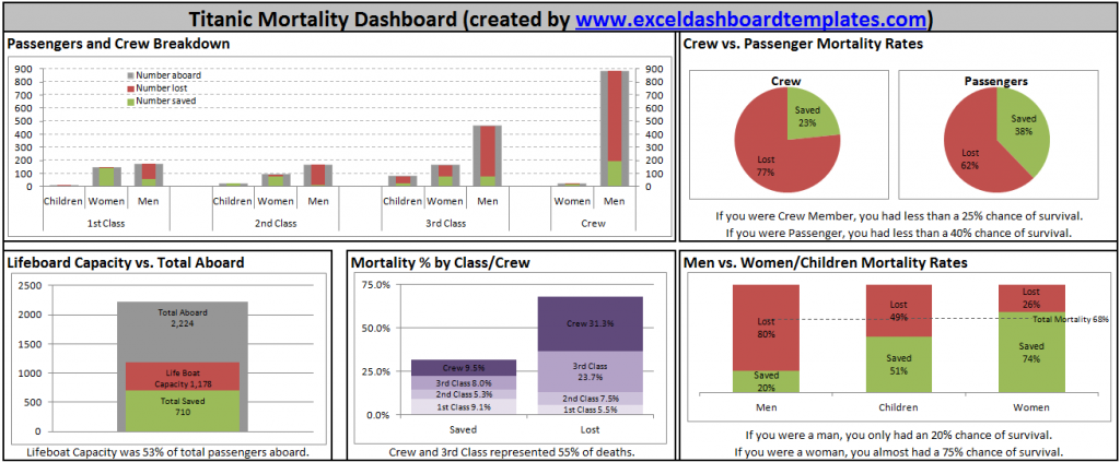
Here is the Excel Dashboard I created that shows the Titanic Mortality information on Deaths and Survivors in a graphical representation of the data.
The Breakdown:
The Top left section of this Excel Dashboard, has a breakdown of the passengers by their ticket class as well as the crew. You can quickly see a visual representation of the each class by gender and if they were classified as children. 
The Top Right area of the Excel Dashboard shows a pie chart breakdown of the passengers or crew and how many were saved or lost: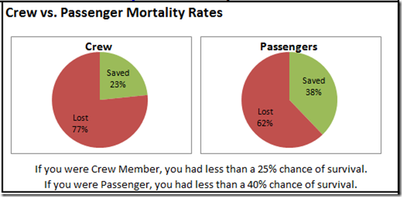
The Bottom Left part of this Dashboard shows the life boat capacity versus the total people on board the Titanic and the total passengers saved.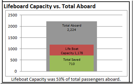
The middle bottom part of the Excel Dashboard shows how may people were saved or were lost when the Titanic sank with a breakdown of their ticket status or crew.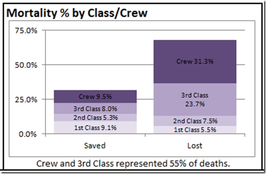
Finally on the bottom right section of the Titanic Excel Dashboard shows how the Men, Women and Children ended up comparatively to the total mortality percentage of all aboard.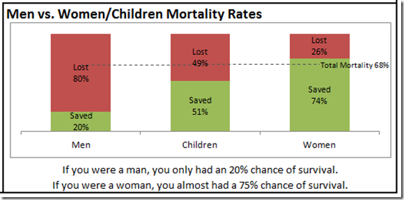
Note that 4 of the 5 sections of the also had more detailed assertions of the data represented displayed as text. Study the Excel Dashboard and let me know what you think.
You can download this Free Excel Dashboard Template here:
Titanic-Mortality-Excel-Dashboard.xlsx
Do you think of this as a representative dashboard for the Titanic Survivors and Victims by Ticket Class, Gender (Women, Men) and children?
Leave your comments and also send me a copy of your Excel Dashboard using the same data.
Finally, consider signing up for our newsletter so that you get the next post delivered directly to your inbox.
Steve=True

