I love trying to create an Excel chart that was originally drawn with an Infographic software package. Back in 2011 I saw a New York Times infographic and I wondered if I could easily create this type of graph in an Excel Chart. I lost the newspaper issue and WSJ is a paid site so I can’t show you the exact graphic, but it looked very similar to this: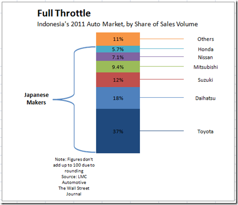
As you can see, the chart is grouped by the Japanese Auto Makers with a left curly bracket or as I like to call it a “Mustache” Bracket. Also the chart has lines that match the column colors that extend to the legend values. This tutorial will show you how to make the Mustache or Curly bracket grouping. Tune into the next tutorial to see how I created the lines matched to the legend values.
So what a cool technique being able to group the values with a bracket. This will really help our executives focus on the parts of the dashboard chart that are the most important.
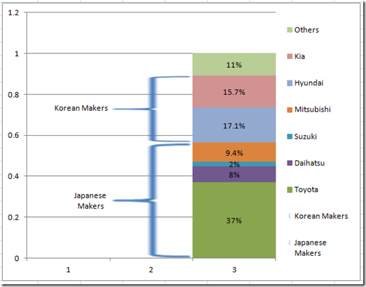
Here I have modified the Excel chart to highlight Japanese Auto Makers versus Korean Auto Makers with Mustache or Curly Brackets.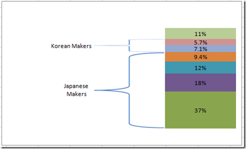
I think it can be an important Excel technique that is easy to create and does not need Excel Macros. Also, as the values change the brackets will move to accommodate the change in values. It can do this because it is not drawn over the chart, but actually part of the chart. In this picture below, I have modified the data to make Korean percentages 20 percent bigger and Japanese percentages smaller by 20 percent. The chart updates itself and the curly brackets adjust accordingly.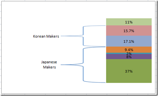
So lets see how I did this part of the infographic in Excel.
The Breakdown
1) Create your data range for the Excel Chart
2) Create a stacked column chart
3) Insert a curly bracket graphic/Excel shape (Mustache Graphic) into the spreadsheet
4) Copy and replace the column graphics with a custom marker/custom chart graphic.
5) Close the Gap on the Chart columns.
6) Insert Data Labels
7) Change the Bracket data labels to Series and remove Percentage.
8) Move Data Labels for curly bracket/mustache graphics to the left.
9) Clean up the chart junk.
See this additional tutorial regarding the main technique:
How-to Make and Add Custom Markers in Excel Dashboard Charts
Step-by-Step
1) Setup your Excel chart data.
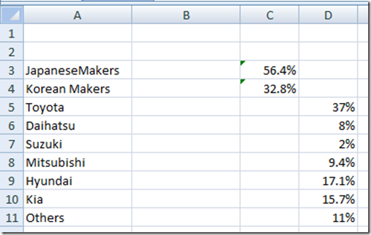
I set up the data into 3 different series like this. The blank series in column B will allow us some space for labels.
The formulas in Cells C3 and C4 are basic sum formulas that calculate the total percentage of Japanese (D5:D8) Auto Makers and total percentage of Korean (D9:D10) Auto Makers.
2) Create Stacked Column Chart
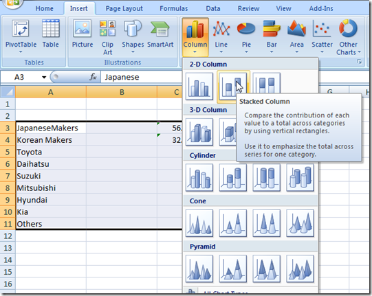
Highlight the range of A3:D11 and Insert a Stacked Column chart from the Insert Ribbon:
Your resulting Excel chart will look like this: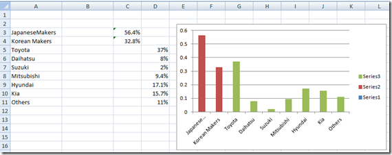
Not quite what I expected ![]() but not a problem. You must switch the chart data by clicking on the Switch Row/Column button in the Data group of the Design Ribbon.
but not a problem. You must switch the chart data by clicking on the Switch Row/Column button in the Data group of the Design Ribbon.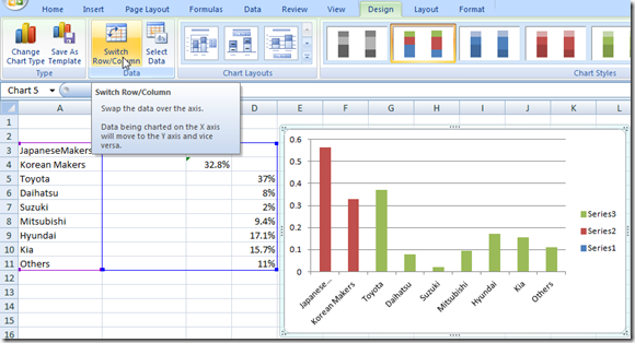
Your resulting chart will now look like this: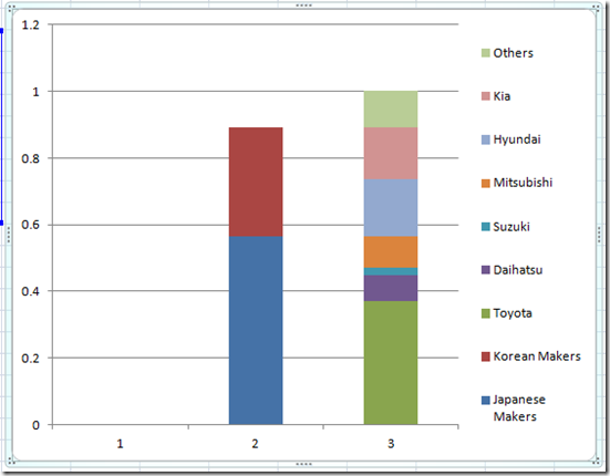
3) Insert a curly bracket graphic/Excel shape (Mustache Graphic) into the spreadsheet.
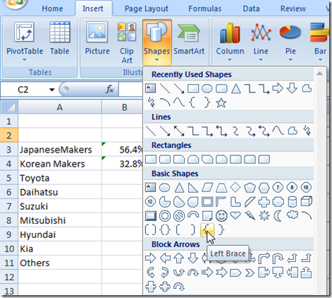
From the Insert Ribbon, in the Illustrations group, choose the Shapes button. Then in the Basic Shapes section, choose the Left Brace (what most call a curly bracket and I call a mustache ![]() )
)
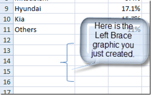
After you select the left brace from the menu, you need to go to your spreadsheet and drag and drop the shape about 1inch long. Your spreadsheet will now look like this with the shape.
4) Copy and replace the column graphics with a custom marker/custom chart graphic.
a) Now select the left brace graphic you just created and copy it.
b) Then select the stacked column chart/graph you have already created
c) Then select the data point / column that represents the Japanese Auto Makers and press Control + V (CTRL+V) to paste the shape and it will change the column to a left brace/curly bracket. It should now look like this: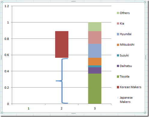
See this additional tutorial regarding the main technique:
How-to Make and Add Custom Markers in Excel Dashboard Charts
d) Repeat Step 4C for the Korean Auto Makers and your chart will now look like this: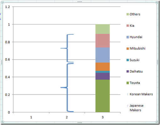
Pretty neat ![]()
5) Close the Gap on the the Chart columns.
Now we need to move the braces/brackets closer to the other stacked column. To do this, you need to select any data series in the chart and then Press Control + 1 (CTRL+1) or right click on the data series and choose format data series menu item or go to the Excel Layout Ribbon and choose Format Selection from the Current Selection group:
And change the Gap Width from the Format Data Series dialog box to NO GAP.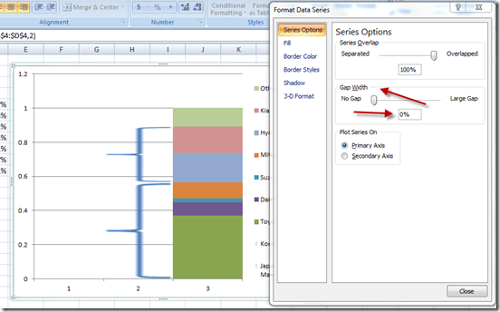
6) Insert Data Labels
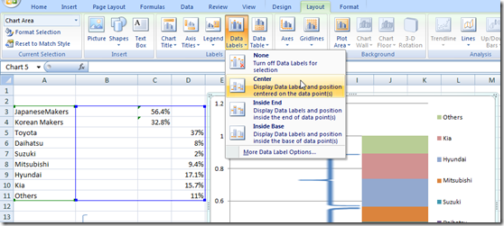
Click on the Plot Area of your chart and then add Chart Data Labels by going to the Layout Ribbon and choose Center from the Data Labels button in the Labels group.
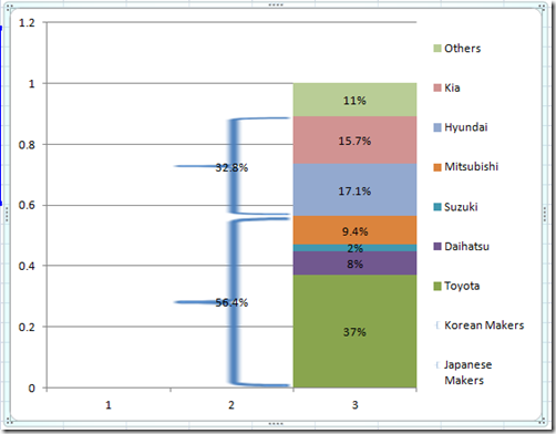
Your chart will now look like this:
7) Change the data labels for the curly brackets / left brace groups to Series and remove Percentage data labels.
To do this, right click on the Japanese and Korean Data Labels and choose Format Data Label or choose the data label and press CTRL+1 and then change the Label Options to check Series Name and unchecking Value. Your chart will now look like this: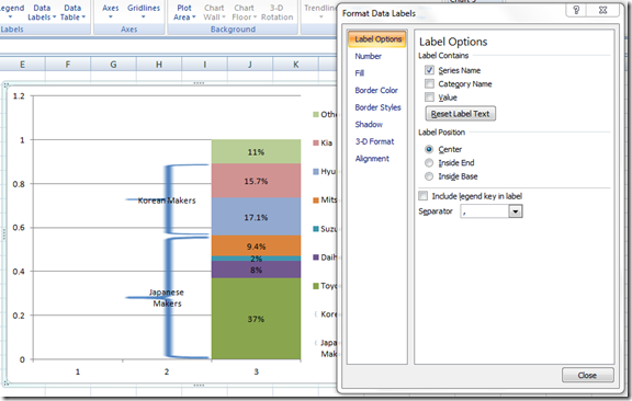
8) Move Data Labels for curly bracket/mustache graphics to the left.
Now lets move the “Korean Makers” and “Japanese Makers” data labels to the left of the mustache / curly bracket / left brace graphics. You can do this by selecting the data label you want to move and then drag and drop it to the left of the appropriate graphic. Your chart should now look like this:
9) Clean up the chart junk.
The chart is looking pretty good. All we need to do now is clean up the chart junk.
a) Select the legend and press the delete key.
b) Select the horizontal grid lines and press the delete key.
c) Select the horizontal axis and press the delete key.
d) Select the vertical axis and press the delete key.
Your final chart should now look like this: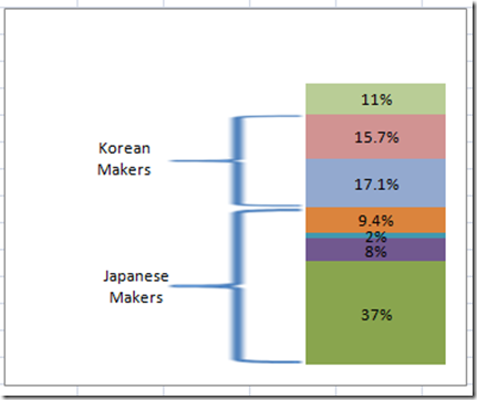
I think this is a really cool technique that you can use in any Excel Dashboard to highlight values in your Executive Dashboards. Stay tuned for the next post where we will complete the final formatting to get the full infographic that was shown at the top of the post.
Video Tutorial
Check out a real time video tutorial that shows this full Excel Advanced Charting Technique here:
Thanks for visiting my blog regularly and be sure to sign up for the blog so that you are sure to get the latest charting techniques for Excel Charts.
Steve=True

