How-to Make a Wall Street Journal Horizontal Panel Chart in Excel
In a recent Wall Street Journal article I saw the following chart regarding Dropbox, YouSendIt and Box.com. The graph describes how many people use...
Add Vertical Line Between Columns in Excel Stacked Column Chart
Add Vertical Line Between Columns in Excel Stacked Column Chart
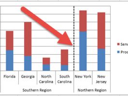
In this tutorial, you will learn how to QUICKLY add a vertical line between columns...
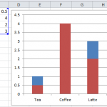
Stop Excel From Overlapping the Columns When Moving a Data Series to the Second...
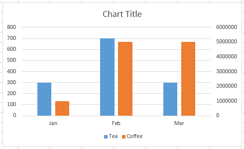
Don’t worry, Excel is not changing your chart to a Stacked Clustered Column Chart or Stacked Bar Chart when you move a data series...
Friday Challenge Answers: Year over Year Chart Comparisons
Thanks for the submissions for the Friday Challenge.
You can get the sample data and chart request here: friday-challenge-help-new-to-excel-yoy-comparisons
Here are some other submissions:
A) In the...
Budget Analyst Question: My Answer
Last week I posted this:
Budget Analysts might be asked by their executive team, managers or co-workers.
Question Title: Bar Graph Below the Line
I need a...
Removing Gaps in an Excel Clustered Column or Bar Chart (Part 2)
Removing Gaps - Excel Clustered Column or Bar Chart (Part 2)
In an earlier Friday Challenge, I posted a problem where someone wanted to remove...
How-to Make an Excel Single Image Goal Chart
Recently, a healthcare company employee contacted me about a chart he wanted to create. The company that he works for is trying to save...
Case Study – Creating a Dynamic Chart in Excel Using Offset Formula
A YouTube video subscriber Mili, wanted to know more about creating a Dynamic Excel Column Chart using Offset function. So Mili sent me the...
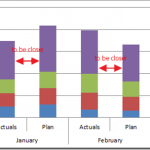
Friday Challenge – Close the Distance Between a Clustered Stacked column Chart
For this week’s challenge, we are going to modify a previous post for a user request.
If you are not familiar with it, you should...
Why is Excel Overlapping Columns When I Move them to the Secondary Axis?
Why is Excel Overlapping Columns in this chart? Why EXCEL, WHY are you doing this??? I don’t understand. Have you ever asked yourself this...

