3 Ways to Add a Target Line to an Excel Pivot Chart

Add a Target Line to an Excel Pivot Chart

Many Excel users use Pivot Tables and they find it very easy to create a Pivot Chart.  However, Pivot Charts have some limitations.  For instance, Pivot Chart series must be part of the Pivot Table.  So that being said, many users find it difficult to understand how they can add a Goal or Target line to their Pivot Chart.

Excel Pivot Chart Goal Line

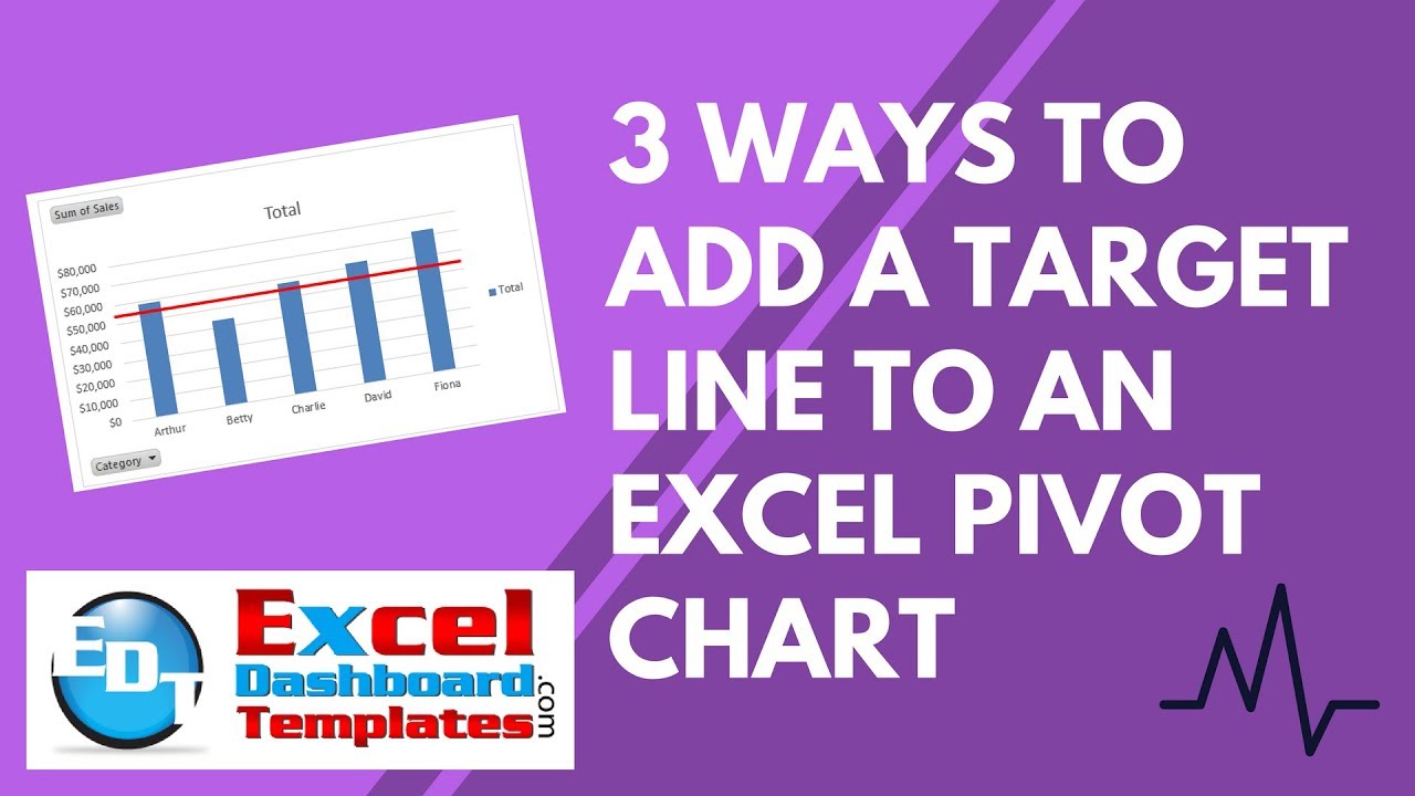
In this tutorial, I will show you the three ways that you can add a target or goal line to an Excel Pivot Chart.


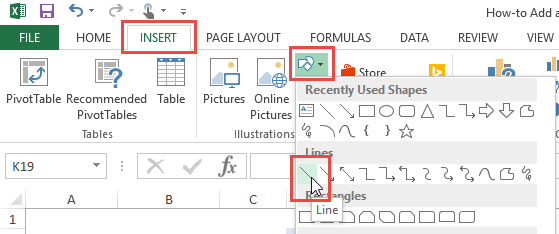
1) Draw a Goal Line Using Excel Shapes

The first way to add a target threshold to an Excel Pivot Chart is the most simplest, but has the most inherent problems.  The easiest way that I am sure you already figured out is to draw a line with the Shapes feature in Excel Illustrations under the Insert Ribbon.


Draw a Line from the Shapes Button in Excel

There are several issues with this approach.

a) Your data may change and the line will no longer be at the right threshold level.

b) If you move or resize your chart, the line may not move along with it.

c) You may not put the line at the correct chart data point.

d) It can be tough to draw a straight line with your mouse.  Now this one I solved in a recent post.  You can check it out here:

How to draw a straight line with Excel shapes

2) Add Data Series to Your Pivot Table

The next method that you can use is to modify your data set.  In order to do this, you will need to include additional data to your original data set that will represent the data for the Excel goal line.  It is relatively easy, in that, you need to add a new column of data to your original data set for the Pivot Table.

Add Additional Target Goal Series to Pivot Table

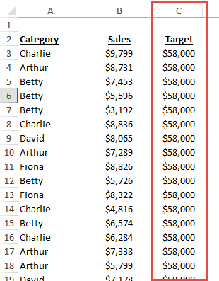
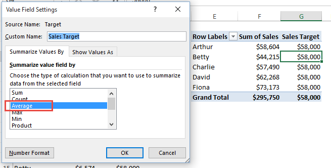
To do this, add a new column of data to your original data.  In our case, since it is a horizontal line, we would add the same value across the entire data range.  Then create your Pivot Table and include the additional column of data.


Pivot Table with Additional Data Series

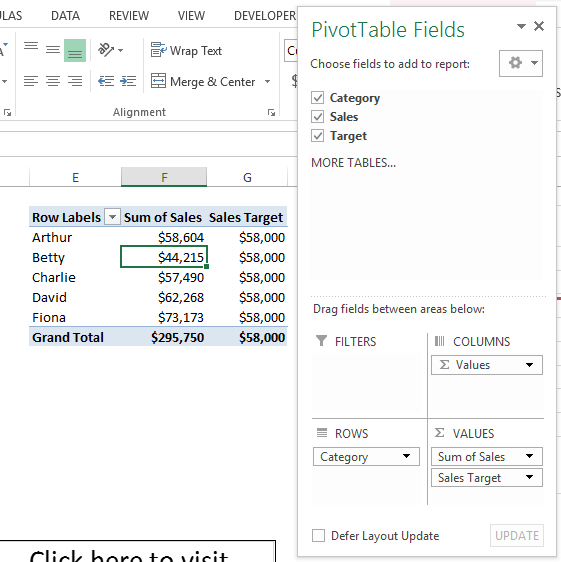
However, you need to summarize this new column of data as average (as the average across the range will be equal to the value in the column of target data).

Pivot Table Goal Data Summarize Value Field by Average

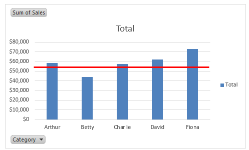
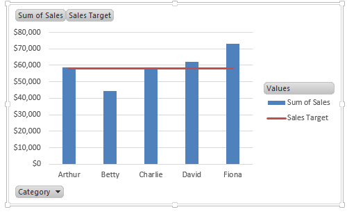
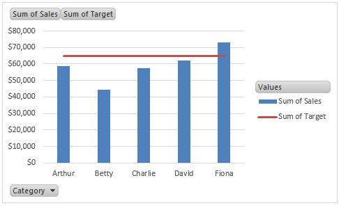
When you create your chart with the new sales target data point as part of the pivot chart, you will not have to worry about the previous issues you had with the drawn line.  However, you have added many new data points to your data set that will add size the to the Excel file.  For small data sets, this is not a problem, but if you have thousands and thousands of rows, this will add considerable size to your Excel file.  Although, your target threshold line will be in the right place and it will move and size with the Pivot Chart.


If you found the website and tutorials helpful, please consider donating to keep the lights on.

Donate with PayPal here:


Pivot Chart Threshold Line

3) Create an Excel Pivot Table Calculated Field

This is the option that I would normally choose when adding a Goal Line to a Pivot Chart.  That being that you would create a calculated field in your Pivot Table and then add that to your Pivot Chart.  In order to do this, you should check out this post:

How-to create modify and delete an Excel pivot table calculated field

Since our scenario is to add a target line to the Pivot Chart, you will simply add a calculated field equal to a set value to your Pivot Table.

Add Pivot Table Calculated Field for Pivot Chart Target LIne

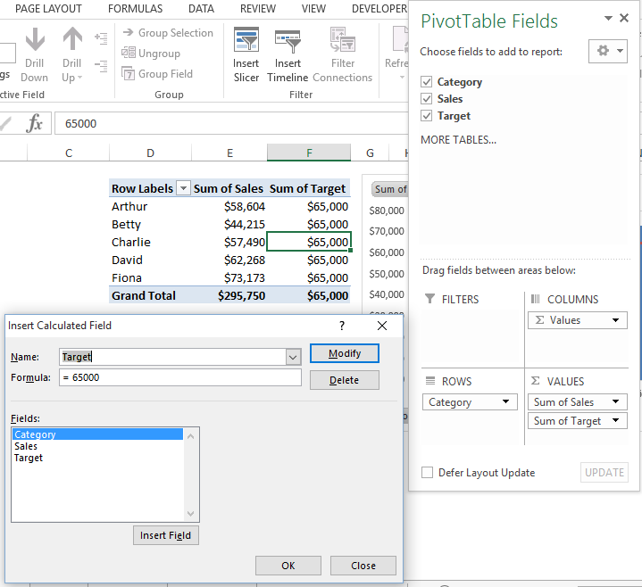
Since it is a calculated field in the Pivot Table, it doesn’t matter if you Average or Sum the Pivot Table Field as the final value will be the same that you desire for the Pivot Chart Target Line.


Calculated Field as Target Line in Pivot Chart

Hopefully this will help you quickly and easily add a goal/target/threshold line to your Pivot Charts.

Video Demonstration:

Sample File Download

How-to-Add-a-Goal-Line-or-Target-Threshold-to-an-Excel-Pivot-Chart.xlsx


What other tips and tricks to you have about Pivot Tables and Pivot Charts?  Let me know your favorite in the comments below.

Steve=True


11 COMMENTS

  1. Thank you so much for these directions I have been able to and a target/goal line to my pivot chart. However, I was hoping the line itself would remain dynamic as users filtered the chart to their desired view. For example if they want to filter the axis field or legend to narrow the graphical representation of the data. When they do this the line of the target data defaults back to being a column and you have to go back into change chart type to set it back to a line. Is this a problem unique to me or is this something fixable. Thanks so much!

    • Hi Kristyn, unfortunately, when the pivot table is refreshed, I do believe that it will reset to the base chart configuration. You may be able to fix this with VBA, but I don’t have code for this type of fix.

  2. Thank you so much!

    How would you do it if your target line changes?

    i.e. 50,000 for the first 3 months, and then 60,000 for the last 3 months?

    • Hi Dennis, in this case, I would recommend method “2) Add Data Series to Your Pivot Table” and set the first 3 months to 50k and the second 3 months to 60k manually. Hope this helps. Thanks. Steve=True


  3. If you found the website and tutorials helpful, please consider donating to keep the lights on.

    Donate with PayPal here:


  4. This is a great tip. I am looking for something slightly different. How would you add a column as a benchmark indicating something changed as of this date?

    I have a line graph that is tracking the sales trend over time. There are two upcoming important dates that I want to note in the chart. Is this possible.

    Thank You

  5. Thank you very much for your tip. How can I get the line but for a 100% Stacked Bar, because method 2 and 3 didn’t work for me or at least didn’t know how to do it.

    Thanks,

      • Thank you very much for your answer
        I think the behaviour of the pivot table is completely different to a table for a regular 100% stacked bar, for example: If I add another column for target, all the values are set to 0.9 Which should represent 90%, but when I try to select the series, doesn’t show as a series but as a slicer, and I guess that’s the problem. An example of the table that’s generating the pivot table is as follows:
        Date, Category (To make the example easier has just 2 values: Value1, Value 2)
        The Column Label is Category, Row label is Date(Month)and Values is Count of Category (Value1 + Value2 =100%)

        Date Category
        January A
        January A
        January B
        ….

        I hope there is enough detail to my problem, I know I can copy the pivot table and work on a regular table, but just complicates everything as I have to keep track of any change in the pivot table to update the other table.

        Thank you in adavnce for help

  6. Hi Friends,
    Have a great day ahead!
    I could not able find out the right post here as well as in other web pages.
    I have a excel table where I have to enter the daily/occasional expenses and I will have to consolidate these expense details by yearly and monthly basis using Excel Pivot Table option.

    Also, I need to create a stacked column type Pivot Chart and the monthly values shall be stacked.

    Now, I would like to add the Total Budget / Target Value / Maximum Value in the same excel Pivot Chart using “Line chart type” .
    I will have to enter the expense details in the excel table only and the associated Pivot Table and Pivot Chart shall be automatically updated.

    Please share with your valuable idea to sort out my issues.

    Advance thanks for all.

LEAVE A REPLY

Please enter your comment!
Please enter your name here