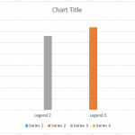
A Better Format For Excel Chart Secondary Axis Columns Overlap with 3 Series
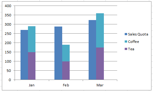
Learn a better charting format when your Excel Chart Secondary Axis Columns Overlap with 3 data series.
The Problem
I didn’t love the last chart we...
Stop Excel Overlapping Columns on Second Axis for 3 Series
We have learned how to Stop Excel Overlapping Columns in a few posts on the site. A reader had a follow-up question that I...
Why is Excel Overlapping Columns When I Move them to the Secondary Axis?
Why is Excel Overlapping Columns in this chart? Why EXCEL, WHY are you doing this??? I don’t understand. Have you ever asked yourself this...
How-to Make an Excel Single Image Goal Chart
Recently, a healthcare company employee contacted me about a chart he wanted to create. The company that he works for is trying to save...
Friday Challenge Answers: Year over Year Chart Comparisons
Thanks for the submissions for the Friday Challenge.
You can get the sample data and chart request here: friday-challenge-help-new-to-excel-yoy-comparisons
Here are some other submissions:
A) In the...
How-to Visualize 17000 Data Points of Upload and Download Times
In the last Friday Challenge, I presented you with 17,000+ data points representing 2 days of network data usage.
With so many data points, it...
3 Ways to Add a Target Line to an Excel Pivot Chart
Add a Target Line to an Excel Pivot Chart
Many Excel users use Pivot Tables and they find it very easy to create a Pivot...
How-to Create a Combo Line and Column Pivot Chart
Some Excel users can be confused when it comes to Pivot Tables and Pivot Charts. I recently saw a post asking for this help:
"Please...
How-to Center Excel Clustered Chart Columns Over Horizontal Category Labels
When you have several series
in one chart and only one of those series appear per Horizontal Label Category, you probably want to center the...
How-to Graph Three Sets of Data Criteria in an Excel Clustered Column Chart
Here is a very simple solution to a common Excel Charting question when a user wants to graph “Three sets of data criteria on...

