Removing Gaps – Excel Clustered Column or Bar Chart (Part 2)
In an earlier Friday Challenge, I posted a problem where someone wanted to remove the whitespace from a given data set. That one turned out a lot less complicated than I thought. You can check it out here:
Remove Excel Chart Whitespace from Empty or Zero Columns (Part 1)
Then I found a harder Excel challenge and posted it last week. I had several great attempts, but no one else found a way to solve this problem. Here is the Excel chart issue again:
The Problem:
Clustered Column Chart – Removing Gaps for Zero Value Series
Take this data set:
A | B | C | D | |
---|---|---|---|---|
1 | Subject 1 | Subject 2 | Subject 3 | |
2 | Series 1 | 1 | 1 | |
3 | Series 2 | 1 | ||
4 | Series 3 | 5 | 4 | 1 |
5 | Series 4 | 2 | 9 | |
6 | Series 5 | 3 | ||
7 | Series 6 | 2 | 3 | |
8 | Series 7 | 7 | 2 | |
9 | Series 8 | 6 | ||
10 | Series 9 | 4 | ||
11 | Series 10 | 5 |
and instead of creating this Excel chart:
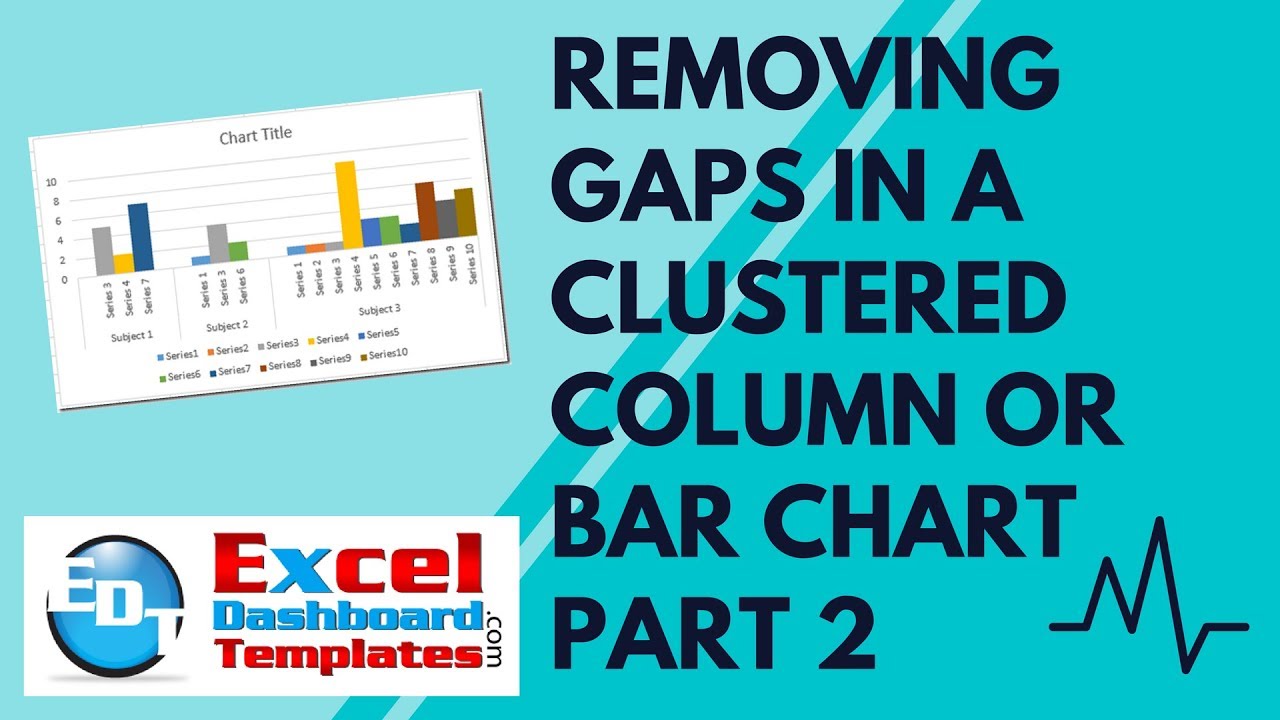
You want to create this Excel Clustered Column Chart without gaps for each series like this:
Challenge Submissions
We had a few great entries in the challenge. One from Don and one from Pete. Both worked well, but they were not able to overcome the individual coloring like the example above. Both of their solutions had all the same color for all series data points. You may be able to correct this issue by changing each data point color, but that is not dynamic and takes a lot of work.
Also, Peter had a WAY cool way to dynamically create his chart data set. You should check it out. I am sure that he will update it when he sees this solution. Here are their Excel Spreadsheets chart challenge submissions (Note, you can download the completed/final Excel Dashboard Template spreadsheet free of charge at the bottom of the article):
Don’s looks great:
Dons-Challenge-Answer-2-7-14.xlsx
Pete’s has an AWESOME macro/VBA code that builds the chart data range:
Petes-Answer-Part-2-Removing-Gaps-from-a-Clustered-Column-Chart.xlsm
(Updated file is available for Pete’s NEW version at the bottom of the article)
Now before we get to the solution to the challenge, I need to disclose that I was not smart enough to figure this out, but thought it should be shared amongst all the Excel fans out there. Full credit for the Excel solution goes to the GREAT Andy Pope. He is awesome when it comes to Excel charting and I hope to grow up to be just like him one day.
The Breakdown
1) Arrange the Chart Data
2) Create your Chart
3) Adjust the Gap Width and
Step-by-Step
1) Arrange the Chart Data
So there are no macros or VBA needed for this Excel solution. You just need to arrange the data so that each related series is in the same column. You need to arrange your data like this:
A | B | C | D | E | F | G | H | I | J | K | L | |
---|---|---|---|---|---|---|---|---|---|---|---|---|
1 | Series 1 | Series 2 | Series 3 | Series 4 | Series 5 | Series 6 | Series 7 | Series 8 | Series 9 | Series 10 | ||
2 | Subject 1 | |||||||||||
3 | Series 3 | 5 | ||||||||||
4 | Series 4 | 2 | ||||||||||
5 | Series 7 | 7 | ||||||||||
6 | ||||||||||||
7 | Subject 2 | |||||||||||
8 | Series 1 | 1 | ||||||||||
9 | Series 3 | 4 | ||||||||||
10 | Series 6 | 2 | ||||||||||
11 | ||||||||||||
12 | Subject 3 | |||||||||||
13 | Series 1 | 1 | ||||||||||
14 | Series 2 | 1 | ||||||||||
15 | Series 3 | 1 | ||||||||||
16 | Series 4 | 9 | ||||||||||
17 | Series 5 | 3 | ||||||||||
18 | Series 6 | 3 | ||||||||||
19 | Series 7 | 2 | ||||||||||
20 | Series 8 | 6 | ||||||||||
21 | Series 9 | 4 | ||||||||||
22 | Series 10 | 5 |
First in order to create a the Horizontal Axis groupings,
We need to arrange the data in the following layout:
Don’t worry, Excel will do it for you, but here is what it is setting in the Axis options:
You can learn more about Multi-level Category Labels here:
How-to Easily Create a Stacked Clustered Column Chart in Excel
Stacked bar chart with data from multiple columns – How would you do it?
Case Study Solution – Mom Needing Help on Science Fair Graphs/Charts
Then to line up the data points so that they are in the same column if they are representing the same series. See below how the Series 3 data is only in column 3. This will make sure that the colors of the data points are all the same:
Also, the blank rows in row 6, 7, 11 and 12 are optional, but allow for the space padding between the Subjects.
2) Create your Chart
Now that you have created your chart data layout, you have done the bulk of the work. To create your chart, all you have to do is highlight the range A2:L22
Then go to the Insert Ribbon and choose the 2d Clustered Column Chart:
Your chart should now look like this:
3) Adjust the Gap Width and Series Overlap
Select any series in your chart and press CTRL+1 then choose the series options and change your Series overlap to 100% and your Gap Width to 0%:
Your final chart should now look like this:
Video Demonstration
Watch this technique to remove gaps in your column chart here:
Free Excel Dashboard Chart Template File
Download the Excel challenge solution file here:
Clustered-Column-Chart-Removing-Gaps-for-Zero-Value-Series.xlsx
Pete’s Updated Macro File that Creates the Layout for you!!!
Friday-Challenge-Part-2-Removing-Gaps-from-a-Clustered-Column-Chart-Rev-2.xlsm
Thanks Pete and Don for your Submissions and thank you Andy Pope for teaching me so much and also for figuring out this chart gap.
Steve=True
I have sent in an updated version of my solution that combines the layout that you suggest and the dynamic updating that my original solution has.
This has proven to be a worthy challenge. 🙂
Thanks Pete! I love the macro that creates the layout for you. I have added a link to it at the bottom of the Excel tutorial. Glad it was fun!
Good job Steve. I thought I had tried every combination of data, but I would never have thought of this one.
Thanks
Thanks Don. Wish I could take the credit but glad I could share the Excel solution. Thanks for all your contributions.
Thanks for this solution, do you also have one for adding error bars to this chart?
Thanks Sarah. I don’t have one yet, but I can put it on my list. Do you have sample data? I am curious because with a stacked clustered column chart, would you put errors on both columns of a stack or just one of the columns? Thanks. Steve=True
Tried this 3 times in XL2010 but it turned out a pig’s breakfast each time. Then manually selected the data and it worked perfect. Great outcome, thanks.
Eg. Series 1 = data from C2:C22
Series 2 = data for D2:D22, etc.
X-values in series 1 = A2:B22.
Thanks for the tip. Glad you got it worked out. Steve=True
Thank you for having this challenge still posted out here. My chart just amazed my Executive. I feel like a genius!!
Awesome, thanks for the great comment. So glad I may have helped you with a raise/promotion soon 🙂 Steve=True
Can i change the Series to say something different or remove it completely this is great and just to solution i needed but i don’t need the series headings.
Hi Abby, yes you can always remove the label from your chart data and the series will not have label.
Wow, this is a really cool technique.
Unfortunately, the vast majority of users I know (including IT people) would tell me that VBA is not an option for them which often means missing out on good stuff like Steve’s macro. So I tried reproducing the result using a pivot table, a really cool Excel feature that has been covered on many pages here at EDT. It works just great!
Allow me to share:
1. Analyse your data set (If you have none, grab the data from the table at the beginning of this article and follow along!). In order to use the pivot table feature, you will want to have your data in the list format, in case of this article’s sample data like this:
Series Subject Value
Series 1 Subject 2 1
Series 1 Subject 3 1
Series 2 Subject 3 1
Series 3 Subject 1 5
…
If your data is in the list format, go to step 2. Otherwise, your data may be in a format like the data set at the beginning of this article. That is, the possible values of one field (“Subject”) are not in a column but spread out along the horizontal axis like the “Subject 1||Subject 2||Subject 3”. This format can be thought of as the result of pivoting the Subject column to the the horizontal axis. So in order to obtain a list-format data set, we need to “unpivot” the subject field back into a column. And that is exactly what this great article is about.
https://www.exceldashboardtemplates.com/how-to-convert-an-existing-excel-data-set-to-a-pivot-table-format/
If you followed the steps at the link destination, your resulting list-formatted data set will be an Excel table – auto-formatted and with drop-down menus next to the field titles. If your original data set had empty cells like this article’s sample data, the list will contain some records with an empty Value field. You can then use the filter in the drop-down menu to filter out all empty-Value records and copy the filter result over to a new sheet.
2. In order to have spaces between the main category (“Subject”) clusters, we need to add to our list as many dummy rows with Series being a single space and Subject being incrementing number of space (one, two, three). We use spaces because we need something invisible and the number of spaces – and thereby the value – must be different because otherwise the pivot table would aggregate those multiple records into one.
3. Copy the subcategory column (“Series”) and paste it to the right of your set. I explain why later.
4. Select some cell in your data list and press Alt > N > V > C. Follow the wizard to create a pivot chart. You will have the pivot table panel on the right of the Excel window. Now drag the main category (“Subject”) from the field list to the ROWs box, then drag the subcategory (“Series”) below that. Since you copied the “Series” column in your data, you can drag the corresponding field to the COLUMNS box and lastly the “Value” field to the VALUES box. And boom! You can already see the pivot chart that looks pretty much like the desired result. Since we added those rows with spaces to the data list, those show up at the top of the vertical axis. Hover your mouse pointer over one of those at a time till the pointer becomes a cross with arrow tips and drag that space “Subject” between the actual subjects to create the spacing.
5. If all the bars have the same height now – 1 -, open the drop-down menu from the arrow next to the “Value” item in the VALUES box, select field settings and change the aggregation mode from count to sum.
If someone at EDT likes this trick, maybe they can make a video about it. It looks like a lot to do but is actually more easily done than explained and contains a bunch of useful techniques.
Thanks for the write up. I will have to check it out.
When I try this, I get lines in between each Series Label in the chart and a slightly longer line separating the Subjects. In format table options I select no line but unfortunately gets rid of each line (including between subjects). Any way to get rid of the lines between Series and not the Subjects? Thanks
Hi Gobind, you can format the axis and change the Axis Options to “None” for the Major Tick Mark Type. However, this may remove all of them. Unfortunately, there may not be a way to only get some of the tick marks.
That works, thanks!
Hi there, such a cool tutorial, it helped me sort out my problem too. But now I am stuck again because I need to add error bars to my chart and the way I usually do it (creating a table with inputed error values as the custom value for the error) doesn’t work…I really need help with this. Many thanks in advance! Happy new year everyone!
Hi Alex, I have sent you an email to see if I can help. Not sure what the issue is via the comment.
Thank you so much Steve. This came as a timely help for me. Much appreciated.
Glad it worked for you. Thanks for the comment.
This is fun…..do we think this would be possible if creating floating bars? I can’t quite get my head wrapped around it. Lots of floating bars made here, and above is right on track for good visual, but I am showing salary ranges (for same position, at multiple employers, not all employers reported a response for each position (hence me finding this for closing those gaps)), but no salary begins at zero of course….!
Hi Alexandra, probably possible. Question is there a possibility the floating bars would NOT be above the columns. Thus, not be floating, but be overlapping?
Didn’t work for me.
Strange that it didn’t work. Did you download the sample file and test it out to see if the sample worked for you?