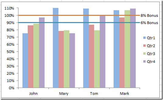
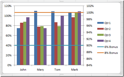
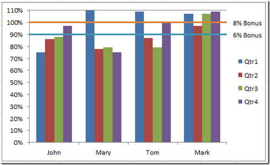
Sales executives are always pushing their sales teams. They typically do this by setting sales quota’s for their salespeople. Quotas are thresholds or minimum targets that they expect their sales people to achieve during a certain sales cycle. Therefore, most Excel Sales Dashboard would be probably include some sort of sales quota charts or graph components. So lets see how we can create one using 2-D Clustered Column Excel charts that represent the salesperson’s actual numbers by quarter along with a sales quota line that they are striving to achieve if not exceed.Here is what the final product will look like:
This Excel Dashboard Component quickly shows the sales manager and executive team who are their better sales people and who needs improvement. At a glance, I can see that John started out slowly in the beginning of the year, but he has been advancing and finally reached into the bonus zone in quarter four. On the other hand, Mary is having a lot of trouble after having a stellar performance in quarter one. Tom started strong, faltered but has recovered. Mark is clearly the sales rock star of the group by getting a bonus every period with the majority hitting the maximum bonus.
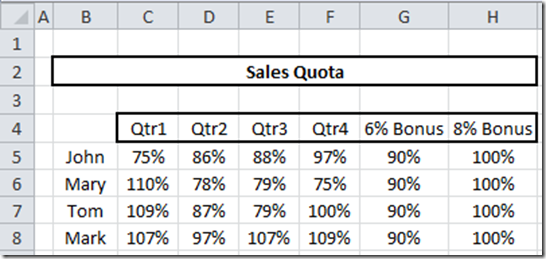
Here is how I created the data for the above chart:
Notice that the data for the bonus lines runs the entire data set and follows the same pattern as the legend entries (by that I mean the quarters).
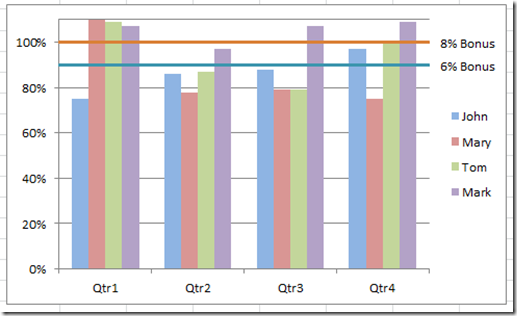
If we plot the data in a slightly different way, we can group our data by quarter and see how the quarters have done per quarter instead of per salesperson.
This chart shows that almost everyone of our sales people do great in the first and last quarter of the year. Maybe they sell a product that is more cyclical in nature than others. Perhaps their buyers typically spend their budgets before the year end or are only able to purchase when a new budget cycle opens up during the first of the year. But also looking at it, we should find out how is Mark able to still hit quota during the middle of the year and teach our other salespeople these same techniques. This pattern is quickly seen when using an Excel Dashboard Component that has a metric or key performance indicator like a sales quota or threshold.
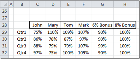
Here is how the data set looked for the Excel Chart that is grouped by Quarter above:
Notice that the data for the bonus lines run the entire length of the data from quarter 1 to quarter 4 in an opposite fashion of the first chart.
You will want to consider how your data will be grouped first before you create the horizontal sales quota lines so that you will save yourself a little bit of chart rework. Okay, lets get to the actual Excel Tutorial and Excel Video Demonstration.
The Breakdown
1) Setup Your Excel Chart Data Range
2) Create 2-D Clustered Column Chart
3) Switch Rows/Columns of the Chart
4) Change the Quota Data Series to a Line Chart Types
5) Move the Sales Quota Lines to the Secondary Axis
6) Change the Secondary Horizontal Axis Formatting
7) Add Data Labels to the Sales Quota Lines
8) Adjust Primary Vertical Axis
9) Chart Clean Up
10) Deposit your bonus check for a well designed and well made Excel Dashboard!
Step-by-Step
1) Setup Your Excel Chart Data Range
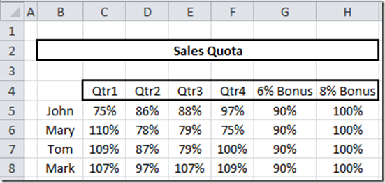
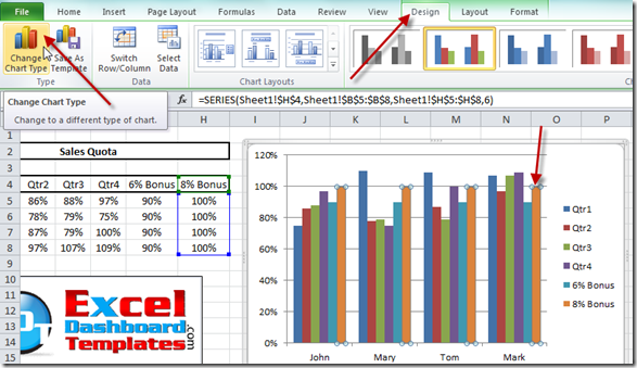
I am going to use the the first data set that you saw above for my Excel sales quota template with the data going from cell B4:H8, like this:
2) Create 2-D Clustered Column Chart
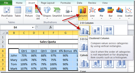
Highlight your range from B4:H8 and then select the Insert Ribbon and then choose the Column button in the Charts Group and finally, choose the 2-D Clustered Column chart.
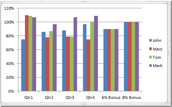
Your Excel chart should now look like this:
3) Switch Rows/Columns of the Chart
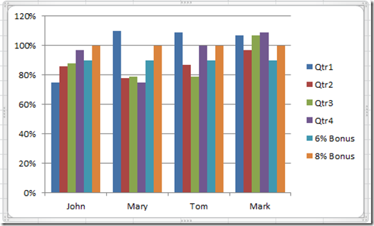
Select your chart and then press the Switch Row/Column from the Type Group on the Design Ribbon. This will put the quarters as the category groupings on the Horizontal Axis.
If you want to know why Excel setup our chart in this fashion, check out this post:
Why Does Excel Switch Rows/Columns in My Chart?
Your chart should now look like this (with the sales people on the horizontal category axis and the quarters and bonus lines in the legend):
4) Change the Quota Data Series to a Line Chart Type
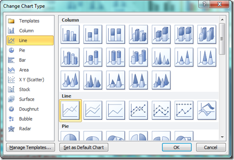
Select your chart and then select one of your Quota Data Series. Then press the Change Chart Type from the Type Group on the Design Ribbon.
Repeat this same step for the 2nd quota line data series.
Your chart should now look like this: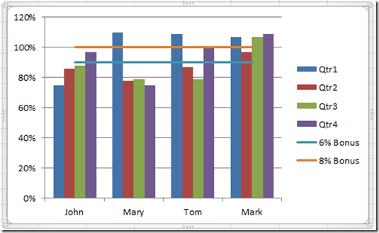
Alright, we now have our 2 quota lines. But why stop here? Lets really trick out this Excel Graph! So keep reading.
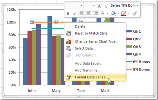
- 5) Move the Sales Quota Lines to the Secondary AxisRight Click on either of the Sales Quota Data Series and choose Format Axis… from the pop-up menu or press Ctrl+1 to launch the Format Data Series dialog box.
- Then from the Format Data Series dialog box, select the
Secondary Axis from the Series Options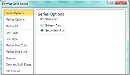
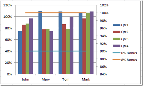
- Repeat this step for the other Sales Quota Excel Chart Line.Your chart should now look like this:
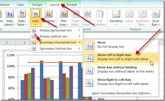
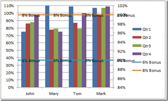
- Now it looks like we have messed things up, but don’t worry, there is a method to my madness.6) Change the Secondary Horizontal Axis FormattingAlright, this step is how we will get the Sales Quota Bonus lines to stretch from one side of the Excel Chart to the other.First we need to add the other axis that you don’t see. We are only seeing 3 out of 4 of the axis available to us. So to fix this, you need to Select the chart and then go to the Layout Ribbon and choose “Show Left to Right Axis” from the Secondary Horizontal Axis menu in the Axis button.
- Your chart will now look like this:
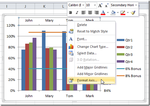
- Now that we have the Secondary Horizontal Axis, right Click on it and select Format Axis… from the pop-up menu.
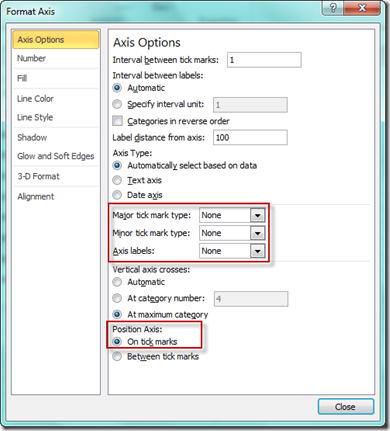
- From the Axis Options on the Format Axis Dialog Box, change the Major Tick Mark Type to None, the Axis Labels to None and Position Axis to On Tick Marks as you see below:
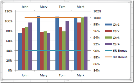
- Your chart will now look like this:
- 7) Add Data Labels to the Sales Quota Lines
- Now we need to add the cool labels to each of the Sales Quota Bonus Lines. This will help the readers quick decipher the chart without much thought or investigation.
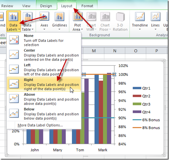
- Click on either of the sales quota bonus lines and then choose Right Data Labels from the Layout Ribbon:
Now right click on any of the data labels and choose the Format Data Labels… from the pop-up menu: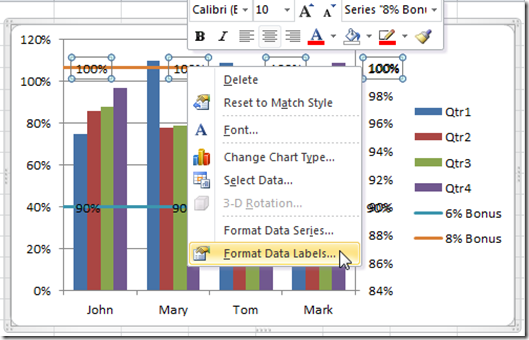
Change the “Label Contains” to Series Name and remove the checkbox next to the value.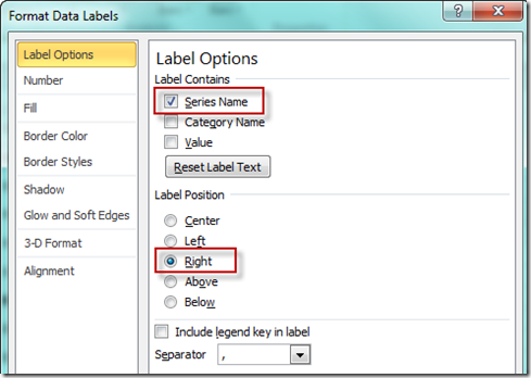
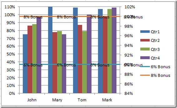
Repeat this same step for the 2nd quota line data series. Your chart should now look like this:
- Looks kind of ugly, but don’t worry, it will all get fixed in the 9th step.
- 8) Adjust Primary Vertical Axis
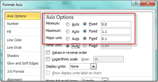
- This is a matter of preference, I don’t like as much white space at the top of my charts, so you might want to right click on the Primary Vertical Axis (left one) and choose Format Axis and then change the minimum, maximum and major unit as follows:
- Your chart will now look like this:
- 9) Chart Clean Up
a) Click on the Secondary Vertical Axis (right one) and press the delete key.
b) Click on the Legend and then click on one of the Bonus entries and then press the delete key. Repeat this step for the other bonus line by first selecting the legend and then selecting the legend entry and then the delete key.
c) Click on the Data Labels on either one of the bonus quota lines and then click on any one of the labels that are not on the far right and then press the delete key. Repeat this step for the other bonus line.
d) Click on the horizontal gridlines and then press the delete key.
Your chart should now look like this and you are done! Nine easy steps to creating your very own dashboard template component for your sales team.
10) SHOW ME THE MONEY!!! YOU ARE DONE! GREAT JOB. Check out the short video tutorial to see this Excel Tip and Trick in action.
Video Demonstration
Here is the How-to Video Tutorial Demonstration Link:
(P.S – Don’t forget to sign up for my YouTube channel so that you will also receive notification for videos that are uploaded that do not have a detailed step-by-step demonstration.
(P.P.S. – Thanks for visiting my blog. If you like it, please send a copy of my blog to your friends and co-workers.)
(P.P.S – Leave me a comment if there is another Excel Tutorial and Video that you would like to see.)
Steve=True

