How-to Show Decades and Highlight a Year in the Horizontal Axis
Recently in an Excel Forum, a user had data similar to this format:
Here is what he wanted to do:
How do I set the Horizontal...
Tips and Tricks – Longer Legend Color Bars in Excel Charts
Here is a real quick tip that you may want to learn when using Excel. This tutorial will help you apply this technique to...
Why is Excel Overlapping Columns When I Move them to the Secondary Axis?
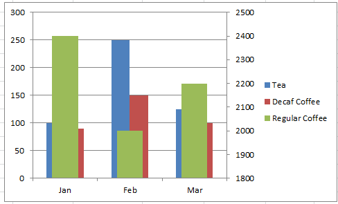
Why is Excel Overlapping Columns in this chart? Why EXCEL, WHY are you doing this??? I don’t understand. Have you ever asked yourself this...
Excel Clustered Column Chart Conundrum
Many, many, many Excel users post this problem in user forums. And this one always throws me for a loop and takes me time...
Group Column Chart with Lines for Excel Dashboard Presentations
Yesterday a user in the MrExcel.com Forums asked how he could make a Column Chart in Excel and then Group those Columns with a...
A Taxing Situation…
In order to prevent vehicle population from growing too fast and also to ease traffic, Shanghai China has begun to auction off license plates. ...
How-to Make a Conditional Column Chart in Excel – REDO
·
In a previous post, I showed you how to make a Conditional Column Chart for your Executive Dashboard Templates, but I had 3...
Remove Excel Chart Whitespace from Empty or Zero Columns (Part 1)
Hi everyone. In the last Friday challenge, we had a user post this question about an Excel Column Chart:
Chart: Remove whitespace from empty (non-existent)...
How-to Center Excel Clustered Chart Columns Over Horizontal Category Labels
When you have several series
in one chart and only one of those series appear per Horizontal Label Category, you probably want to center the...
How-to Make Longer Legend Color Bars in an Excel Chart Video Tutorial
Most Excel 2D Column Charts have small color boxes in the legend to point you to the right series in the graph. However, this...


