But, I am wondering if you have three sets of data – two on one y-axis and one on the other. I am trying to add in “Pad” columns but am failing to get them to not overlap.
Say it’s decaf coffee and tea with low values and caffeinated coffee with high values – no stacking.
Any help would be greatly appreciated,
–Whitney”
First let’s revisit the problem.
The Excel Overlapping Columns Problem
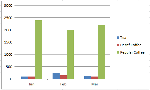
Whitney is asking if we have a series of data like this:
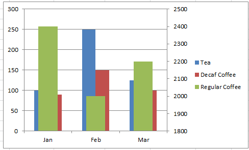
Where some of the data is rather large and you cannot distinquish the smaller series, she would like to move the one large series to the secondary axis or right axis. However, when you move a series to the secondary axis in a Column Chart, you will see Excel Overlapping Columns as shown below:
If you want to know more about why Excel may be Overlapping the Columns, check out this post:
Why is Excel Overlapping Columns When I Move them to the Secondary Axis?
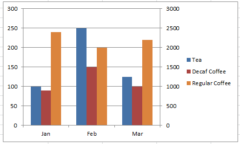
However, what Whitney really wants her Column graph to show is this:
The Breakdown
The technique to fix the Excel Overlapping Column issue, is to remember that Excel is centering the data series along the category labels. Therefore, you need to have an equal number of series for the primary axis and the secondary axis.
So start by counting the total number of series you will have in your chart. Then make sure that you have that amount for the primary axis and also the secondary axis. The Tip and Trick is to make the filler columns equal to zero so that they will not hide the data series you wanted to see.
Step-by-Step
1) Add Extra Padding Data Series to the Primary and Secondary Columns
Here is a graphic to show you what I mean for this data set:
| A | B | C | D | |
|---|---|---|---|---|
| 3 total series are needed for each axis | ||||
| Tea | Decaf Coffee | Regular Coffee | ||
| Jan | 100 | 90 | 2400 | |
| Feb | 250 | 150 | 2000 | |
| Mar | 125 | 100 | 2200 |
If you count the data series we have 3 total. That means we will have a total of 3 data series for the primary and also 3 columns of data for the secondary axis.
| A | B | C | D | E | F | G | |
|---|---|---|---|---|---|---|---|
| 3 total series are needed primary axis | 3 total series are needed for secondary axis | ||||||
| Tea | Decaf Coffee | Blank (overlaps Regular Coffee) | Blank (overlaps Tea) | Blank (overlaps Decaf Coffee) | Regular Coffee | ||
| Jan | 100 | 90 | 0 | 0 | 0 | 2400 | |
| Feb | 250 | 150 | 0 | 0 | 0 | 2000 | |
| Mar | 125 | 100 | 0 | 0 | 0 | 2200 |
What you may notice is that we are planning to have blank series that will overlap the both primary and the secondary axis spaces for 3 columns of data. But we are going to make the ones that overlap other series equal to zero so that they will not display in the Excel Chart.
That is the technique you need to use. Make sure you have equal columns on box axis, then they will remain the same size as well as not overlap. But make the extra columns of data are set to zero so that you will not cover over any of the columns that you wish to display.
Now that we have our data modified as you see above (with the extra padding columns) you can create your chart
2) Create Clustered Column Chart
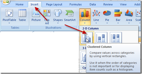
Highlight your data range of the labels and data (not the first row you see above) and go to your Insert Ribbon and click on 2-D Clustered Column Chart
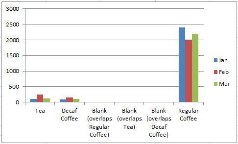
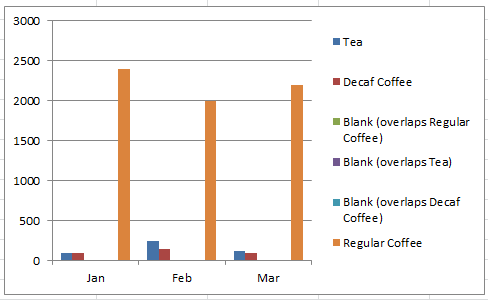
Your chart should now look like this:
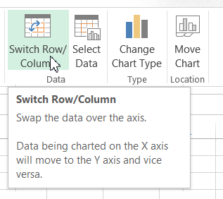
3) Switch Excel Chart Columns/Rows
We really want the months on the horizontal axis in the Excel Chart, so we should switch the Rows and Columns.
If you want to learn more on why Excel is doing this, check out this post:
Why Does Excel Switch Rows/Columns in My Chart?
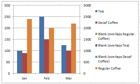
Your chart should now look like this:
4) Move Series to Secondary Axis
Next we need to move each of the data series that needed for the secondary axis. They are the following series:
| Blank (overlaps Tea) | Blank (overlaps Decaf Coffee) | Regular Coffee |
To do that, select the series and press CTRL+1 to bring up the Format Series Dialog box and then pick the Secondary Axis: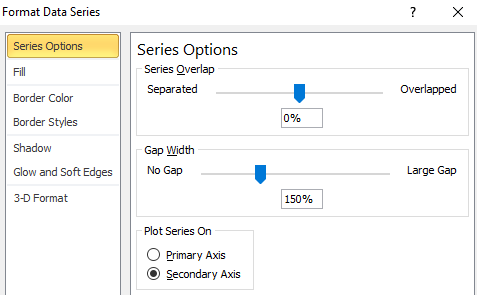
If you are having problems selecting the right series to move to the 2nd Axis, check out this post:
How-to Select Data Series in an Excel Chart when they are Un-selectable?
Your chart should now look like this:
5) Delete Chart Legend Entries
The final thing we need to do is to clean up our Legend entries and remove the ones that are not needed. To do this, simply select your chart, then select the Chart Legend, then select a Legend Entry and then press the delete key on your keyboard.
Your final chart should look like this:
Video Tutorial
See how you can do this in this short video tutorial:
Download File
You can get your own copy of this tutorial to play around with from this free download link:
Stop-Excel-Overlapping-Columns-on-Second-Axis-for-3-Series.xlsx
Related Tutorials
Do you need more help to fix the Excel Overlapping Column issue in your Excel Clustered Column Chart, check out these posts:
Stop Excel From Overlapping the Columns When Moving a Data Series to the Secondary Axis
Stopping Excel Pivot Chart Columns from Overlapping When Moving Data Series to the Second Axis
Now if you watched the video, you will learn that I am not in love with this solution. So be sure to tune in to the next post to see my more preferred way to display this data in an Excel Chart.
Steve=True

