In the last Friday Challenge, I presented you with 17,000+ data points representing 2 days of network data usage.
With so many data points, it may be best to visualize the data to see what is happening … and when.
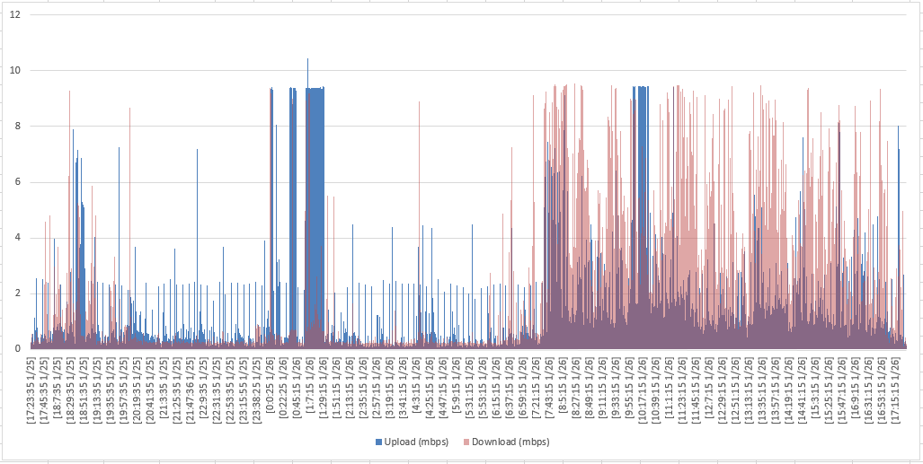
Here is my what my chart looks like:
You can quickly make this chart with the following steps:
1) Highlight the Data
2) Insert a 2-D Stacked Column Chart
3) Change the “Download” Data Series Fill to Red
4) Change the “Download” Data Series Transparency to 50%
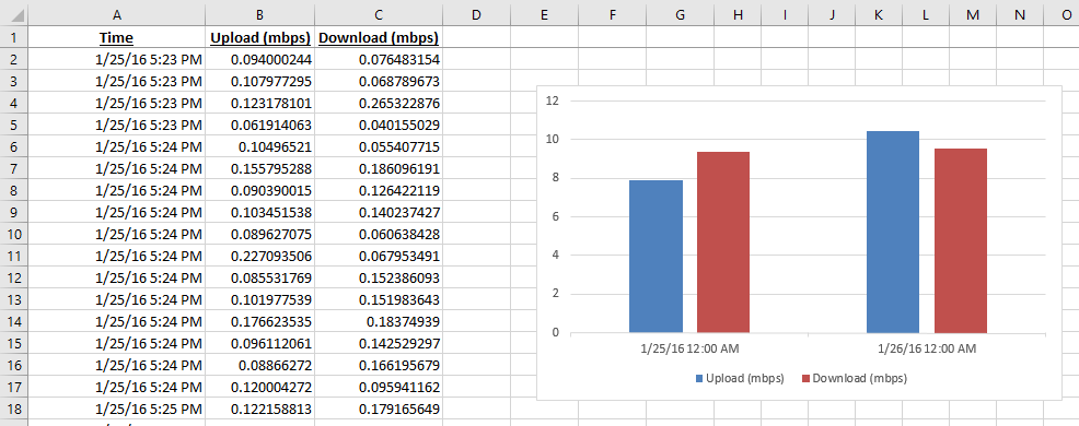
This is really easy when your Horizontal Axis has Text. If your data is Date/Time format, your chart will look like this:
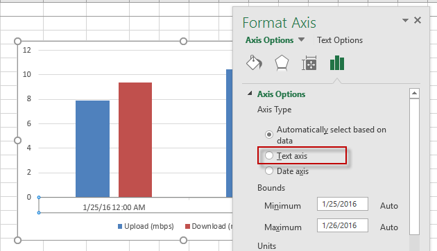
Excel charts your data like this because Excel thinks that you want to chart all the data by day, not time. To see the time data, change your Horizontal Axis from Automatic to Text:
If you do that, then you will get the chart that you see at the top of the post.
Video Tutorial

Sample Data File
Here is the sample Data File: Sample-Data-Network-Usage.xlsx
Do you have any other visualizations for this data? If so, drop me a line in the comments section below.
Steve=True


