Chart Conditional Labels and Callouts
Learn how to make the simple and easy these Excel Chart Label Callouts:
In my most recent article, I described how Excel is taking user feedback for changes to the MOST AWESOME PRODUCT IN THE WORLD 🙂 You can check out the post here:
Do you have an Idea to Make Excel Better? Excel’s Suggestion Box is Here!
One of the Ideas submitted by users is as follows:
“Adding comment (tool tip) in chart (to various elements of the chart, data points, etc.)
To be able to add comments to a specific data labels in a chart (can be bar chart, line chart) -Kreshna Fowdar”
So it got me thinking how can we use standard Microsoft Excel Charting features to Quickly and Easily mimic this request? And in my testing, I developed a whole NEW way of thinking about Chart Conditional Labels and Callouts for Column and Bar Charts.
Below you will find my instructions, video tutorial, and free sample Excel file to create the following charts:
- Custom Labels based on a Formula or Threshold
- Custom Label Callouts for Individual Data Points
A) Custom Labels based on a Formula or Threshold
The Breakdown
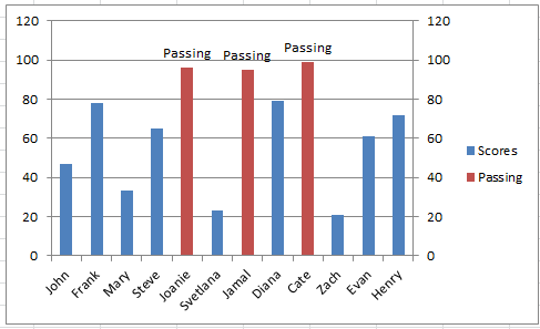
This chart will allow you to enter in 1 value for a threshold and apply that to both the Labels as well as the Conditional colors of the Column chart.
- Add 2 New Chart Data and Label Columns
- Create Excel Column Chart or Excel Bar Chart
- Add Data Labels to New Chart Data Column
- Change Labels to Category Name
- Move New Chart Data Column to 2nd Axis
- Change Horizontal (Category) Axis Label Range
- Delete 2nd Vertical Axis
Step-by-Step
1) Add 2 New Chart Data and Label Columns
For our sample chart, we will start with this sample data in Cells A3:B15:
| A | B | |
|---|---|---|
| 1 | ||
| 2 | ||
| 3 | Scores | |
| 4 | John | 47 |
| 5 | Frank | 78 |
| 6 | Mary | 33 |
| 7 | Steve | 65 |
| 8 | Joanie | 96 |
| 9 | Svetlana | 23 |
| 10 | Jamal | 95 |
| 11 | Diana | 79 |
| 12 | Cate | 99 |
| 13 | Zach | 21 |
| 14 | Evan | 61 |
| 15 | Henry | 72 |
For this chart, we need to add a placeholder for the Threshold (Cell D1) and for the Custom Label (Cell D2) that we wanted to apply in the chart. Also, you will need to add the following formulas in Cell C4 =IF(B4>$D$1,B4,0) and D4 =IF(VALUE(C4)>0,$D$2,””) respectively and copy the formulas down to the end of the range C4:D15.
The formula in Column C will use the value you put in cell D1 to determine if it meets the threshold. If it does meet the threshold then the Label put into cell D2 will then populate the range in Column D. The chart wil then use Column C as the position on the chart and Column D will be the Labels shown in the chart.
| A | B | C | D | |
|---|---|---|---|---|
| 1 | Threshold | 79 | ||
| 2 | Label | Passing | ||
| 3 | Scores | Passing | Label | |
| 4 | John | 47 | ||
| 5 | Frank | 78 | ||
| 6 | Mary | 33 | ||
| 7 | Steve | 65 | ||
| 8 | Joanie | 96 | ||
| 9 | Svetlana | 23 | ||
| 10 | Jamal | 95 | ||
| 11 | Diana | 79 | ||
| 12 | Cate | 99 | ||
| 13 | Zach | 21 | ||
| 14 | Evan | 61 | ||
| 15 | Henry | 72 |
Worksheet Formulas
|
2) Create Excel Column Chart or Excel Bar Chart
The data is now all setup to make the chart. So let’s create it now.
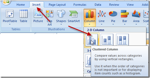
First, highlight cell range A3:C15 and then click on the Insert Ribbon. Next, click on either a Clustered Column Chart or a Clustered Bar Chart.
Your chart should now look like this:
3) Add Data Labels to New Chart Data Column
As we want to add a custom threshold label on the chart, we need to add labels. Don’t worry if they are not the correct ones yet, we will change that in a few steps.
To add labels, click on the chart, then click on the Red Column for the passing data series. Then click on the Layout Ribbon and press on the Data Labels button as you see here: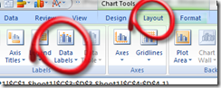
and then choose “Outside End”
Your chart should now look like this:

4) Change Labels to Category Name
This solution does not use Value labels. Instead, we need the Category Name. To change your Data Labels of your Excel Chart to Category Name, first, click in the chart, then double click on the data labels for the series. Then from the Format Data Labels dialog box change the “Label Contains” option from Value to Category Name as you see here:
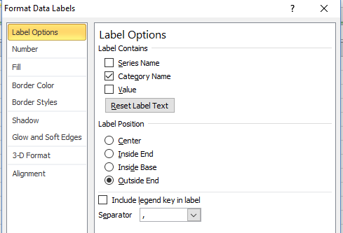
Click on the Close button and your chart should now look like this:
5) Move New Chart Data Column to 2nd Axis
Now you may be wondering why we did that last step of adding Category Name Labels as it looks just like the horizontal axis. Well, in order to show different Category Names we need to move this series to the secondary axis. To do that, first, select the chart, then double click on the Red Column for the Passing data series. This will open the Format Data Series dialog box. Then change the “Plot Series on” option to Secondary Axis.
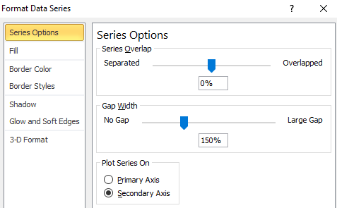
After changing this option, the chart will look like this:
Note: It is a personal preference as to the color of the 2nd axis chart series. Default, Excel will change the color like you see here to Red. If you want the color to match the primary axis series, you will want to change the Fill color to “No Fill” in this step.
6) Change Horizontal (Category) Axis Label Range
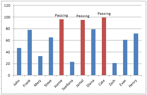
Here is the real Tip and Trick that makes this Microsoft Excel Chart technique so work well. Now that we have our label data series on the secondary axis, we can assign a different range for it’s category labels. That way the new category range will show up as our labels.
However, the secondary category axis labels are not apparent that they are in fact different than the primary axis. Microsoft Excel defaults the Horizontal Category Axis Labels as the same range as the primary axis unless you change them manually.
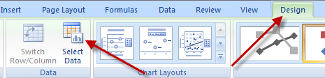
To change the 2nd Axis Horizontal (Category) Axis Labels to another range, follow these steps. First, click anywhere in the chart. Then select the design ribbon and then choose the “Select Data” button in the Data group.
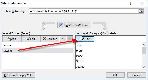
Next, from the Select Data Source Dialog box, click on the “Passing” series in the Legend Entries (Series) section. Then with that series selected, click on the “Edit” button in the Horizontal (Category) Axis Labels Section as you see here:
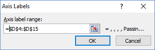
Then from the Axis Labels dialog box, drag and drop in the spreadsheet to highlight the range for the Secondary Axis Category Labels. In this case, you will want to highlight cells D4:D15.
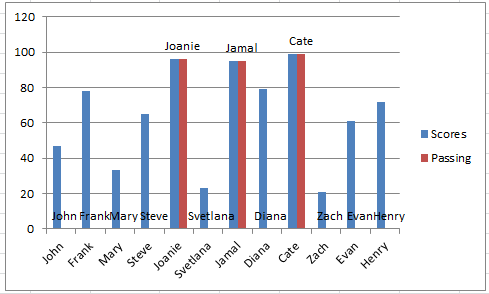
Click on the OK buttons until you are back to the spreadsheet and your chart is almost complete and will now look like this:
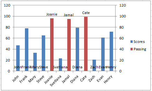
7) Delete 2nd Vertical Axis
To finish the Dynamic Excel Chart Conditional Labels, we just need to clean things up a bit. I HIGHLY recommend deleting the secondary vertical axis. I highly recommend it because Excel will change that axis based on your threshold limit in cell D1 to fill up the chart the way it sees fit. You can learn more about why Excel does that here: Problems with an Excel Dashboard Goal Chart
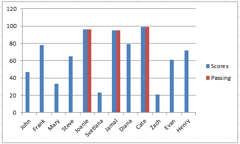
Also, you may or may not want to delete an entry in the Legend or delete the legend entirely. It is a user choice on if the legend is needed or is confusing. In our case, I deleted both and your final chart will look like this:
B) Custom Label Callouts for Individual Data Points
The Breakdown
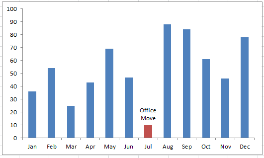
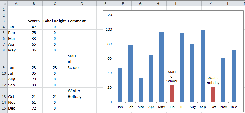
This chart will allow you to enter a custom label for ANY data point along the Clustered Column Chart or Clustered Bar Chart of your choosing. Simply put in the custom label text next to the value that you want to highlight.
The steps are the same as the tutorial above, except that you will have different formulas in columns C and D.
Step-by-Step
For this chart, use this setup and change the formulas in cell C4 to =IF(LEN(D4)>0,B4,0) and there is NO formula in Column D.
| A | B | C | D | |
|---|---|---|---|---|
| 1 | ||||
| 2 | ||||
| 3 | Scores | Label Height | Comment | |
| 4 | Jan | 47 | 0 | |
| 5 | Feb | 78 | 0 | |
| 6 | Mar | 33 | 0 | |
| 7 | Apr | 65 | 0 | |
| 8 | May | 96 | 0 | |
| 9 | Jun | 23 | 0 | |
| 10 | Jul | 95 | 0 | |
| 11 | Aug | 79 | 0 | |
| 12 | Sep | 99 | 0 | |
| 13 | Oct | 21 | 0 | |
| 14 | Nov | 61 | 0 | |
| 15 | Dec | 72 | 0 |
Worksheet Formulas
|
Then follow the rest of the steps presented for the first chart.
Then as you enter any text in column D next to the data you want to callout in the chart, your text will appear in the graph as you enter them as you see here:
Video Demonstration
Check out this Video tutorial of the techniques presented above.
Sample File Download
Click here to Download the Free Sample Excel Template File: Create-Dynamic-Excel-Chart-Conditional-Labels-and-Callouts.xlsx
Let me know what you think of this technique in the comments below. Also, do you have any favor Excel Chart Tips and Tricks? Let me know those as well!
Steve=True


