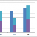
How-to Easily Create a Stacked Clustered Column Chart in Excel
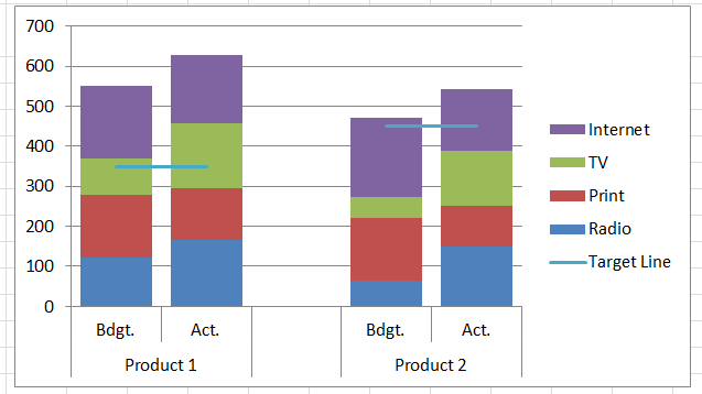
Create a Stacked Clustered Column Chart in Excel
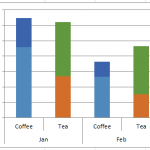
There is one type of chart that is always requested, however, Excel doesn’t offer this type of...
How-to Setup Your Excel Data for a Stacked Column Chart with a Secondary Axis
Many users have mixed reactions about this secondary axis overlap fix. You can see the post here:
Stop Excel From Overlapping the Columns When Moving...
How-to Make a Tenant Timeline Excel Dashboard Chart
So last week, I posted this question that I responded to in an Excel forum. I also asked you how you would solve this...
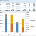
How-to Make an Excel Stacked Column Pivot Chart with a Secondary Axis
In this previous post:
Stopping Excel Pivot Chart Columns from Overlapping When Moving Data Series to the Second Axis
I had a fan question - How...
Stop Excel From Overlapping the Columns When Moving a Data Series to the Second...
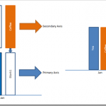
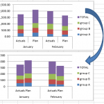
Don’t worry, Excel is not changing your chart to a Stacked Clustered Column Chart or Stacked Bar Chart when you move a data series...
How-to Create a Stacked and Unstacked Column Chart in Excel
Stacked and Unstacked Column Chart in Excel
Excel is awesome because, even when a certain chart type is not a standard option, there may be...
How-to Close the Gaps Between Chart Series in an Excel Stacked Clustered Column Chart
Many users like to create a chart that Excel doesn’t have as a chart type. It is a combination of a clustered column and...
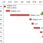
How-to Add Resource Names to Excel Gantt Chart Tasks
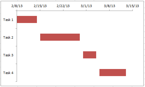
How-to Add Resource Names to Excel Gantt Chart Tasks
I recently received a request from a fan that asked how he could add resource names...
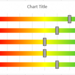
How-to Make an Excel Project Status Spectrum Chart
Here is the long awaited demonstration of a recent Friday Challenge.
The challenge was to recreate a Project Management Status Chart that I saw on...
How-to Easily Add Task Information to Excel 2016 Gantt Charts
Easily Add Task Information to Excel 2016 Gantt Charts
Excel 2013 and Excel 2016 make this need so much easier. Thanks Excel! I recently posted...


