So last week, I posted this question that I responded to in an Excel forum. I also asked you how you would solve this problem using Excel charting tools. I had one great response from Pete that looked like it would work great. Here is my solution which is very similar. But first, in case you missed the last post, here is the question again:
Names and lease expirations
I’m trying to figure out how to create a chart showing names and the corresponding lease expiration in Excel 2007.
There is 1 column with the name of tenants and the next column has the date the lease expires. They are labeled “tenant” and “lease expiration”, respectively. Out of the 15 tenants a couple have text instead of dates.
I was thinking of a scatter plot, with the names of the vertical access and dates on the horizonal, but can’t figure out how to do this. Any help would be greatly appreciated
Here is the chart that I created for the Tenant Timeline dashboard chart: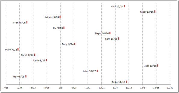
I really liked it. What do you think? Let me know in the comments below. Here is how I built this Excel dashboard chart:
The Breakdown
1) Set up your Data Range
2) Set up your Chart Data Range Calculations
3) Create Stacked Bar Chart
4) Change Fill of “Lease Expiration Fill” Series
5) Add Data Labels
6) Remove Vertical Axis
7) Change Horizontal Minimum and Maximum and Major Unit
8) Change Vertical Grid Line Style
Step-by-Step
1) Set up your Data Range
Here is how I set up my data for the chart:
| A | B | |
|---|---|---|
| 1 | ||
| 2 | Tenant | Lease Expiration Date |
| 3 | Mike | 11/16/2013 |
| 4 | Mary | 8/5/2013 |
| 5 | John | 10/17/2013 |
| 6 | Jack | 12/18/2013 |
| 7 | Justin | 8/26/2013 |
| 8 | Steve | 8/14/2013 |
| 9 | Mark | 7/28/2013 |
| 10 | Tony | 9/24/2013 |
| 11 | Sam | 11/8/2013 |
| 12 | Steph | 10/30/2013 |
| 13 | Joe | 9/13/2013 |
| 14 | Frank | 8/6/2013 |
| 15 | Monty | 9/9/2013 |
| 16 | Macy | 12/15/2013 |
| 17 | Yani | 11/14/2013 |
Sheet1
You should be able to copy and paste this data range directly into Excel to try it yourself as you go through this tutorial.
2) Set up your Chart Data Range Calculations
Now I like the data in the graph to represent the actual lease termination date. If I used the dates in Step 1, then I might be off 1 day. So I like to do a few things for my chart.
a) I like to create a new column of data that I titled: “Tenant + Date”
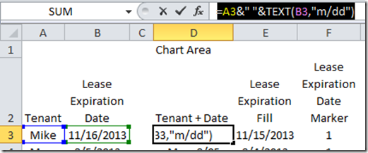
This is what I will use for the data label. It is a combination of the tenant name and the date of their lease termination. So what we want to do is to create a formula in cell D3 that looks like this:
D3 =A3&” “&TEXT(B3,”m/dd”)
What this is doing is concatenating the tenant name with the lease date. You can read more about the concatenation technique in this post:
I will show you more about the Text formula in a future posting.
After you put the formula in Cell D3, copy it down to D17.
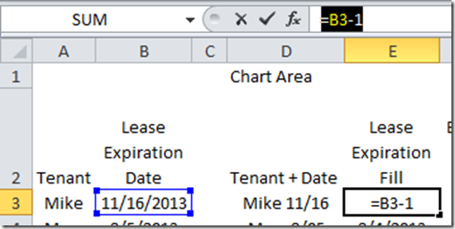
b) Now we need to create a series that we will use to put a spacer from the left vertical axis to one day before the tenant’s lease expires. This is a pretty simple formula that you need to put in cell E3 and then copy down to E17
E3 =B3-1
This is simply subtracting one day from the lease expiration date located in cell b3.
c) Finally, we need to put in a data point that will represent the lease termination date. Just highlight cells F3:F17 and type in the number 1 and then press CTRL+Enter to put a value of 1 in the “Lease Expiration Date Marker” chart series.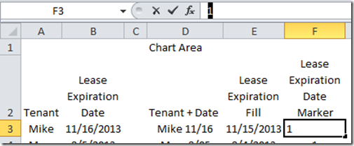
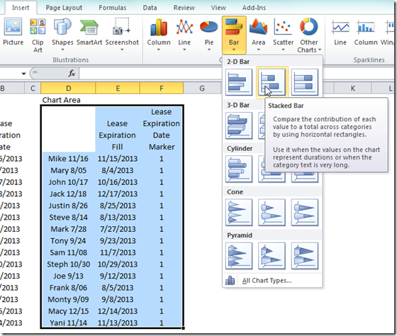
Your final Excel Chart data series should now look like this: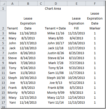
3) Create Stacked Bar Chart
Now that we have set our data up the way we need, now we should create the Excel Stacked Bar Chart.
Highlight the chart data in the range of D2:F17. Then go to your insert menu and choose a 2D Bar Chart from the Chart group. BUT, before you do this, you should first delete the column header in cell D2. If not, you will have a problem as Excel won’t know what are your categories versus data points. You can always add the column header back after you make your chart. Check out this quick post about this topic:
Your chart should now look like this: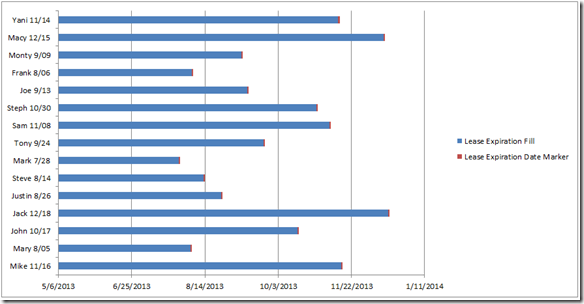
Not too bad for a first try, but we need to clean it up a little bit.
4) Change Fill of “Lease Expiration Fill” Series
The chart I wanted to create was a one that only showed when the lease terminated. To do this, we need to hide the “Lease Expiration Fill” Excel chart data series. To do this, simply select the chart, then select the “Lease Expiration Fill” series (in blue) then press CTRL+1 keys to bring up the “Format Data Series” dialog box. From there, select the Fill menu on the left and choose “No Fill” from the fill options: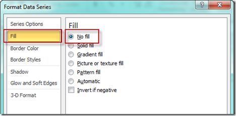
Your chart should now look like this: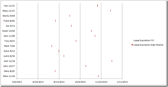
You can see that each of the Leases are now floating over the corresponding date from the horizontal chart axis.
5) Add Data Labels
In this step we will make it so that we can get rid of the vertical axis and see each data point more clearly. To do this, select the chart then select the “Lease Expiration Date Marker” series as you can see here: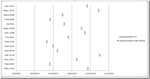
Then go to the “Layout Ribbon” and choose “More Data Label Options” from the “Data Labels” button: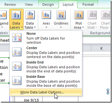
Then from the “Format Data Labels” dialog box, choose Label Options of “Category Name” only and a Label Position of “Inside End”: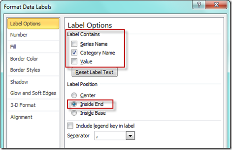
Your chart should now look like this: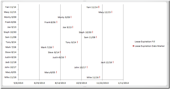
It is starting to look very good now, just a few more things to clean up the chart junk.
6) Remove Vertical Axis and Chart Legend
Click on the vertical axis and press your delete key. Your chart should now look like this: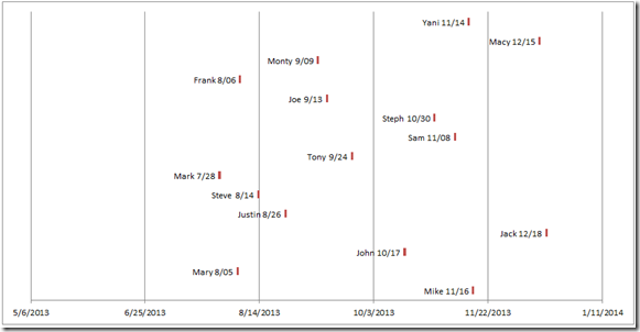
Almost there, just 2 more steps.
7) Change Horizontal Minimum and Maximum and Major Unit
I don’t like the way Excel guesses at the way that I want my horizontal axis to display, so click on the horizontal axis and then press CTRL+1 to bring up the Format Axis dialog box. From there, change the minimum to 41470, the maximum to 41639 and the major unit to 14: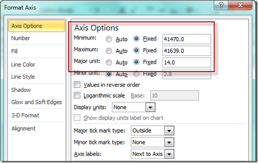
Your chart should now look like this: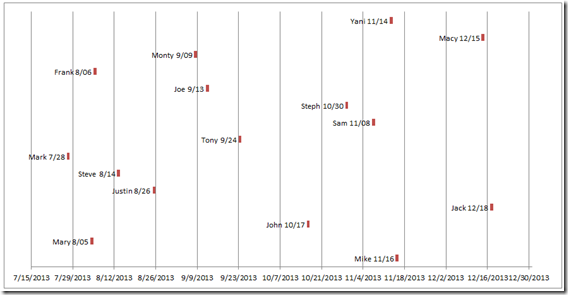
8) Change Vertical Grid Line Style
Now just one last thing to do and that is to change the major vertical gridlines to a dotted line so that it doesn’t over power the data points. To do this, click on the vertical gridlines and then press CTRL+1 to bring up the Format Major Gridlines dialog box. Then change the line style dash type to a Dash format: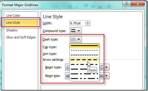
Your final chart should now look like this: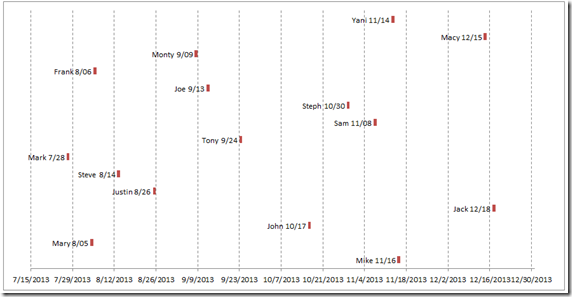
This is a very simple Excel timeline graph that can be used in lots of application. Perhaps you can use it in your next project dashboard.
Video Tutorial
Here is a video demonstration on how-to make this simple tenant timeline:
Don’t forget to subscribe so that you can get the next post and upcoming specials delivered directly to your inbox. Also, let me know what you think about this timeline technique in the comments below.
Steve=True

