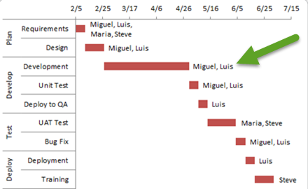
How-to Add Resource Names to Excel Gantt Chart Tasks
I recently received a request from a fan that asked how he could add resource names to Excel Gantt Chart that he had created. The technique I describe below is a technique that you can use to add more task information to your Excel Gantt Charts.
One caveat, this technique will work for any Excel version past 2003. It is a great workaround to add labels in Excel 2007 and Excel 2010. However, for Excel 2013 and Excel 2016 there is a much easier technique that I will demonstrate in the next post.
The Breakdown
The crux of this technique is to add another data series to the chart that will be put on the secondary axis so that the labels can display alternate categories.
1) Create Chart Data and Stacked Bar Chart
2) Modify Duration Filler Series Fill
3) Modify Primary Axis
4) Move Resource Filler Series to Secondary Axis
5) Modify Secondary Axes
6) Modify Secondary Axis Categories
7) Change Secondary Axis Chart Type
8) Add Chart Labels
9) Modify Secondary Series Fill
10) Chart Clean Up
Step-by-Step
1) Create Chart Data and Stacked Bar Chart
Assuming we start out with our data in this format:
| A | B | C | D | |
|---|---|---|---|---|
| 1 | Phase | Task | ||
| 2 | Duration Filler | Duration (Days) | ||
| 3 | Plan | Requirements | 2/5/2018 | 7 |
| 4 | Design | 2/12/2018 | 14 | |
| 5 | Develop | Development | 2/26/2018 | 63 |
| 6 | Unit Test | 4/30/2018 | 7 | |
| 7 | Deploy to QA | 5/7/2018 | 7 | |
| 8 | Test | UAT Test | 5/14/2018 | 21 |
| 9 | Bug Fix | 6/4/2018 | 7 | |
| 10 | Deploy | Deployment | 6/11/2018 | 7 |
| 11 | Training | 6/18/2018 | 14 |
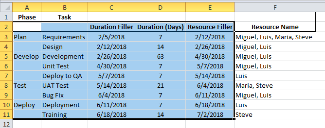
The first step is to add 2 columns of data to your Excel Gantt Chart data range.
A) One, in column “E” add a filler series called “Resource Filler” to the right of the duration data. This is a calculated column. In Cell E3 enter =C3+D3.
B) Two, in column “F” add the resource names that you want to have for your labels by task line.
Your chart data will now look like this:
| A | B | C | D | E | F | |
|---|---|---|---|---|---|---|
| 1 | Phase | Task | ||||
| 2 | Duration Filler | Duration (Days) | Resource Filler | Resource Name | ||
| 3 | Plan | Requirements | 2/5/2018 | 7 | 2/12/2018 | Miguel, Luis, Maria, Steve |
| 4 | Design | 2/12/2018 | 14 | 2/26/2018 | Miguel, Luis | |
| 5 | Develop | Development | 2/26/2018 | 63 | 4/30/2018 | Miguel, Luis |
| 6 | Unit Test | 4/30/2018 | 7 | 5/7/2018 | Miguel, Luis | |
| 7 | Deploy to QA | 5/7/2018 | 7 | 5/14/2018 | Luis | |
| 8 | Test | UAT Test | 5/14/2018 | 21 | 6/4/2018 | Maria, Steve |
| 9 | Bug Fix | 6/4/2018 | 7 | 6/11/2018 | Miguel, Luis | |
| 10 | Deploy | Deployment | 6/11/2018 | 7 | 6/18/2018 | Luis |
| 11 | Training | 6/18/2018 | 14 | 7/2/2018 | Steve |
Worksheet Formulas
|
Next, we will want to create a Stacked Column Chart.
To do this, first highlight the chart data range of A2:E11 as you see here:
Next, click on the Insert Ribbon and choose the Bar button in the Chart group and finally select Stacked Bar Chart as you see here:
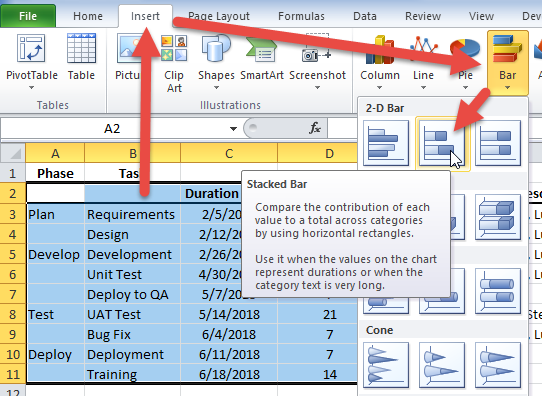
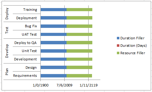
Your chart should now look like this:
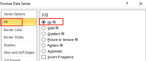
2) Modify Duration Filler Series Fill
The next step is to modify the “Duration Filler” series fill color. In order for the Excel Gantt Chart to have a Gantt Chart look, we need to make this filler series disappear on screen.
To complete this step, select the chart, then double click on the “Duration Filler” series. Or select the series and press CTRL+1 to bring up the Format Series dialog box. Then click on the Fill options and choose “No Fill” so that the series is now not visible but still there.
Your chart should now look like this:
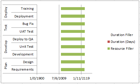
3) Modify Primary Axes
Now you may have noticed that both the horizontal and vertical axes have issues that need to be corrected. One, the vertical axis needs to be reversed so that Plan is on top and Deploy on the bottom. Also, the horizontal axis starts at the year 1900. We need to fix that as well as that is too far in the past and as our Excel Gantt Chart won’t span years, we can remove the year from the number format without issue.
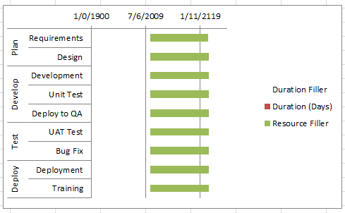
A) Reverse Vertical Axis Direction
To move Plan to the top of the vertical axis, first select the chart, then double click on the vertical axis or select it and press CTRL+1 to bring up the Format Axis dialog box. Next, click on the “Categories in reverse order” checkbox and press the close button.
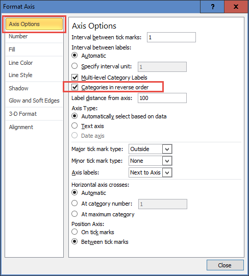
Your chart will now look like this:
B) Set Horizontal Axis Minimum Value
In order to show a small task duration on the chart, you will need to set the minimum value on the chart’s horizontal axis to a more recent date. By default, Excel sets a date of January 1st, 1900 if you have a value of zero (0) but display it as a date. All dates are actually numbers, so our chart is showing the base of zero for the chart as the minimum even though we would want to show a later date. April 5, 2012, which is our minimum date on the Duration Filler column is equal to 43,136, so it is best if we start are chart at that date.
To set the horizontal axis minimum, first, select the chart, then double click on the horizontal axis to show the Format Axis dialog box. Alternately, you can select the horizontal axis and press CTRL+1. Next, change the minimum to Fixed with a value of 43,136 as you see here:
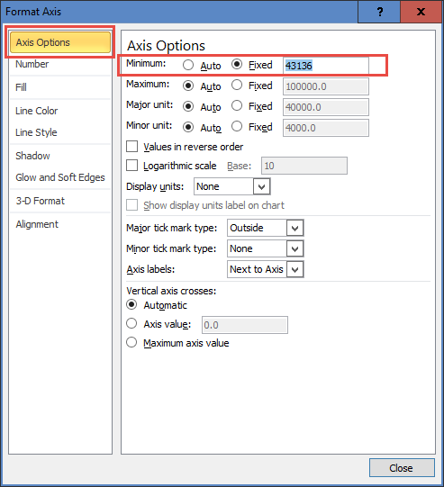
Your chart should now look like this:
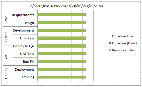
C) Change Horizontal Axis Number Format
As you can see when we change the minimum value for the Horizontal Axis our dates overlap and it is unreadable. The solution is to change the number format in the chart axis.
To change the number format on the horizontal axis, first, select the chart, then double click on the horizontal axis or select it and press CTRL+1 to bring up the Format Axis dialog box. Next, click on the “Number” options and select a short date like 03/14 to just show the day and month as you see here:
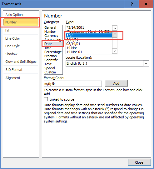
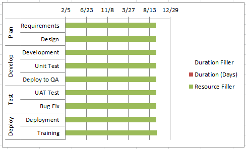
Your chart should now look like this:
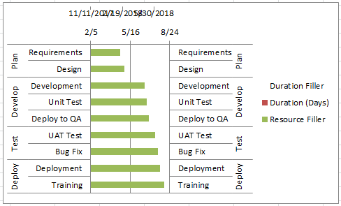
4) Move Resource Filler Series to Secondary Axis
Now we are going to start really messing with the chart. In order for this technique to work, we need to move the “Resource Filler” chart series to the Secondary Axis.
To move the series, first select the chart, then double click on the “Resource Filler” series. Or select the series and press CTRL+1 to bring up the Format Series dialog box. Finally, in the “Series Options”, select the “Secondary Axis” radio button from the “Plot Series On” group as you see here:
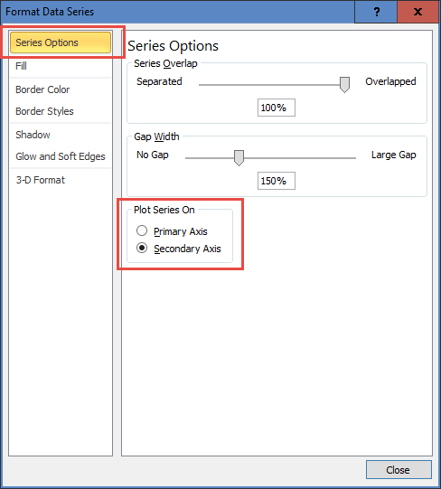
Your chart should now look like this:
5) Modify Secondary Axes
Now you may have noticed that we now see the secondary horizontal axis but not the vertical axis in the chart. We will need to show the secondary vertical axis as well as change the order to match the reversed order of the primary axis. Finally, we will need to modify the secondary horizontal axis to start at 2/5 to match the primary axis minimum fixed value. As we won’t be displaying the secondary horizontal axis, we will leave the number format unchanged.
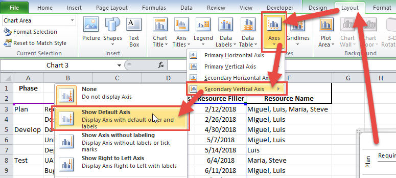
A) Show the Secondary Vertical Axis
So that we can reverse the order of the secondary vertical axis, we first need to show it so that we can complete the action and also verify that it now matches the primary axis. To do this, first select the chart, then select the “Layout” Ribbon, then select the “Axis” button and then the “Secondary Vertical Axis” menu option and finally the “Show Default Axis” choice as you see here:
Your chart will now look like this:
B) Reverse Secondary Vertical Axis Direction
As you can see above, the secondary vertical axis does not match the primary. To move Plan to the top of the secondary vertical axis, first select the chart, then double click on the secondary vertical axis or select it and press CTRL+1 to bring up the Format Axis dialog box. Next, click on the “Categories in reverse order” checkbox and press the close button.
Your chart will now look like this:
C) Set Horizontal Axis Minimum Value
Just as we did for the primary horizontal axis, we need to fix the minimum value on the secondary vertical axis.
To set the secondary horizontal axis minimum, first, select the chart, then double click on the secondary horizontal axis to show the Format Axis dialog box. Alternately, you can select the horizontal axis and press CTRL+1. Next, change the minimum to Fixed with a value of 43,136 as you see here:
Your chart should now look like this:
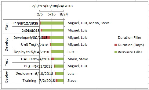
6) Modify Secondary Axis Categories
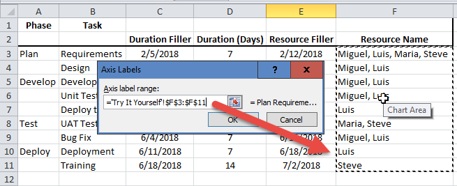
Here is the little-known technique that we will use to create our resource name labels in the Excel Gantt Chart. What we want to do is to modify the secondary axis categories from Plan, Develop, Test and Deploy to the resource names by task. In order to do this, follow these steps:
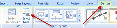
A) Select the Chart, Click on the “Design” Ribbon, then click on the “Select Data” button in the “Data” group to open the “Select Data Source” dialog box:
B) Select the “Resource Filler” series in the “Legend Entries (Series) area, then click the “Edit” button in the “Horizontal (Category) Axis Labels” area:
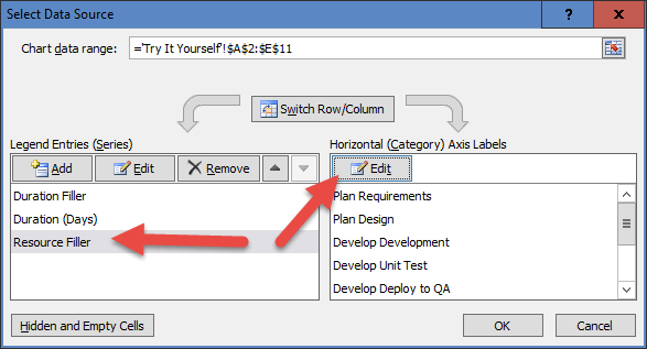
C) Finally, select the range that you have for your resource names by task. In our case, it is F3:F11 as you see here. Then press OK on all dialog boxes to finalize your updates to the secondary axis labels.
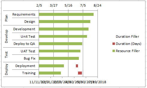
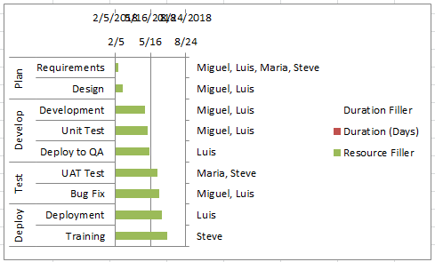
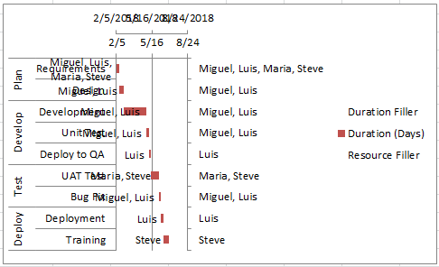
Your chart should now look like this with the resources by task appearing on the secondary axis:
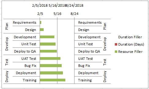
7) Change Secondary Axis Chart Type
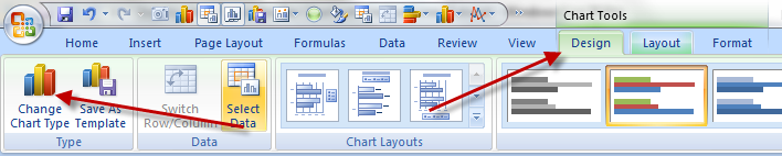
In order to make our labels appear at the end of each Gantt task, we need to change the chart type of the “Resource Filler” series on the secondary axis to a Clustered Bar Chart. This will allow us to place a label on the end of the bar as opposed to only on the inside of a stacked bar chart.
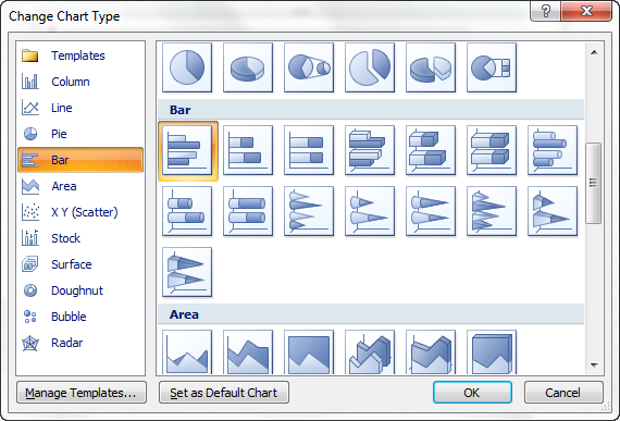
To do this, first select the chart, then select the “Resource Filler” series. Next, select the “Design” Ribbon and then choose the “Change Chart Type” button in the “Type” group as you see here:
Finally, select the Clustered Bar Chart type as you see here:
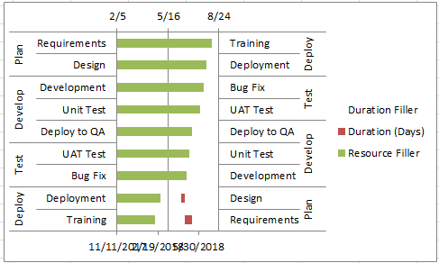
Your chart will now look like this. It may look strange as the series is now being plotted along with the resource names, but don’t worry, when we delete the Secondary Axes, it will align to the Phase and Task labels on the left.
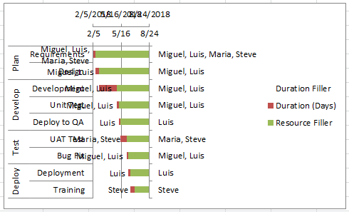
8) Add Chart Labels
Finally, we are at a point that we can Add Resource Names to Excel Gantt Chart Tasks by adding labels to the “Resource Filler” chart series and then modify them to display the category labels instead of the value.
A) Add Outside End Chart Labels
To do this, first select the chart, then select the “Resource Filler” Chart Series. Next, select the “Layout” Ribbon, then choose “Data Labels” Button from the “Labels” Group and finally, click on the “Outside End” Option as you see here

Your chart should now look like this:
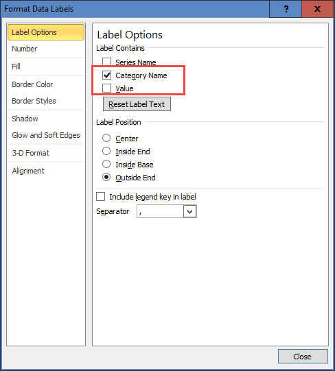
B) Change Data Labels to Categories
Excel default for data labels in a chart will display Values. We need to change ours to Categories.
To do that, first, select the chart, then double-click on any of the data labels we just added like the “7/2/2018” at the bottom middle of the chart or select it and press CTRL+1 to bring up the “Data Labels” dialog box.
Then “uncheck” the “Values” checkbox and check the “Categories” checkbox as you see here:
Your chart should now look like this with the Resource Names now appearing in the chart as a data label. Don’t worry, the chart will sort itself out when we delete the secondary axis in 2 steps:
9) Modify Secondary Series Fill
We are almost done. We have left the “Resource Filler” series as an automatic solid fill of green this whole time so that we would be able to select the series as needed. But we don’t need to see it anymore. So let’s hide it from the chart by changing the Fill Option to “No Fill”.
To do this, first, select the chart, then double click on the green “Resource Filler” data series or press CTRL+1 to open the “Format Data Series” dialog box. Then change the Fill type to “No Fill” as you see here:
Your chart will now look like this:
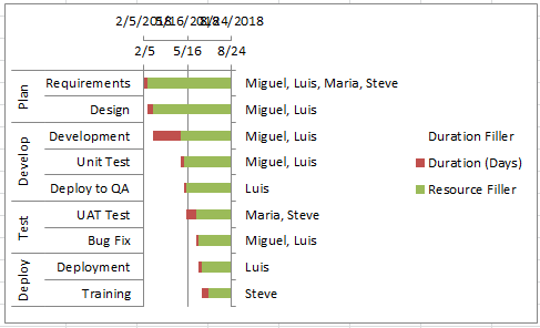
10) Chart Clean Up
Last but not least is to clean the chart up of unneeded items and this will create the final look and feel you were looking for with the Gantt Chart Format in Excel. This is pretty simple. First select your chart, then select each of these items and press the delete key.
A) Delete Legend
B) Delete Secondary Vertical Axis
C) Delete Secondary Horizontal Axis
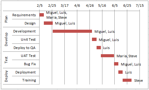
Your final chart should now look like this:
You can use this technique to show any task information in your Gantt charts that you wish, such as Percent Complete (% Complete), Assigned Resources, Start Date and Finish Date. The possibilities are only limited by your imagination.
Check out Some Other Tutorials Related to this Article:
https://www.exceldashboardtemplates.com/FirstAndLastDates
https://www.exceldashboardtemplates.com/FixMissingMulitLevelCategoryLabelOption
https://www.exceldashboardtemplates.com/GanttChart7EasySteps
Video Demonstration
Check out this Video tutorial on the techniques presented above.
Sample File Download
Click here to Download the Free Sample Excel Template File:
How-to-Add-Resource-Names-to-Excel-Gantt-Chart-Tasks.xlsx
Your Thoughts and Comments
This is a great trick to add more detail to any line chart, column chart or bar chart within Excel. Do you think that Excel should default to show all of the secondary axes? Do you like this Excel Gantt Chart technique? Let me know in the comments below.
Also, make sure you sign up for the newsletter so that you get the notification of the release of the video on how you can do this more easily in Excel 2013 and Excel 2016 in the next post.
Steve=True


