Tenant Timeline – How would you create an Excel chart for this data?
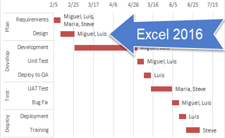
A user wanted to know how to create an Excel chart that shows when his tenant’s leases are expiring. He wanted to put this...
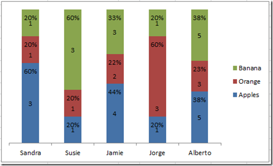
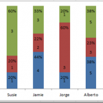
Friday Challenge – Create a Percentage (%) and Value Label within 100% Stacked Chart?
First I want to say I am sorry to those waiting to see the dynamic chart scroll bar tutorial. My project launched this week...
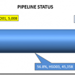
Pipeline Usage Chart – Don’s Answer
Here is another response that I received from Don for our recent Friday Challenge:
Friday Pipeline Usage Challenge
Since we weren’t sure from the client if...
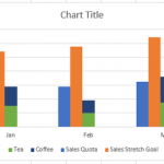
How to Make a Clustered Stacked and Multiple Unstacked Chart in Excel
How to Make a Clustered Stacked and Multiple Unstacked Chart in Excel
On my post How-to Create a Stacked and Unstacked Column Chart I received...
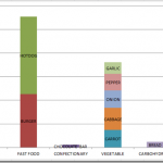
Multi-Column Stacked Chart – How would you do it? – How I did it.
First, I want to say thank you, because you are an Excel fan. Then again, maybe you are an Excel Geek? I know I...
How-to Make a Basic Gantt Chart in an Excel Chart in 7 Easy Steps
Project Managers and Executives love Gantt Charts. They also love Microsoft Excel, Charts and Graphs. So it is a natural to consider how you...
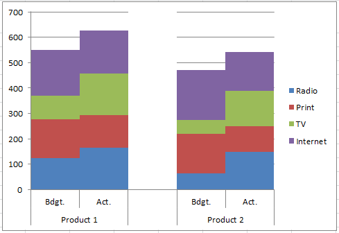
How-to Easily Create a Stacked Clustered Column Chart in Excel
Create a Stacked Clustered Column Chart in Excel
There is one type of chart that is always requested, however, Excel doesn’t offer this type of...
How-to Close the Gaps Between Chart Series in an Excel Stacked Clustered Column Chart
Many users like to create a chart that Excel doesn’t have as a chart type. It is a combination of a clustered column and...
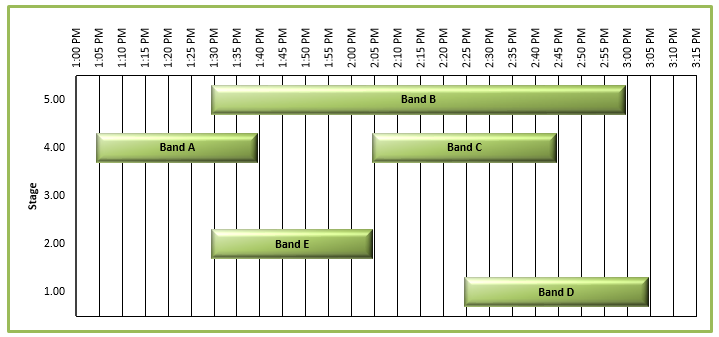
Friday Challenge – Recreate an Excel Project Status Spectrum Chart
I am always looking for charts or anything that I can put into an Excel chart. In fact, I just skim the Wall Street...
How-to Make Conditional Label Values in an Excel Stacked Column Chart
Recently I was thinking that sometimes when you make a Stacked Column Chart in your Excel Dashboard, you may want to hide some of...


