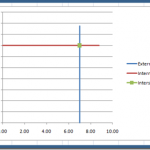
How-to Draw a Vertical and Horizontal Line that Intersect in an Excel Chart
Recently a user in the Mr. Excel Forum a member wanted to know how they could make an Excel Chart where one Metric was...
How-to Make a Horizontal Tornado Chart Comparison
Recently in an Excel Forum, a user was asked to create a chart that compared 4 companies by month in a Column Chart.
HOWEVER, there...
How-to Close the Gaps Between Chart Series in an Excel Stacked Clustered Column Chart
Many users like to create a chart that Excel doesn’t have as a chart type. It is a combination of a clustered column and...
Incredible Excel 2012 Olympic Medal Count Dynamic and Interactive Dashboard
People are awesome and so creative. We have been talking about building an Olympic Medal Count Dashboard using Excel and I asked for your...
Free Dashboard Template Download – BMI Weight Tracker
In this ever expanding universe, so is my belt. I need to drop more than a few pounds.
Now I can use an Excel Dashboard...
Friday Challenge Answers – The Boss Says…
I received some great responses from lots of fans. Thank you so much for all your great comments. I agree with most and my...
Step-by-Step Horizontal Bar Chart with Vertical Lines Tutorial
In a recent request for help in the MrExcel Forums, a user was having difficulties adding Vertical Line KPI Metrics to a Horizontal Bar...
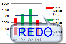
How-to Make a Conditional Column Chart in Excel – REDO
·
In a previous post, I showed you how to make a Conditional Column Chart for your Executive Dashboard Templates, but I had 3...
How-to Make an Excel Clustered Stacked Column Chart with Different Colors by Stack
In a popular post, I showed you how to easily create a Clustered Stacked Column chart in Excel using Multi-Level Category Axis options.
Here is...
How-to Make Dynamic Excel Dashboard Charts Using Tables
For almost every Excel Dashboard you will want to make a Chart template Dynamic. Meaning that as you add new data, the chart updates...


