People are awesome and so creative. We have been talking about building an Olympic Medal Count Dashboard using Excel and I asked for your designs. A reader of mine: Mitch designed and developed an incredibly inspirational Excel Dashboard for the 2012 Summer Olympics.
Check it out!

This is a totally dynamic dashboard that the user can interact with.
Here are the features presented in the Excel Dashboard List of London 2012 Olympic Medal Winners.
(Note – here are the definitions of the features from Excel Help)
Scroll Bar – Scrolls through a range of values when you click the scroll arrows or when you drag the scroll box.
Conditional Formatting – Conditional formatting helps you answer specific questions about your data.
In Cell Charts – Chart like features and display in a worksheet cell using Excel Functions and Fonts.
Data Validation Pick Lists – Data validation is an Excel feature that you can use to define restrictions on what data can or should be entered in a cell.
Large Function for Sorting – Returns the k-th largest value in a data set. You can use this function to select a value based on its relative standing.
Vlookup – You can use the VLOOKUP function to search the first column of a range (range: Two or more cells on a sheet. The cells in a range can be adjacent or nonadjacent.) of cells, and then return a value from any cell on the same row of the range.
Index/Match Lookup – The INDEX and MATCH functions in Excel provide an alternative to the VLOOKUP function when data isn’t in the first column of a worksheet.
Named Ranges – By using names (name: A word or string of characters in Excel that represents a cell, range of cells, formula, or constant value.), you can make your formulas much easier to understand and maintain. You can define a name for a cell range, function, constant, or table.
Wingdings Font – Different fonts provide different symbols. For example, if you want to insert check marks or bullets, you can find them in the list of symbols that is availalbe for the Wingdings font.
Hidden Worksheet Gridlines – To make the data in a chart that displays axes easier to read, you can display horizontal and vertical chart gridlines.
Hidden Row and Column Headings – Gridlines, row headings, and column headings are displayed by default in Page Layout view, but they are not printed automatically.
Lets take a closer look at the dashboard:
1) Great Title and Header Section with interactive and dynamic sorting features

As you can see, the title says it all.
Right below that you see that you can choose how to sort your Dashboard:

This is using Data Validation with a list of choices.
Below that you can use Data Validation rules to select your favorite country.

2) On the left side, there are more dynamic dashboard techniques using Excel Scroll Bars. This technique combined with Vlookup will allow the user to have a dynamic dashboard experience by moving the countries as you scroll through the sorted list.
3) You will see a wonderfully sorted table based on a user sort selection of the medals by type and total in the next dashboard area.

This dashboard will also highlight your favorite country based on your selection above with dotted lines on the top and bottom rows of that country.

4) Based on your medal sort choice, you will see an In Cell Chart (not a standard Excel Chart) that will show the medal counts by country for the type of medal you have chosen (Total, Gold, Silver, or Bronze). The conditional formatting continues across the row of your Favorite Country.

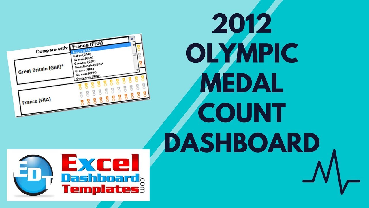
5) In the final section you will see a medal count In Cell Chart comparison with your Favorite country versus a comparison country.

This is using the wing ding In Cell charts with a font color to produce the comparison.
He also used another data validation pick list to pick the comparison country.

6) Many of the techniques are using a combination of Index and Match to perform a complex lookup to get the values for the In Cell Charts as well as the table sorting of the raw data.
7) In order to give a very clean dashboard presentation, Mitch also removed the gridlines and used boarders to create sections for the dashboard.
8) One other very cool feature that all Excel Dashboard Designer should use is to segregate your data from your dashboard as much as possible. Mitch does this with separating the data from the Excel Dashboard on separate worksheets within the Excel Workbook.

Here is my video review of Mitch’s Awesome dashboard.
You can download the free Excel Dashboard sample file here. Check it OUT!:
Olympic-Medals-Sample-File.xlsx
Let us know what you think about the dashboard. I think it is GREAT!!
Steve=True


