In the Mr. Excel forums there was a question raised on how can you create a Likert Chart or Graph using Excel. The person asking the question started to create a chart using a XY Scatter chart, but then got stumped. This is the chart that the user wanted to create or replicate:
Two solutions came to mind:
1) I have created a similar tutorial to this on a previous post using the camera tool with a Excel line chart to create the same effect. Check out the posting here:
Using the Camera Tool to Create a Vertical Line Chart in Excel
2) I suggested just using a regular Excel line chart with markers instead of an XY Chart. Here is what a sample Excel line Likert Chart would look like:
3) Then I gave it some more thought and it occurred to me that I created a similar chart to this when I created Vertical Axis categories. You can check out that posting with this link:
How-to Make Categories for Vertical and Horizontal Axis in an Excel Chart
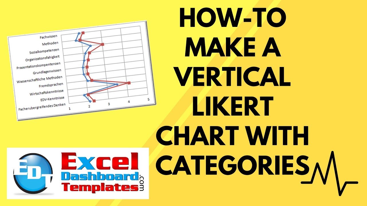
I was able to create the chart as you can see below using these techniques: Below is the How-to Excel Chart Tutorial for building your own Likert Excel Chart. There is also a Free Sample file and Video tutorial at the bottom of the post.
The Breakdown
1) Create an XY Chart with the Likert Data.
2) Add the Categories series to the Chart and convert it to a Bar Chart.
3) Modify the line formats, axis settings and gridlines to match the chart.
Step-by-Step
1) Setup your Chart data
Create your Data for the chart using this format:
2) Create a XY Scatter Straight Line Chart with Markers
Highlight C3:E13 and then create a XY Scatter Straight Line Chart with Markers.
Your chart will now look like this:
Go ahead and delete the legend as we won’t be needing it.
3) Change the XY Scatter Chart series references.
I don’t like how Excel sets up the XY Scatter Chart series, so we need to fix the X’s and Y’s.
Select the chart and then go to the Data group and choose the Select Data button
From the Select Data Series dialog box, choose the Series1 Legend Entry and click on the Edit button:
Your edit series dialog box should look like this (I have switched the Xs and Ys so that the line is vertical):
Repeat the same step for the second series so that it looks like this:
Your chart will now look like this:
4) Insert the Categories Series
Now we need to add another series that will show us the Categories.
Select A3:B13 and Copy the range (Ctrl+C).
Then select the chart and from the Home Ribbon, you need to select PASTE SPECIAL:
then press the OK button from the Paste Special dialog box:
Your chart will now look like this:
5) Change the New Series to a Clustered Bar Chart
This is how you will get the categories on the Vertical Axis.
Select the Series 3 (new green line). Then from the Design Ribbon, choose the Change Chart Type button from the Type group:
Then choose a Clustered Bar Chart from the Change Chart Type dialog box:
Your chart will now look like this:
6) Change the Primary Vertical Axis and Horizontal Axis Formats and Limits
a) First Select the Primary Vertical Axis (on the left) and press Ctrl+1 to bring up the Format Axis dialog box. Then change the settings as follows:
Minimum = 1
Maximum = 11
Major = 1

Your chart will now look like this (the data points on the top and bottom will stretch out to the top and bottom of the chart):
Go ahead and delete the Primary Vertical Axis as we don’t need it anymore by selecting it and pressing the delete key.
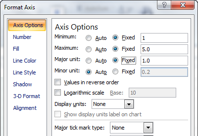
b) Now lets fix the Primary Horizontal Axis. Select the bottom Horizontal Axis and press CRTL+1 to bring up the Format Axis dialog box and change the following settings:
Minimum = 1
Major unit = 1
Major tick mark type = None

Your chart should now look like this:
7) Change the Secondary Vertical Axis and Horizontal Axis Formats and Limits
a) First Select the Secondary Horizontal Axis (on the top) and press Ctrl+1 to bring up the Format Axis dialog box. Then change the settings as follows:
Minimum = 0
Maximum = 5
Major tick mark = None
Axis labels = None

Then choose the Line Color Options for this axis and set the Line Color to “No Line”
Your chart will now appear as follows:
This may seem strange, but the next step will make everything work out.
b) Select the chart and Add the Secondary Vertical Axis by going to the Layout Ribbon and then Choose the Axis button from the Axis group and then select “Show Default Axis” as follows:
Your chart is now really close and will look like this:
Then select the Secondary Vertical Chart Axis and Press Ctrl+1 to bring up the Format Axis dialog box and select the following options:
Categories in reverse order = Yes
Major tick mark type = None
Position Axis = On tick marks

Your chart should now look like this:
Wow, it almost looks exactly like the original chart. Only one last thing to do.
8) Add Vertical Gridlines
We just need to add vertical major gridlines and the chart will be completed.
Select the chart and then select Major Gridlines from the Axis group in the Layout Ribbon:
Your final Likert chart will now look like this:
9) Fix Makers and Line Color
Oops, I forgot that the original chart has different colors and makers, so lets fix that now and then we will be done. Select one of the lines and press Ctrl+1 to bring up the Format Data Series dialog box. Then change:
a) Line Color to dark blue
b) Marker Options Type to Built In circle
c) Marker Line color to dark blue
d) Marker Fill color to dark blue
Repeat these same steps for the second series, but this time to change the blue colors to one or two shades lighter than the previous series. You are now done and your Vertical Likert Chart should now look like this:
Lets compare the two charts side by side:


Looks great and it is all done with the standard Excel charting engine. Below is the sample file and video tutorial.
Video Tutorial
Free Sample Excel Likert Chart Template File
Excel-Vertical-Line-Likert-Chart-with-Categories.xlsx
Let me know what you think by leaving me a comment and if you have any chart that you need help with creating. Thanks!
Steve=True


