In a recent request for help in the MrExcel Forums, a user was having difficulties adding Vertical Line KPI Metrics to a Horizontal Bar Chart that they were creating. I thought I would help out and make this Video Tutorial along with a Step-by-Step Demonstration on how-to make this Bar Chart. I hope this helps you build your own Excel Dashboard Template files and Excel Charts for your Company Dashboard.
Below are the Step-by-Step instructions along with a Video Tutorial and Sample Free Download File so that you can see how I did it and try it for your self.
The Breakdown
First we will make a Horizontal Bar Chart in Excel and then we will add individual XY Series to create the Vertical Lines.
Step-by-Step
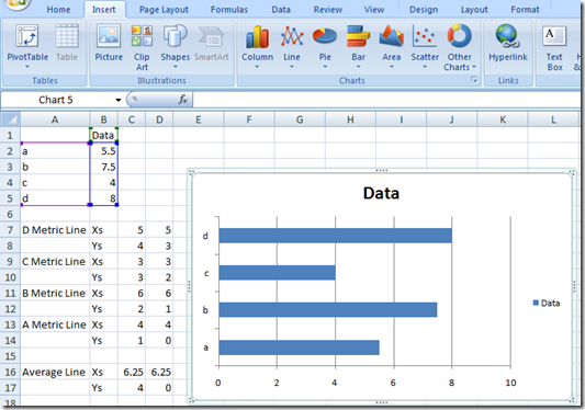
1) Create Horizontal Bar Chart – For 2007 – Highlight the Data Range, then select the Insert Ribbon and then Bar Menu from the Charts Group and Select 2D Clustered Bar.
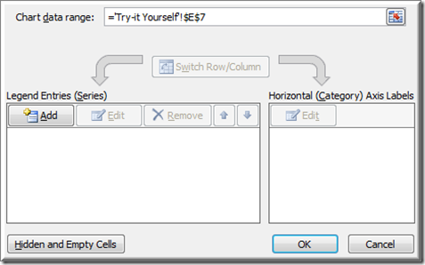
2) Create a New Series for the Vertical Lines by Adding a New Series by Clicking on the Design Ribbon then Click on Select Data in the Data Group
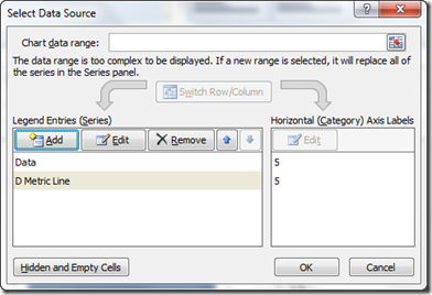
then click on the Add in the Legend Entries (Series)
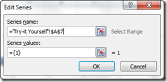
Select the Series name for the first Vertical Line. The Series value is not important at this time since we have to create this series as a Bar first and then change it to an XY Series. That is when we will create our line. So just click on OK as it doesn’t matter yet.
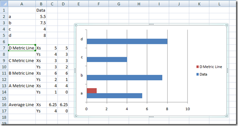
Your Chart will now look like this:
3) Change the New Series Chart Type to an XY Scatter with Straight Lines
First Select the new Series and then Click on the Design Ribbon then Click on Change Chart Type in the Type Group
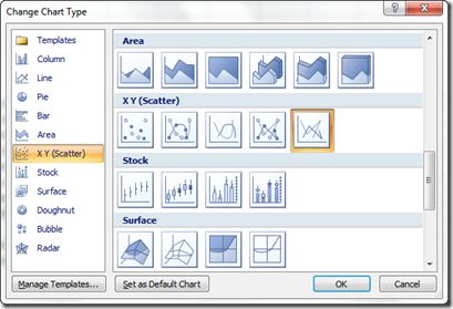
Then pick the XY Scatter with Lines from the XY (Scatter) Group.
Your series will disappear, but don’t worry we will change that with the next step.
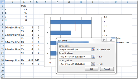
4) Edit the XY Series Data by choosing the Design Ribbon and then Click on the Select Data button from the Data group
then Select the series that you want to make a vertical line and edit the Series X Values and Series Y Values like this:
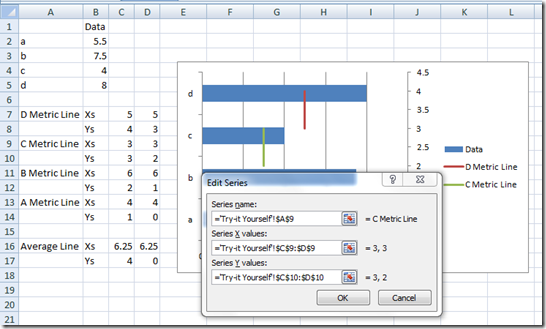
5) Add the next Vertical Line to the Bar Chart by clicking on the Add Series in the Select Data Source Dialog Box
then choose the next XY Data Series information as such:
Rinse and Repeat – Repeat this last step for as many lines as you want to add.
6) Delete the Legend since it is not necessary to take up all that Real Estate in the Dashboard or Chart by selecting the Legend and hitting the delete key.
7) Change the Secondary Vertical Access Maximum Value so that your Vertical Lines Line Up with the Horizontal Bars by Right clicking on the Secondary Vertical Axis and select Format Axis… from the pop-up menu.
8) Delete the Secondary Vertical Axis by right Clicking on the Secondary Vertical Axis and then hitting the Delete Key.
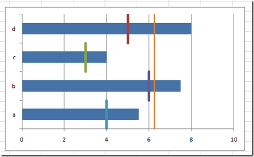
Your final chart will now look like this:
(I also increased the Point Size of each of the KP Metric Vertical Lines by adjusting their Line Style Width to 4pt. – you can do this by right clicking on each vertical line, then select Fomat Data Series… a then go to the Line Style area and change the Width to 4)
Video Tutorial
Sample Free Download Files
Excel-Chart-Horizontal-Bar-with-Vertical-Lines.xlsx
Please remember to subscribe so that you will be emailed the most current postings.
Steve=True

