In our recent Friday Challenge,
Friday Challenge – Creating an Excel Graph of Cumulative Events Over Time
where a user wanted the following:
Creating a graph of cumulative events over time
I currently have a table of various events that occurred and the associated date. How can I go about plotting a graph of the cumulative incidence of specific events over time?
For example my table looks something like this:
| A | B | |
|---|---|---|
| 1 | 6/4/2014 | A |
| 2 | 6/25/2014 | B |
| 3 | 7/1/2014 | C |
| 4 | 7/4/2014 | A |
| 5 | 7/4/2014 | A |
| 6 | 7/4/2014 | B |
| 7 | 8/8/2014 | C |
How do I create separated line graphs of the cumulative incidences of A, B and C over time ?
I received several great submissions.
This one from Crazy Dog 64 is the exact chart that I created when first trying to solve this problem. Here is what their final chart looked like: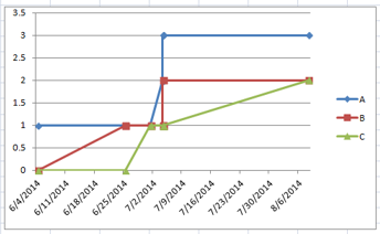
Only issue with this chart versus the original request is that the line progresses from Zero to 1 in a sloped/trend type of format, but the incidents were zero right up until the first incident. So I feel that this chart should be more of a step type chart, but this is a really close solution.
You can learn more about step charts here:
Understanding How-to Make a Step Chart in Excel Using Index and Match Functions
How-To Create an Excel Step Chart Formula Using the Small Function
How-to Create a Step Chart in Excel with 3 Quick Steps
How-to Easily Create a Step Chart in Excel
I also receive this great submission from Magrifa:
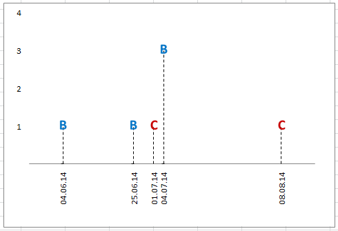
This is a real great visual for incidents by date. Only issue that I see is that the user wanted a line chart to show the data and that they wanted cumulative incidents by date. This shows number of incidents, not a cumulative value, but I think that I like really this graphic representation of the data. What do you think?
I believe that Magrifa plotted the data points in a line graph, added labels and then hid the line. Then Magrifa used drop lines to connect the data to the date in the horizontal access. Great job Magrifa!
Next I also received the following solution from Piotr from Poland:
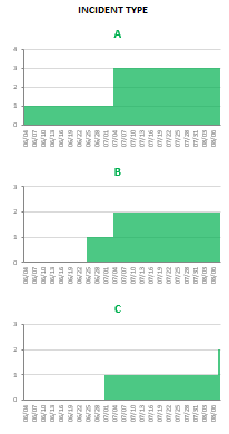
I too like this format. Piotr is representing the data in a Step-Area type of format. I think that he is using a column chart and closing the gap. Also, Piotr has stacked the charts on top of each other in a Vertical Panel chart type format. Only issue is that this isn’t the line chart that the user requested, but I also really like this one too. Thanks Piotr!
If you want to learn more about panel charts, check out this post:
How-to Make a Wall Street Journal Horizontal Panel Chart in Excel
Finally, here is the solution that I created:
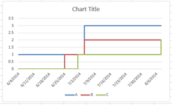
It represents the data in a line chart and it is also cumulative data. It looks like a step chart but I had to significantly change the formulas so that would create a cumulative value of all incidents by type. Check out the download file to see how the formula was updated for these issues. I of course am most partial to my version, but I want to know what you think? Which chart do you like best? Let me know in the comments below!
Video Demonstration:
Free Excel Sample Download File:
Friday-Challenge-Answers-cumulative-eventes-over-time.xlsx
Steve=True


