Okay, apologies again ![]() . I have been so swamped with my Go-Live project this week that I have been too tired to finish the Scrolling Excel Dashboard Chart. I even forgot what day it is. In fact, I am writing this on a plane ride home from LAX. Also, I love finding things for this Friday Challenge, so I couldn’t resist posting another one. If you like them, please leave me a comment so that I know (P.S. I look at every comment and post them when I get a chance. This is to avoid SPAM as well as make sure I take time to answer your comments, so don’t be upset if your comment takes 1/2 a day to show up on the site. I am busy man
. I have been so swamped with my Go-Live project this week that I have been too tired to finish the Scrolling Excel Dashboard Chart. I even forgot what day it is. In fact, I am writing this on a plane ride home from LAX. Also, I love finding things for this Friday Challenge, so I couldn’t resist posting another one. If you like them, please leave me a comment so that I know (P.S. I look at every comment and post them when I get a chance. This is to avoid SPAM as well as make sure I take time to answer your comments, so don’t be upset if your comment takes 1/2 a day to show up on the site. I am busy man ![]() ).
).
Alright sports fans, this is a FUN one!!!!!!
I am so SUPER psyched because I managed to make a WAY cool solution for this problem that I can’t wait to share. But lets see what you come up with on your own right. I am sure it will be better than mine, but I am biased ![]() . This may even work into a 2 part posting of a basic and advanced answer. Stay tuned.
. This may even work into a 2 part posting of a basic and advanced answer. Stay tuned.
Okay, here goes. Check out this Excel forum user post:
“How to eliminate outliers in graph
When viewing some graphs, sometimes I need to ignore some outliers. Like to know whether it is possible to click on the outlier data or the corresponding x on the x axis and the graph will be updated without this outlier data. I know I can go to the data set and remove the outliers but want to simplify by doing it on the graph. Many thanks. “
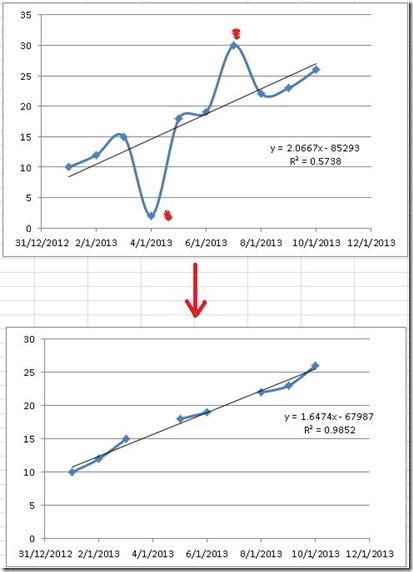
Here is the picture that this user posted:
You can see from the top picture that the graph has two outlier data points. One outlier data point is on January 4th and one on January 7th. The user then manually deleted these data points you will see the final chart that they desire on the bottom of their picture. They have also added a trendline that with a trend line formula and r value. If you are in the USA, don’t worry about the horizontal axis. This is how the rest of the world displays dates ![]() . You can tell because the left most point starts with a 31 and then a 12. 31 is the day and 12 is the month. If the user hadn’t displayed this one value, we could only guess as to the real data. From what I see, the data goes from January 1st to January 10th of 2013. So lets go with that assumption. Below is your data set for this Excel Challenge. Highlight the table below and copy/paste to your version of Excel.
. You can tell because the left most point starts with a 31 and then a 12. 31 is the day and 12 is the month. If the user hadn’t displayed this one value, we could only guess as to the real data. From what I see, the data goes from January 1st to January 10th of 2013. So lets go with that assumption. Below is your data set for this Excel Challenge. Highlight the table below and copy/paste to your version of Excel.
| A | B | |
|---|---|---|
| 1 | Data | |
| 2 | 1/1 | 10 |
| 3 | 1/2 | 12 |
| 4 | 1/3 | 15 |
| 5 | 1/4 | 2 |
| 6 | 1/5 | 18 |
| 7 | 1/6 | 19 |
| 8 | 1/7 | 30 |
| 9 | 1/8 | 22 |
| 10 | 1/9 | 23 |
| 11 | 1/10 | 26 |
Okay, now you have your data, an INCREDIBLY clear picture of your final result. Have at this Excel challenge. Your final chart should recreate as close as possible to the final chart by removing the data points from January 4th and January 7th. However, you must do this without manually deleting those data points.
Let me know in the comments below how you do. Don’t just let me know if you were successful, but also what is causing you problems in replicating the final chart.
EXTRA CREDIT: See if you can make this chart dynamic, not by simply eliminating the outlying points, but also letting the user choose what an outlier is and letting them eliminating different data points. More extra credit is awarded for solutions that make this the easiest as possible. I will post the answers I get by Monday along with part 1 of my solution. Good luck and stay in touch!.
Also, don’t forget to become a subscriber! And please share this site with your Excel co-workers and friends. It is much appreciated.
Steve=True


