New Take on the Excel Project Status Spectrum Chart
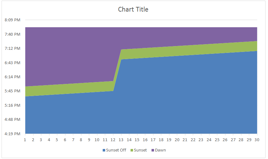
Leonid, a wonderful reader of our website, sent in a new take on my Excel Project Status Spectrum Chart. Here is what his looks...
Friday Challenge – Find Unique Class List in Excel ANSWER
On Friday, I posted this challenge:
https://www.exceldashboardtemplates.com/friday-challenge-find-unique-list-in-excel/
You can download the sample data set here: Challenge Sample Data
Check out the post and download / try it yourself before you...
How-to Make a Tenant Timeline Excel Dashboard Chart
So last week, I posted this question that I responded to in an Excel forum. I also asked you how you would solve this...
Friday Challenge Answers – Cumulative Events Over Time
In our recent Friday Challenge,
Friday Challenge – Creating an Excel Graph of Cumulative Events Over Time
where a user wanted the following:
Creating a graph of...
How-to AverageIF Excluding Zeros Across Excel Worksheet Tabs
I didn't receive any sample formulas from Friday's post that included a Friday Challenge, so maybe I stumped everyone when asking you to create...
3 Ways to Create Vertical Lines in an Excel Line Chart
Sorry I have been swamped on a new project in Australia and Singapore so my posts have been less frequent than I wish. We...
Excel Goal Chart Filling a Bottle of Soda
In a previous post, and one of my favorites, I showed you a unique company goal chart using a beer mug instead of a...
How-to Make a Thermometer Goal Chart in Excel
How-to Make a Thermometer Goal Chart in Excel
A friend and co-worker asked me if I had a tutorial on a building a Thermometer Goal...
How-to Easily Add Task Information to Excel 2016 Gantt Charts
Easily Add Task Information to Excel 2016 Gantt Charts
Excel 2013 and Excel 2016 make this need so much easier. Thanks Excel! I recently posted...
Excel Line Charts Using a Date Axis
Not sure if you knew this or not, but Excel is amazing!
The makers of Microsoft Excel even went so far as to make sure...

