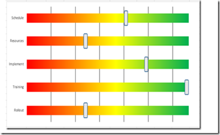
Leonid, a wonderful reader of our website, sent in a new take on my Excel Project Status Spectrum Chart. Here is what his looks like: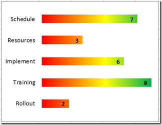
I think it is cool and a BIG Thanks to Leonid for his submission. Let me show you how to make it.
The Breakdown
1) Create Chart Data
2) Create Stacked Bar Chart
3) Change Fill Color of Spectrum Series
4) Move Data and Filler Series to Secondary Axis
5) Change Data Series Color to No Fill and Filler Series Color to White
6) Change to “Categories in Reverse Order” on Both Vertical Axes
7) Change Maximum Bound to 8 on Both Horizontal Axes
8) Add Data Labels Inside End
9) Delete Legend, Gridlines and Both Horizontal Axes
Step-by-Step
1) Create Chart Data
Here is how you want to set up your data: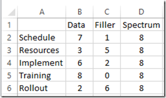
Column A = Enter your Project Status Categories
Column B = Enter a value from 1 to your maximum value you have in the Spectrum column (column D)
Column C = Enter this formula in cell C2 and copy down to C6 C2=D2-B2 (This is the difference between the maximum Spectrum series and the current Data value.
Column D = Enter your maximum status value
2) Create Stacked Bar Chart
Now that you have your data set up, we can make the Excel Stacked Bar Chart.
To do that, select the chart data range from Cell A1:D6, then go to the Insert Ribbon and select the Stacked Bar Chart as you see here: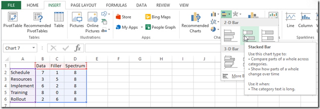
Your chart will now look like this: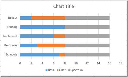
3) Change Fill Color of Spectrum Series
Now we need to create the red, yellow and green spectrum colors in the Spectrum series.
To do this select your chart, then right click on the grey Spectrum series and select Format Series… from the pop-up menu.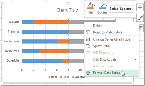
And then click on the Fill and Line menu and choose the Gradient Fill radio button and then add or delete the Gradient stops until you only have 3 stops. Then make the left stop a color of red and a position of 0%. Make the middle stop a color of yellow with a position of 50% and the right stop a position of 100% and a color of green.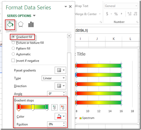
Your chart should now look like this: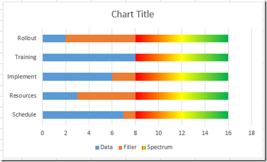
4) Move the Data Series and Filler Series to Secondary Axis
Now that we have our Spectrum Series set up, we need to move the other series to the secondary axis.We need to move the Data Series and Filler Series to the secondary axis so that they will overlap the Spectrum Series. To do this, select the orange Filler Series and press CTRL+1 or right click on it and select Format Data Series…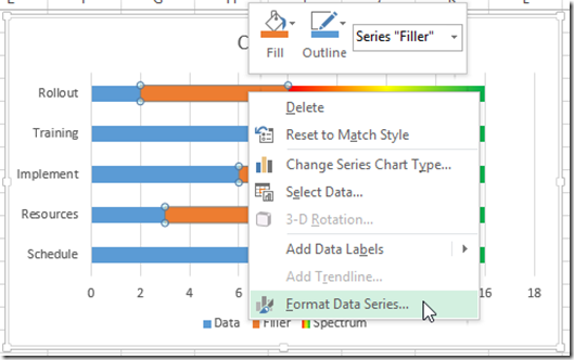
Then select the Secondary Axis radio button in the Series Options: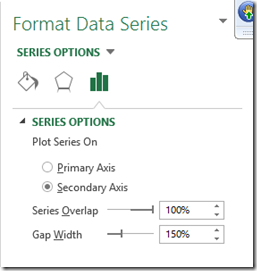
Then repeat these steps for the blue Data Series and move it also to the secondary axis. Your Excel chart should now look like this: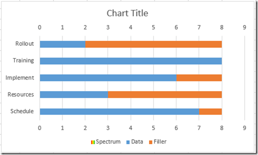
5) Change Data Series Color to No Fill and Filler Series Color to White
Our graph will come alive, we need to move the Data Series and the Filler Series to the secondary axis.
To do this, select the Orange Slider Fill series and press CTRL+1 or right click on it and select Format Data Series…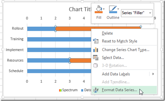
Then change the fill color to Solid Fill with a color of white: 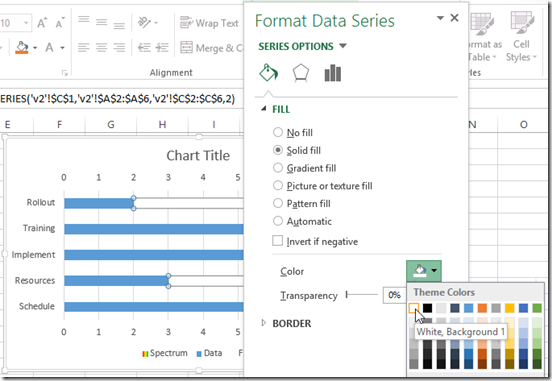
Repeat this step for the Data Series (blue colored bar) and change the fill color to No Fill. Your chart will now look like this: 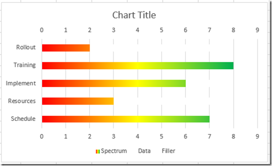
6) Change to “Categories in Reverse Order” on Both Vertical Axes
We need to get our status categories to match our data input in the spreadsheet.
To do that, select the chart, then select the the vertical axis and press CTRL+1 or right click on the vertical axis and choose Format Axis…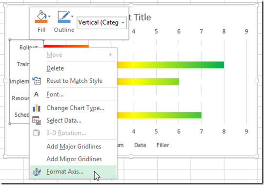
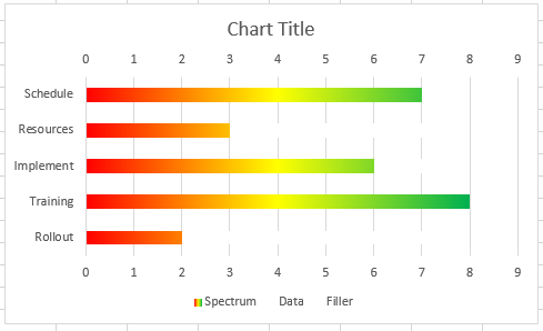
Then from the Axis Options, click on the check box of “Categories in Reverse Order”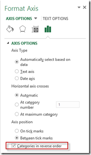
Your chart should now look like this: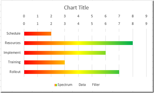
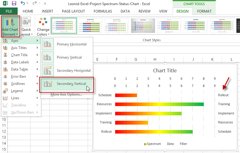
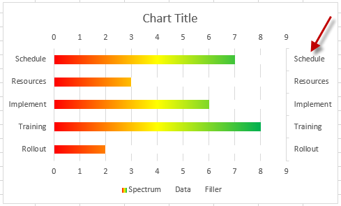
Next you will want to show the Secondary Vertical Axis and repeat this step (Second Axis Categories in Reverse Order) the so that your values and categories will align. Then after you do that, you can delete the secondary vertical axis as it won’t be needed anymore.
Show the Secondary Axis:
Secondary Axis – Categories in Reverse Order:
Then Delete the Secondary Vertical Axis and your chart will now look like this:
7) Change Maximum Bound to 8 on Both Horizontal Axes
In order to eliminate the white space to the right of the horizontal axis, we need to change the maximum value of both horizontal axes.
To do that, select the chart, then select either horizontal axis and press CTRL+1 or right click on the horizontal axis and choose Format Axis… 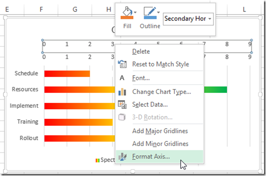
Then from the Axis Options, change the maximum bound to 8.0 (equal to the maximum of your Spectrum Series) 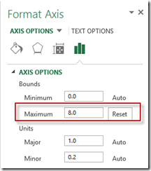
Your chart should now look like this: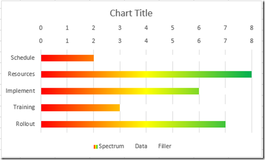
8) Add Data Labels Inside End
The chart is almost done. To match the target graph, we need to add some data labels.
To do this, right click on the Data Series and then select the Add Data Labels menu item from the pop up menu and then select the Add Data Labels sub menu: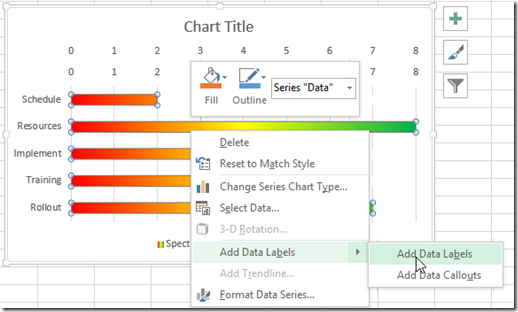
To move them to the right place, right click on the data label and select the Format Data Label menu choice. Then change the Label Options to Inside End.
Your chart will now look like this: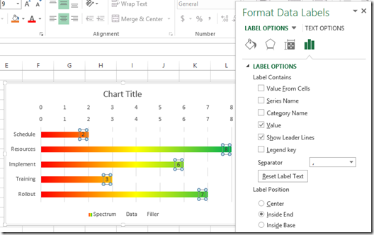
9) Delete Legend, Gridlines and Both Horizontal Axes
A few last things we need to do is delete unneeded elements.
Within the chart, select any horizontal axis and press the delete key.
Then repeat this step for the other horizontal axis.
Next, select the legend and press your delete key.
Finally, select the vertical gridlines and press your delete key.
Your final chart should now look like this: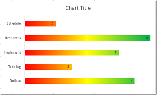
Video Demonstration
Check out the video tutorial here:
Free Excel Project Spectrum Chart Download
You can download the free sample Excel Project Status Template file here:
Leonid-Excel-Project-Spectrum-Status-Chart.xlsx
In case you wanted to know more about the original chart, here was my original chart looked like:
You can get the step-by-step and video tutorials here for the original chart:
How-to Make an Excel Project Status Spectrum Chart
So what do you think about Leonid’s Excel Project Status Spectrum Chart? I like it. Let me know your thoughts in the comments below. Thanks again Leonid!!
Steve=True

