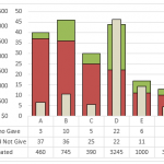
How-to Put Percentage Labels on Top of a Stacked Column Chart
There are times when you are creating your Excel Dashboard Design that you desire something that does not come naturally with the Excel Tools...
Stop Excel From Overlapping the Columns When Moving a Data Series to the Second...
Don’t worry, Excel is not changing your chart to a Stacked Clustered Column Chart or Stacked Bar Chart when you move a data series...
How-to Make an Excel Chart with 3 Different Column Widths (Bullet Chart Option 2)
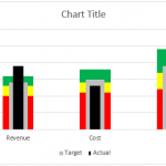
In are recent post, I showed you how to create a Bullet Chart in Excel. Pete, then sent me another way to create a...
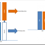
How-to Setup Your Excel Data for a Stacked Column Chart with a Secondary Axis
Many users have mixed reactions about this secondary axis overlap fix. You can see the post here:
Stop Excel From Overlapping the Columns When Moving...
How to Make a Clustered Stacked and Multiple Unstacked Chart in Excel
How to Make a Clustered Stacked and Multiple Unstacked Chart in Excel
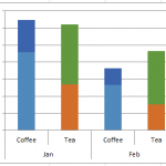
On my post How-to Create a Stacked and Unstacked Column Chart I received...
How-to Make a Thermometer Goal Chart in Excel
How-to Make a Thermometer Goal Chart in Excel
A friend and co-worker asked me if I had a tutorial on a building a Thermometer Goal...
Friday Challenge Answers – Food Donation Excel Dashboard Chart
Last week we presented a chart challenge to see how you represent Food Donation data.
Don said that we should keep it simple and sent...
How-to Recreate a NYT InfoGraphic Mustache Grouping Chart in Excel
I love trying to create an Excel chart that was originally drawn with an Infographic software package. Back in 2011 I saw a New York...
How-to Make a Beer Mug Goal Chart as an Excel Dashboard Component
Time for some beer and Excel. Last month I saw that a User was wondering how to make Beer Mug Goal Chart for their...
How-to Create a Dynamic Banding on an Excel Line Chart
This dynamic shading or banding chart is frequently used in science and in Company Dashboards. It allows the user to quickly see if their...

