I am always looking for charts or anything that I can put into an Excel chart. In fact, I just skim the Wall Street Journal articles looking for the pictures (graphs and charts). No really, I get it for the pictures, not the articles ![]()
Do you do that too?
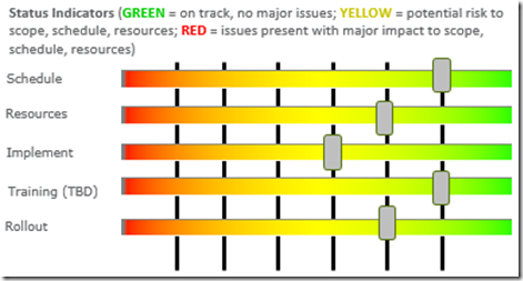
Anyway……I recently saw this Project Status Indicator in a PowerPoint presentation and I wondered if we could recreate it in Excel. In PowerPoint is was created by overlaying shapes in the following format:
Do you think you can recreate this Excel Project Status Spectrum?
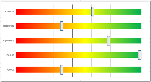
Here is my representation of the same PowerPoint graph in an Excel Chart: 
See if you can create you own Excel Project Status Spectrum.
Here is the sample data set that I used in my Excel chart: Excel-Project-Spectrum-Status-Chart-Data.xlsx
If you are able to do it, leave a comment below and I can send you a personal email where you can send your results. Thanks and Good Luck.
Steve=True


