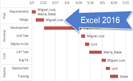
How-to Easily Add Task Information to Excel 2016 Gantt Charts
Easily Add Task Information to Excel 2016 Gantt Charts
Excel 2013 and Excel 2016 make this need so much easier. Thanks Excel! I recently posted...
Add Multiple Percentages Above Column Chart or Stacked Column Chart
I recently posted a tutorial on how you can put a percentage at the top of a Stacked Column Chart. You can see the...
How-to Add Centered Labels Above an Excel Clustered Stacked Column Chart
I am currently working on a project in L.A. and a business analyst at the client site was looking for a chart to present...
How-to Add Label Leader Lines to an Excel Pie Chart
This a an awesome technique to make your pie charts stand out in your Excel dashboard. However, I didn’t know about it for the...
How-to Make a WSJ Excel Pie Chart with Labels Both Inside and Outside
I thought it was a in last week’s USA Today, but looking at the picture I took more closely, it may have been produced...
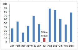
Create Dynamic Excel Chart Conditional Labels and Callouts
Chart Conditional Labels and Callouts
Learn how to make the simple and easy these Excel Chart Label Callouts:
In my most recent article, I described how...
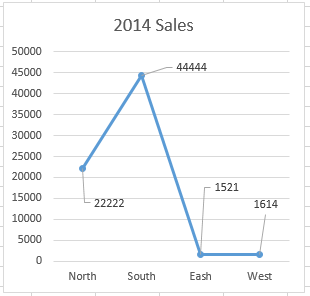
How-to Use Data Labels from a Range in an Excel Chart
Excel 2013 has some cool features. If you were not aware, here is an awesome Chart Data Label option that you now have when...
The Quickest Way to Select an Data Series in an Excel Chart
In a previous post, I showed you how to get around a frustration that many Excel users have when creating an Excel Dashboard chart. ...


