Excel 2013 has some cool features. If you were not aware, here is an awesome Chart Data Label option that you now have when you upgrade to Excel 2013. I know that this wasn’t something that I was looking for and therefore didn’t notice it until someone pointed it out to me. So now I want to show the world :). The awesome new feature is that you can now add data labels to chart from a range on the spreadsheet as a standard option in Excel. No more tricking Excel. The developers got this one right if you ask me. Even though this is a cool technique, I don’t find the use for it as often as I thought. Do you use it? If so, let me know in the comments below. If you don’t know about it, check out the tutorial and the video how-to here:
The Breakdown
1) Create Chart Data Range and Data Label Range
2) Create Chart
3) Add Data Labels
4) Select Data Label Range
Step-by-Step
1) Create Chart Data Range and Data Label Range
First we need to create two (2) different data ranges in our Excel Spreadsheet. First, create your chart data range, like you see in columns A and B. Next, create the data label series in equal length of our data points, like you see in column C. 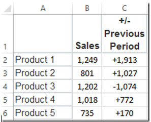
2) Create Chart
Now we are ready to create our chart. For this step, we only want to chart columns A and B and NOT C. So select the chart data range from A1:B6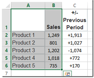
Then go to your Insert Ribbon and select a 2D Clustered Column Chart from the chart buttons like you see here:
Your chart should now look like this: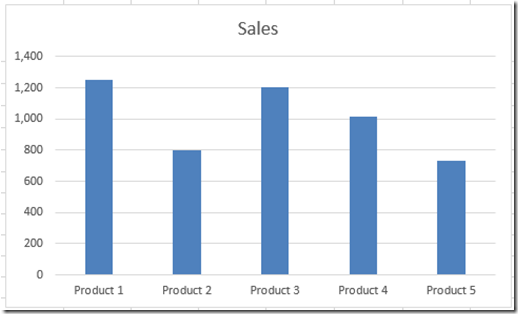
3) Add Data Labels
Now we can add our data labels. To do this, select your chart, then select the Design Ribbon. Then select the Add Chart Element button on the left and select the Data Labels Menu and the “More Data Label Options…” from the menu:
Now you will see a dialog box of Data Label options pop up. Uncheck the “Value” check box and check the “Value From Cells” check box as you see here:
4) Select Data Label Range
When you have done that, you will then get another dialog box that will pop up so that you can input your data range for your chart labels. Simply highlight the range that represented your custom data labels. In our case, it was cells C2:C6. Then press the Ok button.

Your final chart should now look like this with the new data labels from an alternate label range:
Here is a link if you want to do this same thing with your data labels in Excel 2007 or Excel 2010:
How-to Add Custom Labels that Dynamically Change in Excel Charts
Video Tutorial
Free File Download
How-to-Use-Data-Labels-from-a-Range-in-an-Excel-Chart.xlsx
I hope this makes you reconsider migrating to Excel 2013 as one feature that is just what we wanted.
Steve=True


