This a an awesome technique to make your pie charts stand out in your Excel dashboard. However, I didn’t know about it for the longest time.
It is called Label “Leader Lines”.
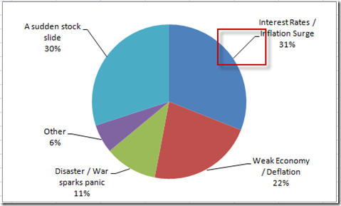
Here is an example of a pie chart with the label option of “Show Leader Lines” checked:
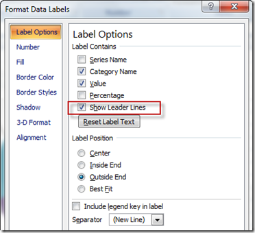
If you create a pie chart and then add data labels you can now add leader lines. When you have your data labels in the pie chart, select the data labels and then press CTRL+1 to bring up the “Format Data Labels” dialog box. It will look like this:
Then, make sure that “Show Leader Lines” check box is checked in your pie chart labels. In fact, it is checked by default ![]() in Excel.
in Excel.
So, how do I get the leader lines to show in my pie chart?
Here is the trick:
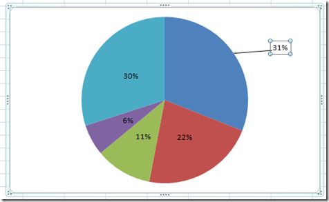
You must click 2 times and select an individual data label (not all data labels) and then drag and drop it outside and away from the pie chart. Here is an example:
They were always there and I just didn’t know it ![]() . It is that simple. Just make sure it is checked in the label options and then drag and drop an individual data label outside of the pie chart.
. It is that simple. Just make sure it is checked in the label options and then drag and drop an individual data label outside of the pie chart.
How about you. Do you use leader lines in your pie charts on your Excel dashboards?
See it in action in the video posted below:
Video Tutorial:
I am going to use this technique in the next post, so make you have it down in your tests and also come back tomorrow to see how I use this to make a USA Today type infographic.
Steve=True


