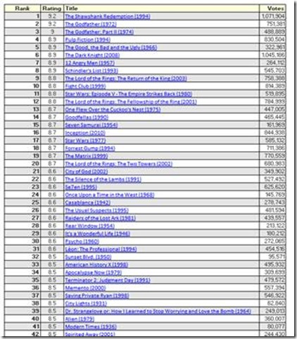
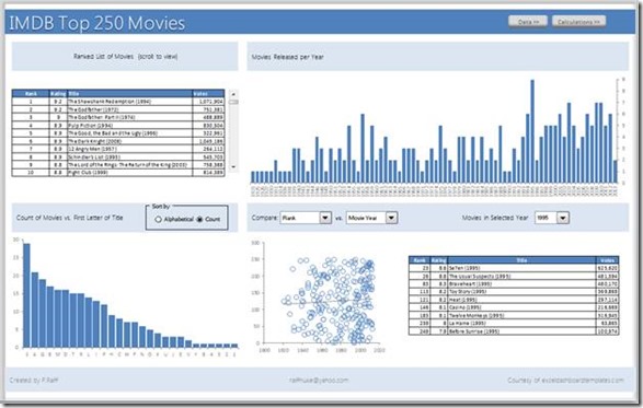
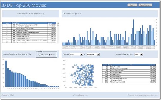
In our last Friday Challenge, we presented a data set of the Top 250 Movies from IMDB and asked you to create a dashboard from that data set. Pete put together an amazing dashboard and here is his tutorial. You can also download the dashboard at the bottom of the post.
Video Overview:
Here is a quick overview of the dashboard Peter created:
****************************************************************
FROM PETE:
A little background information on me…
I spent 13 years in the Navy as a Nuclear Electricians Mate on Submarines. Basically, other than being an electrician operating, maintaining, and fixing the electrical systems on a submarine, I assisted in operating the nuclear reactor that powers the submarine. I also spent the majority of my career in the Navy as an instructor in one capacity or another.
How is this in any way relevant to Excel Dashboards you may be asking yourselves…well, I will tell you.
As anyone that was in the Navy will tell you, we take logs…lots of logs. Essentially hourly readings and measurements from just about everything and every piece of gear onboard the ship. They are laid out in a tabular form with the rows being hours and the columns are the various parameters that are logged. Not only did we record the readings, but we had to analyze them for trends. The trends change all the time depending on the operation that is being performed at that particular time. For example, if a bearing temperature is going up on a piece of the propulsion train we have to ask “Why is it going up?” You have to dig deeper into the readings. If you find that we changed the ordered speed and we are now going faster this hour than last hour, then the trend makes sense. If we slowed down, then why is the temperature going up? Did we change the oil flow to the bearing? Is the bearing hotter than normal? What is the rate of change? How long has it been changing? What are the other bearing temperatures doing?
There are many, many questions to be asked and answered. Now if you take all of these readings and analyze all of them (many hundreds of readings) every hour, every day, over and over for years, you get pretty good at analyzing data for trends and relationships.
Now you can easily see how this type of analytical background lends itself quite nicely to performing data analysis in Excel, and how it can help someone visualize the data. So, that is a little bit about me, and my background that shows how I think and visualize data.
IMDB Top 250 Dashboard Thought Process
The first thing I did was to download the data set and place it into Excel.
Next, I looked at the data, not really the details of the data, but what each data element represented. The data comprised of Rank, Rating, Title (including release date), and Votes. I started to look for correlations in the data, items that were, or could be, related to each other.
The first thing that I saw in the data was that the release date established a sense of time, or a timeline that could be used to relate various items.
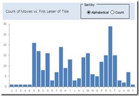
As the data set is relatively small with only 250 records that comprised of 4 elements or columns. I wanted something else that could be compared that might hold some significance to the data. My next thought was to use something to compare the titles of the movies. Obviously the first word might be nice, but there would not be very many similarities, so I chose to look at the first letter of the first word in the title. This showed some interesting trends, but I found that the letter ‘T’ dominated. This was because the majority of the titles started with the word “The”. So, I made the comparison ignore the first word if it was “The” and look at the first letter of the next word in the title. I was not surprised to see the numbers 1, 2, and 3 as the first “Letter” of the title, but I was a little surprised to see the numbers 4 and 8.
To go along with what the title started with, I decided to look at the length of the title, and the year the movie was released.
To organize the worksheets for my dashboard I broke the project into 3 sections.
1. The Data section. This is the data set in original form as downloaded from IMDB.
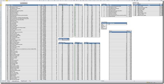
2. The Calculation section. This starts with a linked copy to the original data set (i.e. =Data!B3), and also contains all of the calculations to manipulate the data to drive the dashboard display.
3. The Dashboard.
To fill out the data and provide a little more information to drive the dashboard, I added 3 columns to my copy of the original data on the calculations tab. I added “Movie Year”, “First Letter of Title”, and “Length of Title”. The movie year stripped the year out of the “Title” column and changes it from text to a number using a formula like this: =MID(D5,LEN(D5)-4,4)*1 which takes the middle 4 character starting 4 characters to the left of the length of the cell and multiplies it by 1 to convert it back to a number.
The “First Letter of the Title” was a little trickier, as I wanted it to ignore the first word if it is “The”. The formula looks like this: =IF(LEFT(D5,4)=”The “,MID(D5,5,1),LEFT(D5,1)).
The “Length of Title” is the most simple: =LEN(D5)-7. The 7 characters that I took off of the length account for the space, parentheses, and year added at the end of the title.
I wanted to give a view of the ranking of the movies, which was almost a duplicate of the original data table, but since 250 items are too many for a dashboard view, I made a scrollable table that shows 10 movies at a time.
To make a scrollable table you have to first insert a scroll bar from the developer tools. Then I made a new header section for the table by pointing to the header on the copy of the original data table. Since the data set is 250 rows tall, and I wanted to display 10 at a time, I set my scroll bar settings as follows: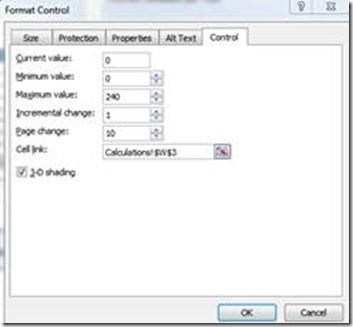
I used the OFFSET function to drive the scrollable table. Which, once setup, I copied across and down to form the table as seen below: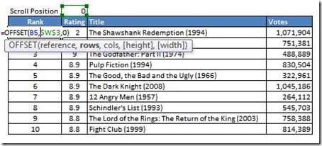
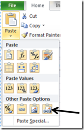
To allow for the most flexible option of where to place the table on the dashboard tab, I took a dynamic picture of the table (CTRL+C, Paste Special, Linked Picture) so that I could place it anywhere that I wanted, and the scroll bar would still make the table scroll.
Next, I wanted to show the distribution of the movies by the first letter (not including the word “The”). To find out what unique values this list would contain was easy. I just selected and copied the entire range of “First Letter of Title” that I had on my copied data table on my Calculations tab. I pasted this range and while it was still selected I went to the Data tab on the ribbon and selected Remove Duplicates.
This gave me a much smaller list that contained only unique values. I sorted this list from A to Z, and then to the left of the list, I added a number index starting at 1 and going up by one for each row. This count or index is my original sort order for use in later calculations. To show the count (or distribution) of how many titles started with a given letter I used a COUNTIF formula like this: =COUNTIF($G$5:$G$254,K5). This counts if any of the values in the “First Letter of Title” column in my data table on the Calculations tab match any of the unique values on my newly created list. The distribution by first letter data now will look like this: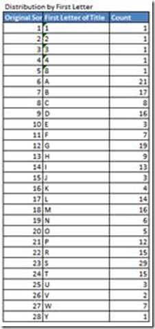
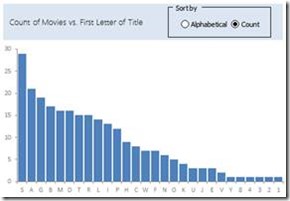
Ultimately, I wanted this distribution to be sortable by both alphabetical order and by descending order by the count. This adds a nice bit of interactivity to the dashboard.
In order to do this, we need to find a way to make the data sortable while at the same time accounting for identical counts (i.e. when there are the same number of movies that start with different letters). This means that the data has to be de-duplicated. Now, normally this can be easily accomplished by adding a very small number (0.0000001) to each row’s value and to account for duplicated, multiply it by the row number in the range we are trying to de-duplicate. My data set that I am de-duplicating is contained in range N5:O32. To get the row multiplier, use the function ROWS and an expanding range like this: ROWS($J$5:J5). This will expand as you fill it down the list until it looks like this at the bottom of the list: ROWS($J$5:J32). This makes unique numbers for what was a duplicated number. Here is an example, let say rows 1 through 5 all have the same value, the number 1. The de-duplicated values will now be:
1.0000001
1.0000002
1.0000003
1.0000004
1.0000005
To put is all together for your sorting, you need a way to choose the sorting method. I used radio buttons to make my selection. I inserted a set of radio button on the Dashboard tab of my workbook and had the buttons link to a selection cell on my Calculations tab.
This allows you to choose a sorting method….literally. I used the CHOOSE formula to drive this. The complication I ran into is that the first letter in the title was not always a letter, it was sometimes a number. I overcame this problem by adding ISNUMBER and IF to my formula. My de-duplicated table looks like this:
The formula that is in the Count column and filled down is: =IF(ISNUMBER(CHOOSE($J$35,K5,L5)),CHOOSE($J$35,K5,L5)+0.0000001*ROWS($J$5:J5),K5).
The formula that is in the Sort Order column is: =IF(ISNUMBER(N5),RANK.EQ(N5,$N$5:$N$32),J5).
Where J35 is the cell that is linked to my radio button selection. This combination discriminated between letters and numbers to either return the count value, or the sort order number (if it is a letter). I had to do this in order to rank the values as you cannot rank letters. This allowed me sort to the values.
The next step is to take the de-duplicated values and dynamically sort them with formulas. My sorted data set looks like this: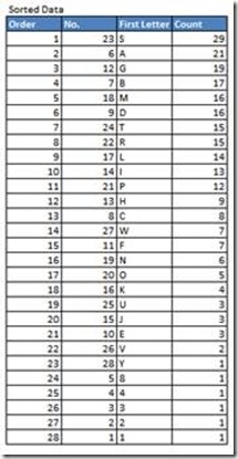
Since I knew from my earlier distribution that there are 28 unique values, which make up 28 rows, I started by making the order column in numerical order 1 through 28.
Next, I wanted to match the ORDER (which will be the displayed order of the values) to the selected sort order (which we determined by the ranking on the de-duplicated values). This can be accomplished by the use of INDEX and MATCH. Basically, we want to INDEX the original sort order (on the Distribution by First Letter table) and MATCH the Sorted Data Order number (1 through 28) to the Ranked Sort Order (on the De-Duplicated table). I called this column the No. column. The next part is slightly tricky…it is entered as an array by using CTRL+SHIFT+ENTER. Select the range of cells that you want the array formula to be entered, in my case it is R5:R32. Enter this formula: =INDEX($J$5:$J$32,MATCH($Q$5:$Q$32,$O$5:$O$32,0)) and press CTRL+SHIFT+ENTER (CSE). This will enter the formula as an array and add curly brackets {} around the formula. Do not try to enter the curly brackets yourself; the shortcut CSE will do that for you to identify the formula as an array formula. It will look like this once you have pressed CSE: {=INDEX($J$5:$J$32,MATCH($Q$5:$Q$32,$O$5:$O$32,0))}.
Next is the Sorted Data First Letter column, which is entered as an array the same way as mentioned above. The formula is: =INDEX($J$5:$J$32,MATCH($Q$5:$Q$32,$O$5:$O$32,0)), which will look like {=INDEX($J$5:$J$32,MATCH($Q$5:$Q$32,$O$5:$O$32,0))} after entered with CSE.
Finally, there is the Sorted Data Count column, also entered as an array with the formula: =INDEX($L$5:$L$32,MATCH($Q$5:$Q$32,$O$5:$O$32,0)), which will look like {=INDEX($L$5:$L$32,MATCH($Q$5:$Q$32,$O$5:$O$32,0))} after entered with CSE.
Once all of the formulas have been entered, select both the First Letter and Count columns and insert a column chart. Format the chart however you prefer for your dashboard. This chart is now sortable by a click of the radio buttons that you previously made.
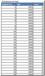
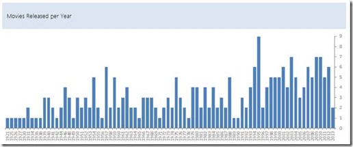
I followed the same steps to create the Distribution by Year data sets and chart, but I found that the chart has so many data points that when it was sorted in anything other than chronological order, it did not make much sense and could be confusing. So, after consulting with my friend Steve=True, I decided to forgo the sorting option on the Distribution by Year chart and leave it in chronological order. The example file has the data sets and formulas for a sorting option, but they are not necessary. You can skip the work involved in making a dynamic search option and just use the COUNTIF formula as mentioned above. Then just sort the resulting data in order by year and chart the results. It will look something like this:
Now that we have a count of Movies per Year, the next logical step and question to be answered is “What movies were released in a particular year?”. For instance, more movies were released in 1995 than any other year, what movies were they?
To answer these questions, I created a selectable list with a drop down menu to choose year to view and the list will show all of the movies that were released in the chosen year. I started with inserting a combo box from the developer tab onto the Dashboard worksheet. I formatted it to have the input be the Year column from the Distribution by Year table we recently created. I set it to display 10 values at a time as this seems to be a reasonable range of values to show, and linked it to a cell on the Calculations worksheet. (The selected value shown below [62] corresponds to selecting 1995 from the drop down list that the combo box provides.)
To display the selected year, an INDEX formula is used: =INDEX(K39:K118,AB2). This indexes the list of years from the Distribution by Year table, and pulls the value on the row defined by the selected value that the combo box selection returns. Next, a count of the number of movies in the selected year is needed. This is accomplished by a COUNTIF formula: =COUNTIF($E$5:$E$254,$AB$3). This could have just as easily been accomplished by using INDEX on the count column of the Distribution by Year table in the same manner that we pulled the selected year mentioned above.
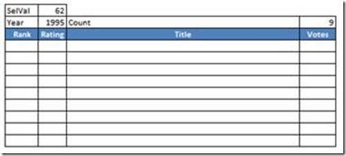
Next I placed headers on the table that I was creating and added borders to enough rows to encompass the maximum number of movies in any year (which happens to be 9). The setup looked like this:
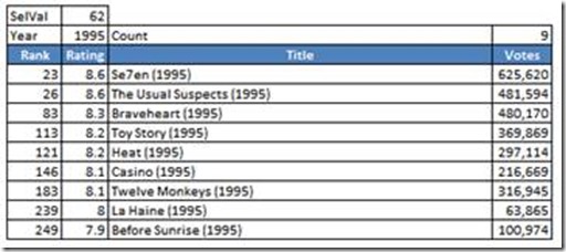
This next bit is hard to explain, and I did not come up with the method on my own. I found this method a while back while looking for different methods to return filtered query results or duplicate results on a VLOOKUP. This equation indexes a lookup array (or range), counts the number of returned values, places the returned values on individual rows in sequence, and any rows that have a row number higher than the returned count of results are made blank. This formula is entered as an array formula using CSE and then is dragged across and down: =IF(ROWS(AA$5:AA5)>$AD$3,””,INDEX(B$5:B$254,SMALL(IF($E$5:$E$254=$AB$3,ROW($B$5:$B$254)-ROW($B$5)+1),ROWS(AA$5:AA5)))), which will look like this after entering with CSE: {=IF(ROWS(AA$5:AA5)>$AD$3,””,INDEX(B$5:B$254,SMALL(IF($E$5:$E$254=$AB$3,ROW($B$5:$B$254)-ROW($B$5)+1),ROWS(AA$5:AA5))))}.
After the formula is filled across and down, the results should look like this:
Which also shows that many great movies were released in 1995!
The last thing I wanted to show on the dashboard was any correlations between any two parameters that I could show. These parameters included Rank, Rating, Movie Year, Votes, and Length of Title. To do this, I wanted an X-Y graph, or scatter plot, to show any relationships that may exist.
In order to drive a selectable scatter plot, I needed a way to choose the X axis and Y axis values at my discretion. In order to drive a selection I inserted two more combo boxes on the Dashboard worksheet; one for the Y axis, and one for the X axis. I lined them up with a text box that has “vs.” so that it looks something like this:
I arranged the base information for the combo boxes and the linked cells to each box like this:
The next challenge I faced was now that I had the combo boxes and the selections, how to reference the data? I found that a series of OFFSET formulas nested inside of a series of IF formulas worked really well to pull the selection results without having to reproduce the data tables again. The Y series formula looks like this: =IF($W$21=3,OFFSET(B4,0,$W$21),IF($W$21=4,OFFSET(B4,0,$W$21),IF($W$21=5,OFFSET(C4,0,$W$21),OFFSET(A4,0,$W$21)))) and is filled down the entire range of 251 rows, 250 for the movie information, and 1 for the header row title. The X series formula is almost identical and is filled down the same way: =IF($X$21=3,OFFSET(B4,0,$X$21),IF($X$21=4,OFFSET(B4,0,$X$21),IF($X$21=5,OFFSET(C4,0,$X$21),OFFSET(A4,0,$X$21)))).
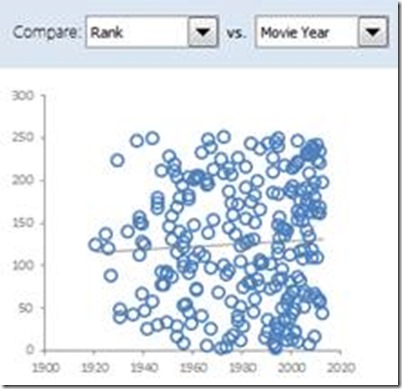
I then inserted a blank scatter plot on the Dashboard worksheet. I right clicked on the blank chart and clicked “Select Data…”. For the Y Series, I selected the Y Series range on the Calculations worksheet that I just created. I did the same type of selection for the X Series. I formatted the chart in a manner that worked well with the color scheme that my dashboard had, and I chose to include a linear trend line to aid in determining if a relationship exists or not. Basically, for the scatterplot, the closer the dots stack to the trend line, the more of a relationship that exists between the two chosen values. The resulting chart area looks like this:
The only remaining task was to align everything and format the various dashboard elements to form a cohesive and visually appealing Dashboard design. I added a few shapes with hyperlinks to act as navigation buttons to move around the various worksheets. I also added some text boxes as headers to add descriptive titles to the different areas of the Dashboard. The final result of all of this work was an aesthetically pleasing, functional Dashboard that provides a surprising amount of information from the limited data source we started with.
I hope that this tutorial give you some insight in how some data can be visualized and an insight on how I view data in order to develop a plan to build an informative, visual display of the data…in other words, a Dashboard. Many of the techniques that I use and the formulas behind them are very useful and have many applications. My hope is that the information contained in this tutorial will lend itself to many uses for you and make your life in using Excel a little bit easier.
My thanks goes out to Steve=True and Exceldashboardtemplates.com for the wonderful site and the opportunity for me to share some information with you.
Best wishes,
-Pete
****************************************************************
File Download:
You download a free Excel spreadsheet and see how Peter created his IMDB dashboard here:
File used in this write up: IMDB-Top-250-Rev-1.xlsx
First draft: IMDB-Top-250-Movies-Excel-Dashboard.xlsx
THANKS AGAIN PETE!
You are very talented and I appreciate your help and skills.
Steve=True


