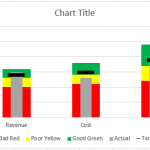
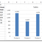
How-to Make an Excel Bullet Chart
Executives and managers love to see gauge charts in their Excel Dashboards. However, gauge charts may confuse or mislead the dashboard readers. For instance,...
How-to Use Data Labels from a Range in an Excel Chart
Excel 2013 has some cool features. If you were not aware, here is an awesome Chart Data Label option that you now have when...
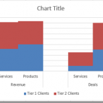
How-to Create a Stacked Clustered Column Chart with 2 Axes
In response to another post of mine, EC wrote:
“My issue: This site has been really helpful so far! I have a follow up question....
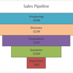
How-to Make a BETTER Excel Sales Pipeline or Sales Funnel Chart
Learn how to make an accurate sales pipeline in Excel. In previous posts, I have showed you how to make a sales funnel chart...
Friday Challenge Answer – Using Excel Slicers to Create Dynamic Charts
A big thanks to Don for submitting the first response to last week’s Friday Challenge.
You can check out the challenge here:
Friday Challenge – Excel...
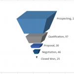
How-to Make a Cool Looking 3-D Sales Funnel or 3D Sales Pipeline Chart in...
Some times these types of charts are called funnel charts or some times they are called pipeline charts. Regardless of what you call them,...
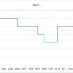
How-to Easily Create a Step Chart in Excel
You might be asking yourself, “What is a Step Chart?”
You have probably seen one, but didn’t know that it is called a step chart.
Here...
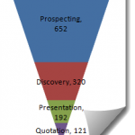
Where Did My Excel 2013 Pyramid Charts Go? (Or How-to Make a Sales Pipeline...
In a previous post I showed you how to make an Excel Sales Funnel Chart or Sales Pipeline Chart, but it is a little...

