Some times these types of charts are called funnel charts or some times they are called pipeline charts. Regardless of what you call them, Excel doesn’t have a native chart type. But don’t fear, we can make a graph like this and I will also show you a quick solution to make them look really cool. At least I think it is cool looking and so may your executive team.
Before we get started, if you don’t know the pitfalls of funnel/pipeline charts, or if you want to do one in 2-D instead of 3-D, check out this link:
How-to Make a Sales Pipeline Funnel Excel Chart Template
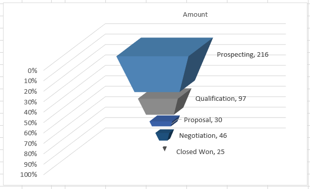
Alright, lets get to it. Here is my idea of a cool looking Excel 3D Sales Funnel or Sales Pipeline Chart. I saw a pyramid chart that looked like this and it gave me the inspiration.
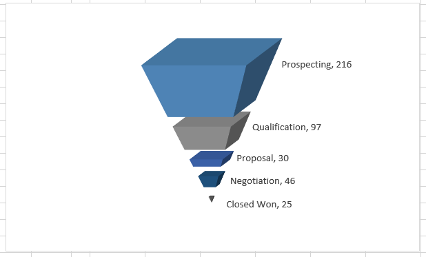
I think it really stands out. Let me know what you think in the comments below.
The Breakdown
1) Create Sales Pipeline Chart Data
2) Create 100% Stacked Column Chart
3) Switch Rows / Columns
4) Flip it upside down
5) Change Spacer Color to No Fill
6) Add Data Labels
7) Clean Up the Chart Junk
Step-by-Step
1) Create Sales Pipeline Chart Data
To make this type of Sales Pipeline graph, we need to take our original chart data
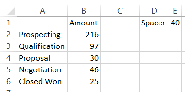
and Add Spacers series as you see here.
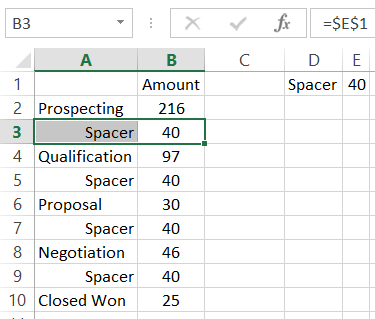
I set the spacers = $E$1 so that I can change the spacer size and also to keep the spacers uniform.
2) Create 100% Stacked Chart
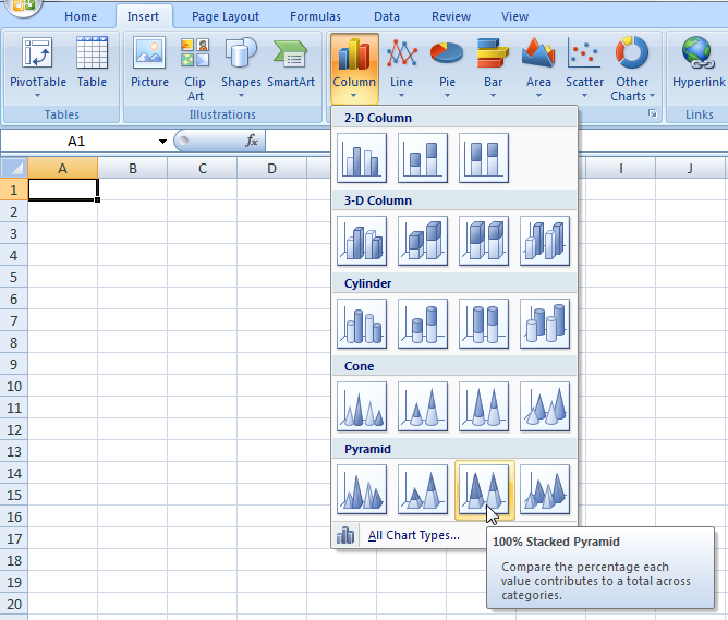
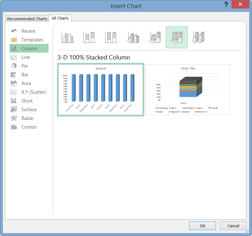
Now that we have our chart data range set up, highlight cells A1:B10 and create a 100% Stacked Chart. Now I said stacked chart because it depends if you are in Excel 2007/Excel 2010 or Excel 2013.
If you are in Excel 2007/Excel 2010, then you can create a 100% 3D Stacked Pyramid Chart as you see here:
If you are using Excel 2013, then you need to create a 100% 3D Stacked Column Chart as you see here:
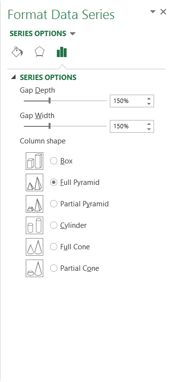
and from the Data Series Options,
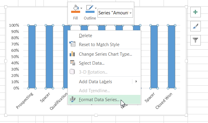
you can then select the Pyramid chart option as you see here:
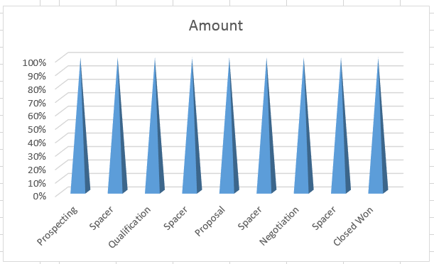
The rest of the tutorial is the same from here on out. Your chart should now look like this:
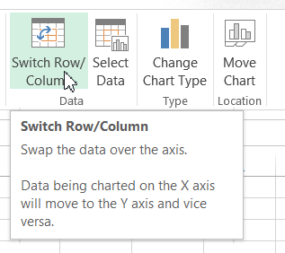
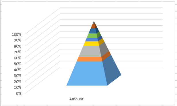
3) Switch Rows / Columns
Now Excel is trying to decide how you want to the see the data, in columns or rows. So you will most likely have to switch the rows/columns. You can do this by selecting the graph and then going to the Design Ribbon and pressing the Switch Row/Column Button.
If you don’t know why Excel is doing this, you should check out this post and video:
Why Does Excel Switch Rows/Columns in My Chart?
Your chart should now look like this:
4) Flip it Upside Down
We are getting real close. The only thing wrong with our sales funnel chart is that it is upside down. To do that, we need to Format the Vertical Axis. Right click on the vertical axis and choose Format Axis. Then in the Format Axis Options, you will see one called “Values in Reverse Order”.
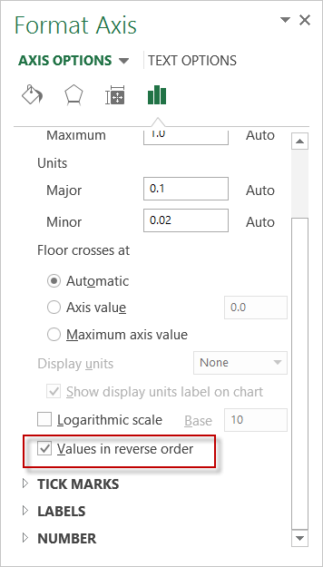
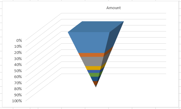
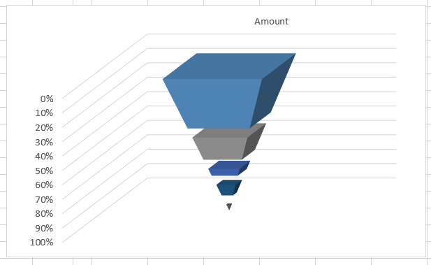
Check that box and your chart will now look like this:
5) Change Spacer Color to No Fill
Your chart looks pretty good. But not great because you can see the spacer data series. We need to hide them so that it looks see through. To do this, you need to click on any of the space data points and press CTRL+1. Then change the fill color to “No Fill”.
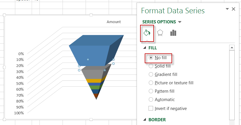
Repeat this for all the spacer data points. Your chart should then look like this:
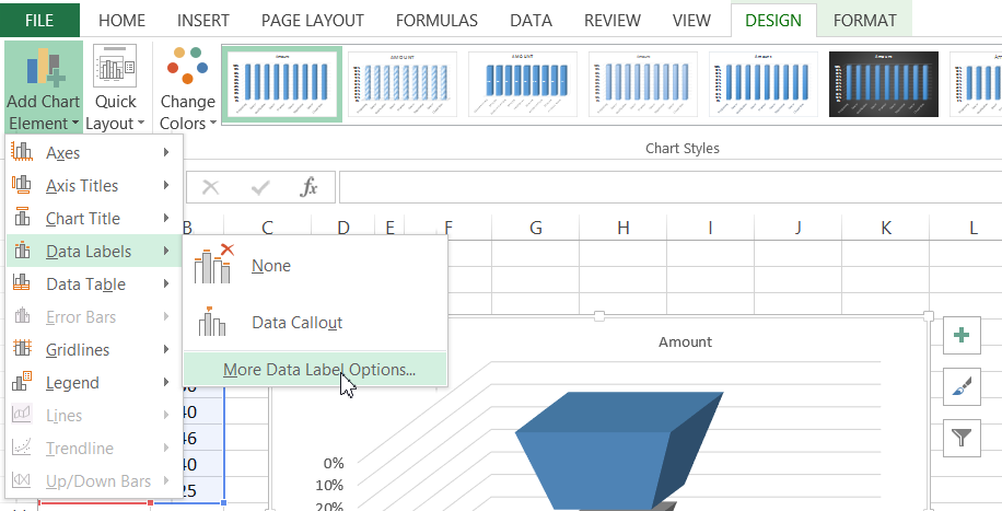
6) Add Data Labels
The Sales Pipeline chart looks good, but the reader won’t know which data points represent which data. So we need to add data labels. To do this, select the chart and then go to the Design Ribbon and Add Data Labels.
Then from the Data Label Options dialog box, check Series and Values.
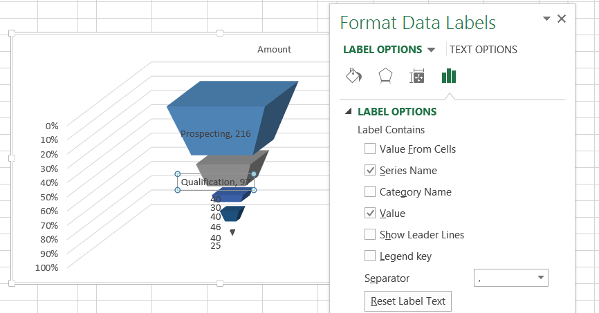
Also, delete the data labels associated with the Spacer series as we don’t want to show those ones.
Then finally, click on each data label and drag/drop it to the right of the data point that it represents. Your chart will now look like this:
7) Clean Up the Chart Junk
Now all we need to do is to clean up the chart junk and are cool sales pipeline graph will be completed. Select your chart and then select these chart elements and press your delete key:
a) Delete Legend
b) Delete Floor
c) Delete Gridlines
d) Delete Horizontal Axis
e) Delete Vertical Axis
Your Sales Pipeline / Sales Funnel Chart for Excel should now be completed and should look like this:
Sample File
You can download a FREE sample Excel Sales Funnel template for your next the Sales Pipeline meeting with instructions here:
3-DSalesFunnel_SalesPipelineChart.xlsx
Video Tutorial
See how to make this 3D Sales Funnel Chart here for both Excel 2007, Excel 2010 and Excel 2013 here:
Thanks for being a fan and for sharing my site with your co-workers.
Steve=True


