Excel 2013 Chart Bug

I think I found a bug in Microsoft Excel 2013.  It is not a major bug, but annoying like most bugs.

Do you see the same thing when you try it on your machine?

Do you see it in other versions of Excel?

Let me know in the comments below.


The Bug

When changing the border formatting on a chart data series from Automatic to No Line, Excel changes the formatting option to a Solid Line.


Steps to Recreate

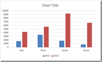
1) Create a Clustered Column Chart

image

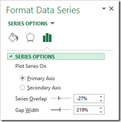
2) Select a data series in the chart and press CTRL+1 to bring up the Format Data Series Dialog box.image
 

3) Select the Fill and Line options menuimage
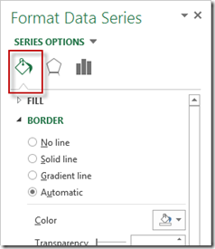
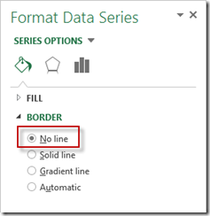
4) Change the Border to No Line


image

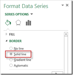
5) Notice that Excel changes your selection to Solid Line

image


If you found the website and tutorials helpful, please consider donating to keep the lights on.

Donate with PayPal here:


Video Demonstration


What other bugs have you found in Excel?  Let me know in the comments below as well.


Steve=True


2 COMMENTS

  1. I only looked at 2013.
    I may be wrong, but “Automatic” by default appears to be no line. If that is true, then there is no reason to go from “Automatic” to “No line”. Excel assumes that if you don’t want the default of no line, there is no reason to choose “No line”, so it picks “Solid line”.

    • Thanks Don. I am not sure why, but I was changing it for some reason 🙂 I think Excel should let me choose what I want, not guess 🙂 It appears that this was different in Excel 2010

LEAVE A REPLY

Please enter your comment!
Please enter your name here