How-to Show Decades and Highlight a Year in the Horizontal Axis
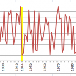
Recently in an Excel Forum, a user had data similar to this format:
Here is what he wanted to do:
How do I set the Horizontal...
Add % Difference Data Labels to Excel Horizontal Tornado Chart
Okay, the client is always requesting changes. How do you deal with these? I suggest increasing the contracted hours. In this case, I decided...
Dashboard Chart of Tiger Wood’s Money Ranking List and Golf Earnings
With the upcoming Open Championship (also known as the British Open) in Royal Lytham & St. Annes Golf Club, I wanted to see how...
2008-2012 Summer Olympics Medal Count Dashboard Part 2
Wow, what a Summer Olympics. the 2012 medal count is so close. China and the USA are neck and neck in terms of total...
Budget Analysts – How would you answer this Excel Chart question?
Two months back there was a posting in the Mr. Excel forums that I thought most budget analysts might be asked by there executive...
Case Study – Creating a Dynamic Chart in Excel Using Offset Formula
A YouTube video subscriber Mili, wanted to know more about creating a Dynamic Excel Column Chart using Offset function. So Mili sent me the...
Add Multiple Percentages Above Column Chart or Stacked Column Chart
I recently posted a tutorial on how you can put a percentage at the top of a Stacked Column Chart. You can see the...
Problems with an Excel Dashboard Goal Chart
A while ago, a user in an Excel help forum had a chart in his Excel Dashboard that was acting quite strange and he...

