Two months back there was a posting in the Mr. Excel forums that I thought most budget analysts might be asked by there executive team, managers or co-workers. I would like you to read the post and come up with your best solution. Put your solutions in the blog comments. Then I will show you what I proposed in posts next week as well as a video tutorial on how to build that solution.
HINT: Remember that sometimes the direct question from your managers/co-workers is not the best/right answer, so open up your minds on how you would create this chart if your manager asked you a similar question.
So that is your homework and below is the detailed questions:
Article Title: Bar Graph Below the Line
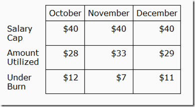
I created a stacked bar graph to show the amount we spent and how much we have left to spend (data below).
What I am looking to do is show the bar chart below the line, in a different color for those times we over spent.
How do I need to modify this table and data sources?
How can I have the “overage” bar automatically a different color?
How can I have this graph below the line without running over the text on the x axis?
That is all you get. Let me know what types of Excel Dashboard Chart Components you would suggest to this user.
Steve=True


