Happy July 4th (United States Independence Day).
I am home and not working too much this holiday, but wanted to send out a post on how to make a flag in Excel using Combination Chart.
Here is what the final chart looks like: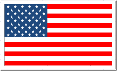
Looks pretty good to me ![]() but I am biased.
but I am biased.
The Breakdown
1) Create 2 Data Sets (One for Stars and one for Stripes)
2) Create Stacked Bar Chart
3) Reverse Vertical Axis Categories
4) Change Colors of the Bars and Gap Width
5) Add a New Series
6) Changes Series to XY Scatter with Markers Only
7) Change XY Scatter Series Data Set
8) Insert Star Shape and Change Fill Color
9) Copy and Paste Star to XY Series
10) Change Axis Min and Max
11) Chart Clean Up
Step-by-Step
1) Create 2 Data Sets (One for Stars and one for Stripes)
This is how I set up my data. Columns A:D are for the Stripes and the Stars are Column E:F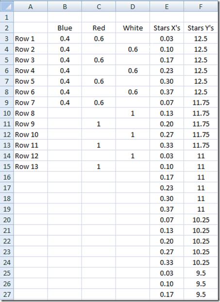
2) Create Stacked Bar Chart
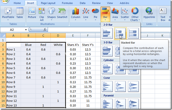
Highlight A2:D15 and the Insert a Stacked Bar Chart: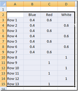
Your chart should now look like this: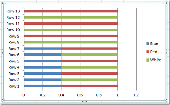
3) Reverse Vertical Axis Categories
Click on the Vertical Axis and press CTRL+1 to bring up the Format Series Dialog Box and then select “Categories in Reverse Order” 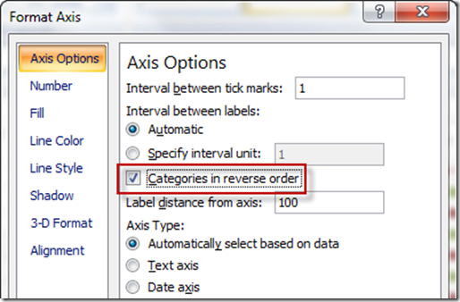
Your chart should now look like this: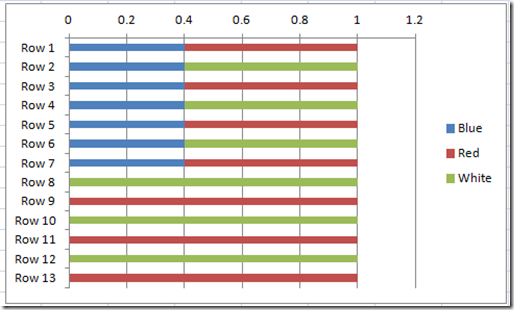
4) Change Colors of the Bars and Gap Width
Now select any series and press CTRL+1 and change the Gap Width to No Gap (0%)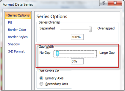
Your chart should now look like this: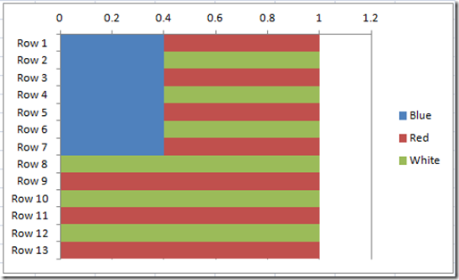
This start with the Blue Series and change the Fill Color to Blue if it is not already by pressing CTRL+1 and from the Fill section, choose Solid Fill and then Dark Blue.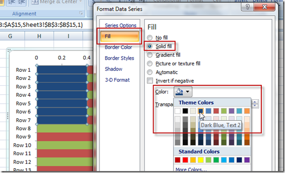
Repeat this step for the White series and choose white as the Solid Fill Color. And repeat the same steps for the Red series fill color. Your chart should now look like this: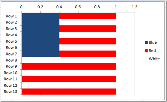
5) Add a New Series
Click on the chart, then from the Design Ribbon, choose the Select Data Button
Then choose the Add button from the Legend Entries (Series) area: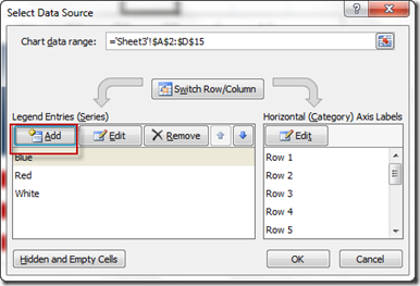
Then from the next dialog box, enter Stars as the series name and press the okay button: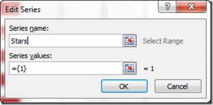
Your chart will now look like this: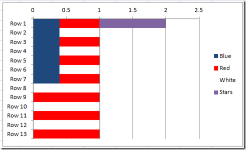
6) Changes Series to XY Scatter with Markers Only
Now we need to change the Stars series Chart Type to a XY Scatter Chart Markers Only. Do this by clicking on the Stars data series in the chart. Then from the Design Ribbon, click on the “Change Chart Type” button from the Type Group. 
Then choose the XY Scatter with only markers from the Change Chart Type dialog box: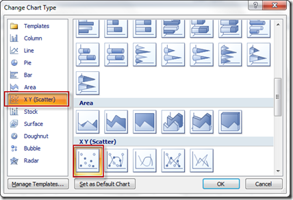
Your chart should now look like this, but don’t worry, we will fix this in the next step: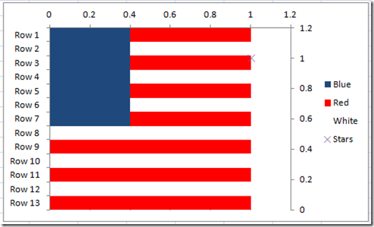
7) Change XY Scatter Series Data Set
Now that we have changed the Excel Chart Type, we need to update the data series for the Stars data points. To do this, first click on the chart and then click on the Select Data button on the Design Ribbon.
Then from the Select Data dialog box, choose the Stars data series and then click on the Edit button: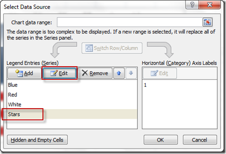
Then from the Edit Series dialog box, you need to update the X’s and Y’s to the data that represents the 50 stars in columns E and F: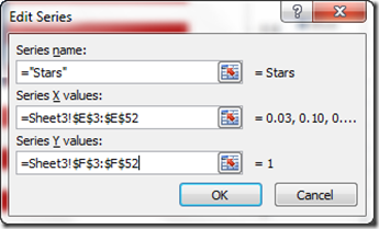
Once you click on OK button a few times, your Excel Chart should now look like this: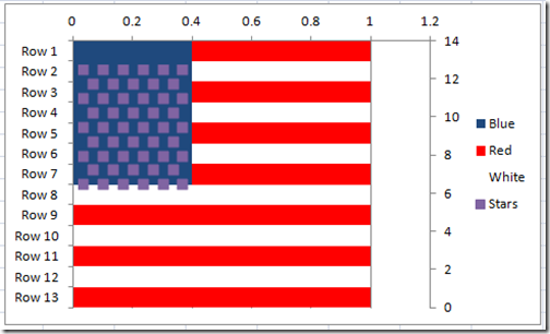
8) Insert Star Shape and Change Fill Color
The Excel US flag chart is starting to get its final shape, but we need to change the Stars from regular markers to white stars. To do this, we first need to create a Star shape from the Insert Ribbon and then choose the Shapes button from the Illustrations group. Choose the 5 Point Star shape in the Stars and Banners group and then Drag/Drop the image of a small star into your spreadsheet: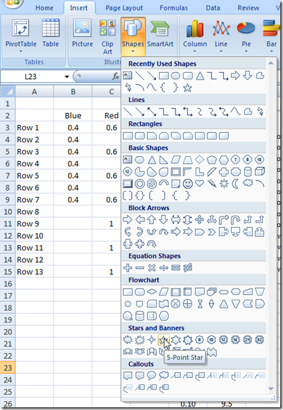
Now that you have created a star in your spreadsheet, it is most likely a blue fill color and we need to change it to a white fill color. You can do this by clicking on the star and then press CTRL+1 and change the fill color to white: 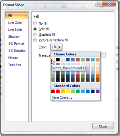
And also the line color of the Star shape to white or no line: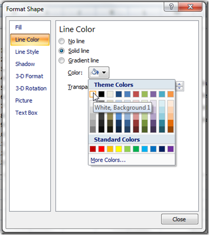
9) Copy and Paste Star to XY Series
Now you want to make sure you have the white star shape selected and then press CTRL+C to copy the shape. From there select your chart and then select the Stars data series: 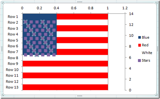
then once you have the stars data series selected, press CTRL+V to paste the star shape and it will replace the markers. Your chart should now look like this: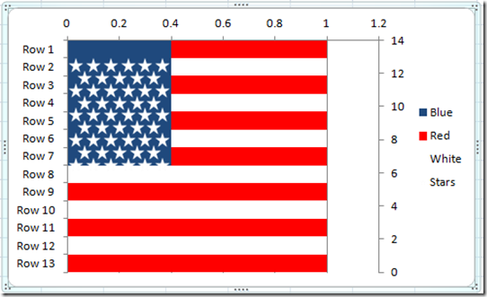
Wow, our United States Flag is almost complete. The next few steps will make it all come together.
10) Change Axis Min and Max
Our axis Max values are affecting our data. Click on the Secondary Vertical Axis and press CTRL+1 to bring up the Format Axis dialog box. Then change the vertical axis Minimum to 0.0 and the Maximum to 13.0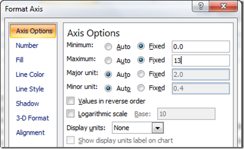
Your chart should now look like this: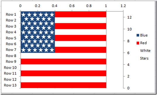
Notice how the stars are now in alignment. Now click on the horizontal axis at the top of the flag and press CTRL+1 and format the Minimum to 0.0 and the Maximum to 1.0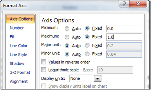
Your chart should now look like this: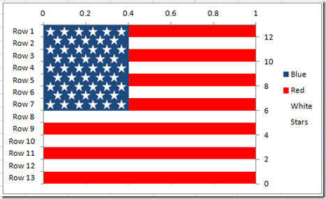
Almost done. One last step.
11) Chart Clean Up
Now we just need to clean up the chart. Delete the legend and all axis by selecting them one at a time and pressing your delete key.
Here is what your final July 4th Excel Chart Flag looks like: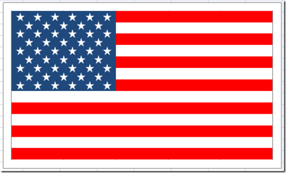
How cool is that? Also, because it is done with an Combination Excel Stacked Bar Chart and XY Scatter Chart, your chart will line up. If you tried to do this with lines and shapes and rectangles, you would have a tough time making them line up and you would have to group all the shapes together to make sure that if you changed the size of the image that it would maintain its shape. Probably overkill as you can find images on the web, but this Excel chart shows you how to combine charts and add custom markers. Pretty cool if you ask me ![]()
Video Tutorial
Happy 4th of July! Make sure to come back next week for other exciting charts and graphs for your Excel Dashboard presentations.
Steve=True

