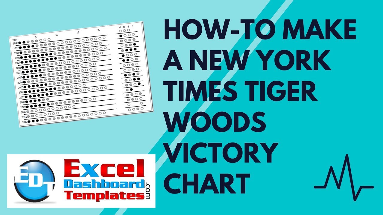
In a past article, I posted 2 different ways to make a chart that appeared in the New York Times. Here is the chart and you can see the post with this link:
Tiger Woods PGA Tour and Major Championship Chart

However, I didn’t provide the files or a detailed tutorial on either procedure on how I made these charts. A follower of the web page (Thanks to Nick for your comment and following of my blog) wanted to see the spreadsheet on how I created these charts. So the next 3 postings will be on how to make each chart and will also include video tutorial and free sample file download on these Excel charting techniques.
The first tutorial will be a detailed step by step of the chart/graph that I created. Also, I have updated the chart to now include 2012. That way we can compare and see if “Tiger is Back”. You decide!
The Breakdown
1) Setup the Data
2) Create an Excel Line Chart from the data
3) Replace the Markers with Custom Markers
4) Format Line Data to recreate grid lines
5) Add Category labels for the Years Vertical Axis
Step-by-Step
1) Setup the Data (Download the file at the bottom of this posting so you can follow this tutorial)
Since we will be using the standard Excel Line charts, we need to set up our data as follows:
I have a set up the data in 3 rows for each year. You will notice that 1996 has 3 rows of data with the year set in each row. The first row of data is for the wins. The second row is for the Top 10 finishes. The 3rd row is for the times that Tiger entered an even but did not finish in the top 10. This format is repeated for each year from 1996 to 2012.
Below that data, I have many other rows that we will user for the faux gridlines. Each faux gridline is set up at the 1/2 year. For instance, the faux gridline between 1996 and 1997 is set at 1996.5 all the way across where I want the line to appear.
Also, after a few gap/break columns, I have added similar rows for data for each of the 4 masters golf events (The Masters, US Open, British Open and the PGA Championship).
2) Create the Line Chart
Now select the data from C1:AF70 and then create a Line Chart with markers.

Your chart will look like this,  but since Excel didn’t format the data correctly, you will need to Switch Row/Column
 to make the chart look more like what we want. Then your chart will look like this:
Now we need to add one more series that we will user for a faux Vertical Year axis.
Copy the data from B72:B88 as seen here (list of Years from 1996 to 2012:
then Select your chart
then from the Home Ribbon, select PASTE SPECIAL and check the Values (Y) = Columns
3) Fix the Primary Vertical Axis
This step will get the chart more to what we want to see. Right now, the vertical axis is too broad. Now fix the Vertical axis to the appropriate range. Click on the Primary Vertical Axis (Left Vertical Axis) and press CTRL+1 to bring up the Format Axis dialog box. Then set the axis options as follows:
Minimum = 1996 (the first year of the chart)
Maximum = 2012 (the last year of the chart)
Major unit = 1
Values in reverse order = Checked
Your graph is looking better and should now look like this:
4) Chart Clean Up
Lets now do 2 things that will make the chart look better as we proceed with the final changes.
a) Delete the Legend – Select the legend and hit the delete key.
b) Delete the Major Horizontal Gridlines – Select the major horizontal gridlines and press the delete key.
Your chart will now look like this:
5) Add the Custom Markers and Make Line Color = None
If you do not know how to create and add custom markers to your Excel chart, you should check out this posting:
How-to Make and Add Custom Markers in Excel Dashboard Charts
a) Create 3 different markers
i) Black circle to represent the wins
ii) Grey circle to represent the top 10 finishes
iii) Grey ring to represent the tournament entries that were outside the top 10 finishes

You can create these shapes from the Insert Ribbon by selecting the Shapes button from the Illustrations group. I suggest creating a oval shape filled with black and a black line. Then copy the circle and change the fill and line to grey. Then copy the grey circle and change the fill to No Fill.
b) Copy the Black circle, select your chart and find any data series that represent a win. Then press CTRL+V to paste the custom marker.
c) Press CTRL+1 and Change the Line Color Option to No Line
Repeat steps B and C for each of the data series that represent a win for each year. Your chart should look like this when competed:
Your chart is really taking shape now.
Copy and paste the grey filled circle for the Top 10 finishes in the same fashion. Your chart will now look like this:
Once again, repeat these same steps for the grey ring 
Looking really good now and you should be able to see where we are going from here.
6) Change Gridline Series Lines Color to Solid and a color of Black and Marker Options to None
On all the horizontal lines that you still see that are running between the Circles should now be changed as follows.
a) Select a line and press CTRL+1 to bring up the Format Data Series… dialog box.
b) Change the Line Color to Solid and a Color of Black
c) Change the Marker Options to None
Your chart will now look like this after doing the first line:
Repeat these steps for each of the lines that appear between each row of circles. After doing this your chart will now look like this:
7) Change the Categories for the Horizontal Axis and Formatting
a) Okay, now lets modify the range for the horizontal axis so that the categories depict what we are looking to show. To do this, select the Design menu and then press the Select Data button from the Data group.
Then select the Edit button from the Horizontal (Category) Axis Labels area of the Select Data Source dialog box:
Then you want to select the Axis Label Range C1:AF1

Your chart should now look like this:
b) Now that we have the categories set for the horizontal axis, lets adjust the formatting of the axis by removing the line color and tick marks. To do this, click on the horizontal axis at the top and press CTRL+1 to bring up the Format Axis dialog box. Then change the Major tick mark type to None
and then set the Line Color options to No Line
the chart will now look like this:
8) Remove Vertical Axis and Create Faux Vertical Axis with XY Scatter Series
These are the last few steps. This is necessary to create the vertical axis since we are not able to get the “Year” horizontal category to float over the years on the left.
A) Select the one last series that you created in Step 2. You can see it running from the bottom left corner to the top right area. You can also select it from the Layout Ribbon and then choose Chart Elements (series 71) picklist.
Once you have selected the series, then press the Change Chart Type from the Type group in the Design Ribbon:
And then choose an XY (Scatter) Chart with only Markers
Your chart will now be change and show Secondary Vertical and Horizontal Axis.
b) This isn’t necessary, so select the same series again from the chart as you did before (if you forgot or can’t find it, then refer to step A above). Then lets change this series back to the Primary Axis:
c) Select the same series again and then add Labels to this series:
Your chart will now look like this:
d) Delete the vertical axis
Now delete the Vertical Axis on the left as we won’t be needing it any more. Just select the vertical axis and press your delete key. Your chart will now look like this:
e) Modify XY Scatter Series (Years for vertical axis)
This is the final step! Click on the chart and then choose Select Data button from the Design Ribbon:
Then from the Select Data Source dialog box, choose the Legend Entries (Series) for “Series 71” and press the Edit button:
Then modify the Series X and Y values as follows (Essentially, we are setting the X values to 1):
That is it, the chart is now done. Here is your final chart:
Based on the chart, it looks like TIGER IS BACK to me. 3 wins and over 11 top tens and one top ten in a major. He is back in form with his performance in the mid 2000s. Hopefully he will continue this next year and maybe even win a major. What do you think?
Video Tutorial
Free Sample Template Download File
Tiger-WoodsGolf-Victories-Excel-Chart2.xlsx
Let me know if you can use some of these techniques in your next Company Executive Dashboard using Excel. Also, consider subscribing to the newsletter so you get the next post delivered directly to your inbox.
Steve=True


