Recently, a fan asked for some help. However, when I got their file, I saw that they needed some help with basic concepts, so I thought I would share those concepts with you.
Now, let me preface that I am not a master database or Excel designer, so I am sure that I also have a lot to learn, but perhaps I can save you some time with this technique.
If you want to create dynamic dashboard charts in Excel like this: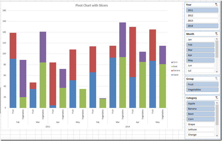 you have to make sure you spend some time setting up your data structure.
Here is the issue with the data file that I received, they had placed their data for each year and month 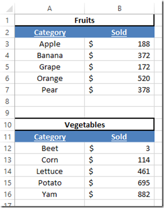
on separate Excel worksheet tabs.
This makes your job as an Excel Dashboard Designer very very difficult. Why you may ask? Because it is very difficult to gather this data without very complex formulas. Way too much work if you ask me. Also, it will eventually cause you problems as time goes on.
So what should I do instead?
Lets think like a database designer.
They don’t create a table for every month of data. They simply put the data into one large table if feasible instead of breaking up the data into different worksheets.
Keep combining your data as much as you can.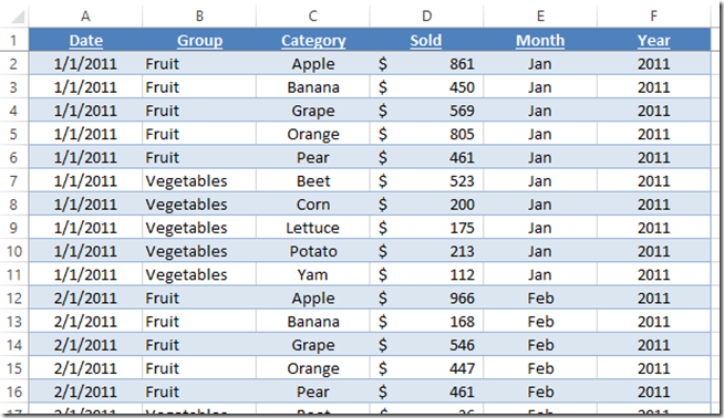 There is no reason to break up this data into multiple worksheet tabs. I created calculated columns of data on Month and Year to create extra filters and sorts instead of creating new tabs. You should consider simplifying your data in such a way.
Once again, I didn’t say I was a master, so make sure and leave your comments below on how we could make this even better or other issues that new Excel dashboard designers face in the comments below.
In the next few posts, we will expand on this concept to make an Excel Dynamic Dashboard Pivot Chart with Slicers.
Steve=True

