Hello everybody. We had a two answers submitted by our friends Don and Pete. Surprisingly, they had the same thought.
They both thought that the best solution is not an Excel Chart. But instead, they thought the best solution was to use Excel Conditional Formatting. Sometimes the answer is NOT a chart or graph. It is always a good thing to remember when working on your own solutions.
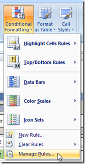
You can download their solution files below. To check out their Conditional Formatting formulas, go to your Home ribbon and then click on the Conditional Formatting button and then choose the “Manage Rules…” menu item:
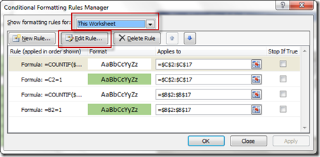
then choose “This Worksheet” from the “Show formatting rules for:” picklist, then choose a rule and click on the “Edit Rule…” button.
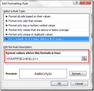
You will then see the detailed rule custom formula:
If you don’t understand how to apply Conditional Formatting to your Excel Spreadsheet cells, check out this post:
The Tricks to Writing a Conditional Formatting Rule Formula
Here is another example of Excel Conditional Formatting in action:
How-to Make a Non-Chart Excel Dashboard Chart (Heat Index)
Petes-Friday-Challenge-Graph-Increase-at-Time-Interval.xlsx
Pete does a great job and has both graphs and conditional formatting.
Dons-Graph-Increase-at-Time-Interval-Data.xlsx
Don gets the extra credit point for creating 2 different Conditional Formatting options with some included instructions.
You should check out both of their answers in the files above. Thanks guys, you rock!!!
Now, here is where I differ from my esteemed Excel All-Stars of Pete and Don. My answer is a completely different take on this challenge.
Stay tuned for the next post!
Steve=True


