Here is my answer to the most recent Friday Challenge. Would welcome any comments below on what you think (flaws, likes, thoughts…)
In case you missed it, here was the challenge:
“I have some Excel data represented like so. I’m not very good at charting so this is probably kind of simple.
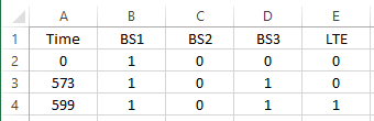
What is the best way to represent this data in chart form in a way so that I can indicate at what time a value increased in a certain column. For example, the increase in LTE that occurred at 599 seconds? I have done simple graphs that illustrate the sum of these values but I also need to point out when in the Time column the value increased.”
Many of my fellow Exceller’s liked an Excel conditional formatting solution. You can check out those answers and download the files here:
Friday Challenge Answers – Graph Increase at Time Interval
My choice?
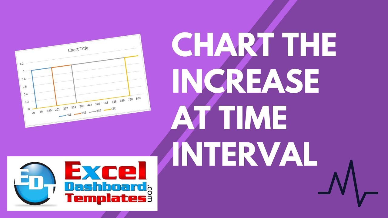
A Step Chart. Here is what it would look like for the 4 series.

Why do I like this better than Conditional Formatting or a Clustered Column Chart?
My main reason for choosing this over the other solutions is that the Time column is in seconds. A clustered column chart or conditional formatting wouldn’t give you the same perspective of Time.
What if we change the seconds that different categories change to a value of 1.
Here is what it would look like with Conditional Formatting:

And what it would look like as a clustered column chart:

And with the Step Chart

I think that the step chart really shows the time difference that is not as easily visible with the other chart choices.
You can learn more about Step Charts here:
How-to Easily Create a Step Chart in Excel
How-to Create a Step Chart in Excel with 3 Quick Steps
Video Demonstration
Let me know what you think of this as the option for the Excel user in the comments below. Thanks.
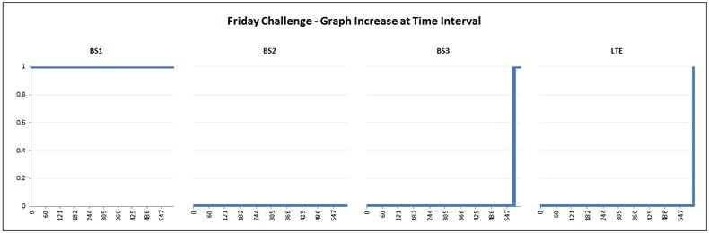
UPDATE: Pete combined our charts into a new file that you can download. It is a 4 step charts displayed as a panel chart. Here is what it looks like:
You can download the file here:
Friday-Challenge-Graph-Increase-at-Time-Interval.xlsx
Steve=True


