Tag: Labels
Create Dynamic Excel Chart Conditional Labels and Callouts
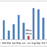
Chart Conditional Labels and Callouts
Learn how to make the simple and easy these Excel Chart Label Callouts:
In my most recent article, I described how...
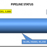
Pipeline Usage Chart – Don’s Answer
Here is another response that I received from Don for our recent Friday Challenge:
Friday Pipeline Usage Challenge
Since we weren’t sure from the client if...
Multi-Column Stacked Chart – How would you do it? – How I did it.
First, I want to say thank you, because you are an Excel fan. Then again, maybe you are an Excel Geek? I know I...
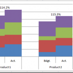
How-to Add Centered Labels Above an Excel Clustered Stacked Column Chart
I am currently working on a project in L.A. and a business analyst at the client site was looking for a chart to present...
How-to Make a WSJ Excel Pie Chart with Labels Both Inside and Outside
I thought it was a in last week’s USA Today, but looking at the picture I took more closely, it may have been produced...
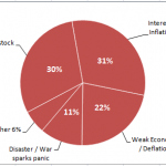
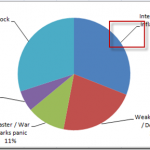
How-to Add Label Leader Lines to an Excel Pie Chart
This a an awesome technique to make your pie charts stand out in your Excel dashboard. However, I didn’t know about it for the...
Add Multiple Percentages Above Column Chart or Stacked Column Chart
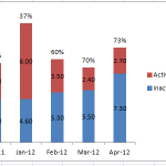
I recently posted a tutorial on how you can put a percentage at the top of a Stacked Column Chart. You can see the...
Creating Excel Stacked Column Chart Label Leader Lines/Spines
In my last post, I showed you how to create a Brace/Curly Bracket/Mustache InfoGraphic type grouping in an Excel Stacked Column Chart.
You can check...
How-to Put Percentage Labels on Top of a Stacked Column Chart
There are times when you are creating your Excel Dashboard Design that you desire something that does not come naturally with the Excel Tools...
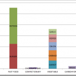
Case Study: Executive Dashboard Chart Creation – Follow-up
The Problem
In a recent post:
“Case Study: Executive Dashboard Chart Creation” (https://www.exceldashboardtemplates.com/?p=1612)
I presented some basic data that you may have in your company that you...

