Add Multiple Percentages Above Column Chart or Stacked Column Chart
I recently posted a tutorial on how you can put a percentage at the top of a Stacked Column Chart. You can see the...
How-to Make a Conditional Column Chart in Excel – REDO
·
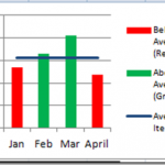
In a previous post, I showed you how to make a Conditional Column Chart for your Executive Dashboard Templates, but I had 3...
Case Study: Executive Dashboard Chart Creation – Follow-up
The Problem
In a recent post:
“Case Study: Executive Dashboard Chart Creation” (https://www.exceldashboardtemplates.com/?p=1612)
I presented some basic data that you may have in your company that you...
Incredible Excel 2012 Olympic Medal Count Dynamic and Interactive Dashboard
People are awesome and so creative. We have been talking about building an Olympic Medal Count Dashboard using Excel and I asked for your...
Excel Line Break/Hard Return within a Cell
Most people don't know that you can put a Hard Return (Line Break) within a cell because when they hit enter Excel takes them to...
How-to Make a Conditional Column Chart in Excel
As you build your Microsoft Excel dashboards, you may want to highlight your data points that exceed your Key Performance Indicators (KPIs) as well...
Date and Time Series Issues in Excel Charts
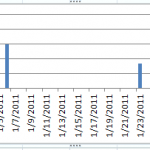
Many users think they are getting an axis error when they say that their column or line charts are showing every date between data...
Tips and Tricks – Longer Legend Color Bars in Excel Charts
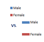
Here is a real quick tip that you may want to learn when using Excel. This tutorial will help you apply this technique to...
How-to Format Chart Axis for Thousands or Millions
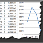
Here is a great way to make your Dashboard Charts in Excel more appealing and your boss will love you and your friends will...
How-to Display Military Time in an Excel Spreadsheet
A few days ago, I had a user ask me a question on the blog about how she can display military time in Excel.
It...

