Many users think they are getting an axis error when they say that their column or line charts are showing every date between data points, but all they want to show is the dates related to the data. In your Excel Executive Dashboards you may use date categories in your charts, however, this may have unintended consequences that you didn’t know. When you use dates as a chart category in Excel, Excel applies the best setting for your data. If it recognizes text, it will set your axis categories as text, if it recognizes dates, it will set up your chart using the Excel date (time scale) axis – Automatically.
Here is what Microsoft Excel Help states on the subject:
“A date axis displays dates in chronological order at specific intervals or base units, such as the number of days, months, or years, even if the dates on the worksheet are not in sequential order or in the same base units.
By default, Excel determines the base units for the date axis, based on the smallest difference between any two dates in the worksheet data. For example, if you have data for stock prices where the smallest difference between dates is seven days, Excel sets the base unit to days, but you can change the base unit to months or years if you want to see the performance of the stock over a longer period of time.”
‘Automatic’ Problems
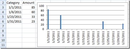
This automatic date (time scale) setting may not cause you a problem, but in some cases it may not be what you want to see. For instance, if your chart series categories are dates but are not in sequential order and you just want to see a column chart with only the dates chosen, however, this is how the Automatic choice of date (time scale) axis will look:
Why is it doing this? As the Excel help text states, it will choose the base units based on the smallest difference between any two dates in the chart data. In this case, the smallest difference is 5 days, so it will choose Days as the Base Unit. This chart does a really good job at showing how often the data is occurring but it is difficult to compare the columns because of the extra white space. This chart has its uses, but not what I was looking to do.
Here is what you get if you change the base units from the automatic choice of days to either months or years:
Definitely not what I was wanting. It is now not showing all of my data points, but instead it is only showing the first data point of the month or year that exists in the data series.
Axis Type
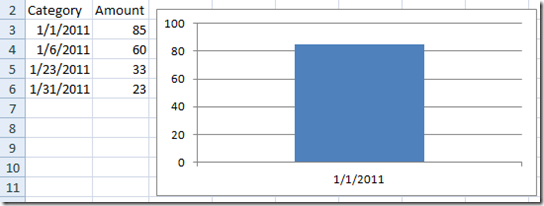
Now this is the type of dashboard column chart that you were hoping to achieve in Excel, It is a simple choice away from the automatic choice that Excel makes for you..
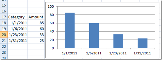
This shows my data more closely together with the categories of each data point showing the date. It is not expanded showing every day of the month. How can you achieve this in your dashboard template? You need to change your Axis type from Date Axis to Text Axis and here are step-by-step instructions showing you exactly how to do this:
How-To Excel Dashboard Instructions
1) Create your chart in Excel
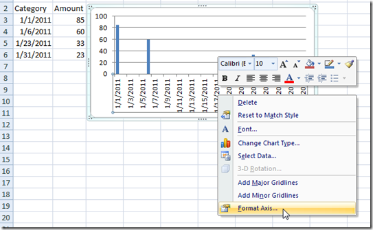
2) Right click on the Horizontal Axis and Select Format Axis…
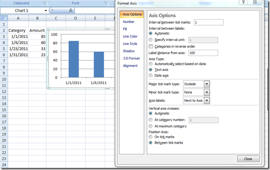
3) Now in the “Axis Type” Select “Text Axis” in the middle of the Axis Options sub menu of the Format Axis Dialog box.
As soon as you change the type to a text axis, you will see your chart change to what you were looking for even before you choose the close button.
What is it doing?
When you select Text Axis, you will see that Excel is no longer treating the data as a Time Series and because of it, it will use each category and not insert other dates in-between your categories.
So next time you are using Dates as your categories and you expect to only see a few dates, but instead you are seeing a date range on your horizontal (X Axis) axis, be sure to check your Axis Type and change it to Text Axis if that gives you the desired outcome.
I hope this helps you in building your next Excel Dashboard Template. Please leave me a comment, sign up for my RSS feed, and leave me comments on your problems!
Steve=True


