Here is a real quick tip that you may want to learn when using Excel. This tutorial will help you apply this technique to your charts to make them more readable.
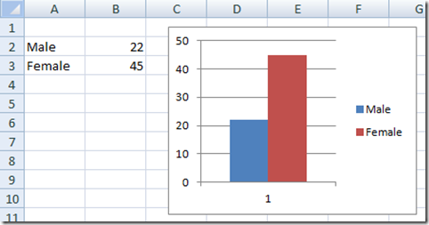
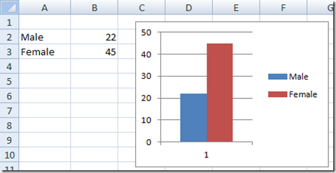
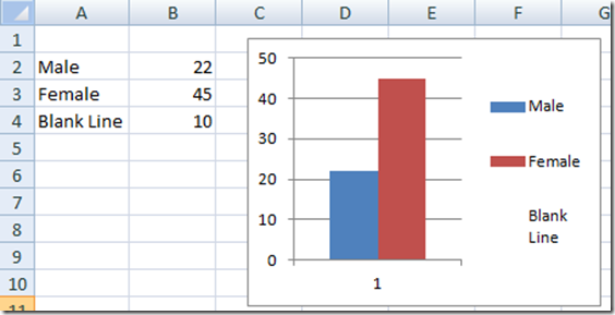
Here is what a standard chart and chart legend may look like. Notice that the color blocks in the Excel Chart legend are small squares.
How would you like the color blocks to be larger and more readable in your Dashboards?
How can we do this?
The Breakdown
1) Create your chart with an additional data series.
2) Change the data series to a line chart.
3) Change the Line Color to white.
4) Delete the data for the dummy line series.
Step-by-Step Tutorial
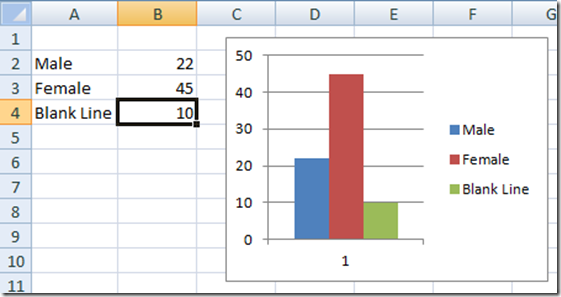
1) Create a Column Chart with an additional series.
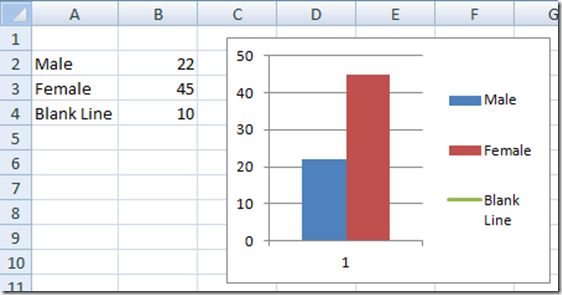
2) Change the blank series to a line chart. Don’t worry that you don’t’ see it, it is still there, just the line is only one point long. You will also notice that you now have longer color blocks in the legend from a box to a rectangle.
3) Now change the color of the line to the same as the background color. In this case change the line color to white.
4) Now delete the dummy series data so that it does not appear in the legend.
Now you can wow and amaze your co-workers and executives since your dashboard will have non-standard legend entries and they won’t know how you did it.
However, since you can’t create a combined chart with all chart types, so you can’t use this Excel Tip/Excel Trick with all of your charts, but it will work many different types.
Let me know if you like the longer legend color rectangles than the standard.
Steve=True

