Hi All,
Sorry my postings have been a little slow. I had several things come up. 1) I got hacked again and had to spend time and money updating the site. I hope you like the new look. 2) I changed projects and it always takes a lot more than you plan to transition to and from another project and company 3) Thanksgiving holiday. But don’t worry, I am back.
So here is my answer to the last Terrible Chart Tuesday.
I loved all the comments. If you didn’t check them out, go to the previous post and read the great comments.
Here are my thoughts:
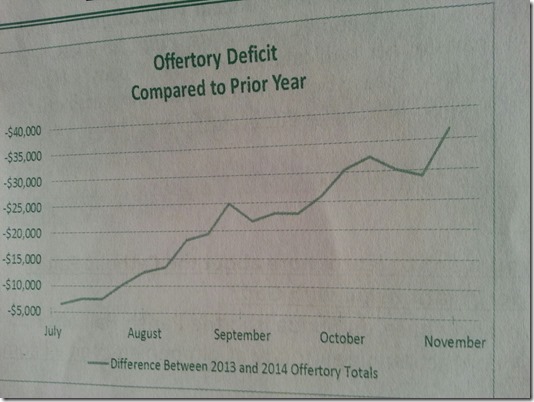
1) The chart should not have a negative value ascending up the vertical axis. I think it is misleading. I believe the church was trying to show that they are behind and falling farther behind. However, just glancing at the chart, I thought we were doing better as the line is ascending upward.
2) This may not be as critical as I thought, but it should be avoided. We don’t need to show a chart title and a chart legend for 1 line. Either one or the other should be sufficient for this chart.
3) This is a tough chart to replicate. So the staffer really had to work at making the chart this bad. I have attached the data below. Perhaps I am wrong, but this is a tricky chart to replicate. Give it a try and let me know if the comments below how you got the negative values have an ascending line going upward.
Terrible-Chart-Tuesday-Data.xlsx
Thanks for all your comments and support.
Steve= True


