Terrible Chart Tuesday – What do you think of this chart?

Part of Excel Dashboard design and development should be to know what is right and what is just wrong with a chart or dashboard.  So I decided to start another on-going series called “Terrible Chart Tuesday’s”


Here is what you need to do:

1) Review The Chart Presented

2) Determine what is Right and what is Wrong with the Chart


3) Determine how you would change the chart

4) Add Your Comments in the Comments Section at the bottom of the article


Extra Credit Points:

a) Send me any bad charts and dashboards that you see in your everyday life that we can use in our next Terrible Chart Tuesday


Sound fun?  I hope you think so.  I also think that we will ALL learn lots of dashboard and chart design ideas and best practices by sharing our thoughts.


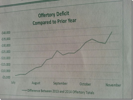
Here is our first chart.  Recently, while reviewing my church’s weekly bulletin, I saw this chart.  It represents how the church’s budget is fairing when it comes to donations collected during mass.

Terrible Chart Tuesday


I think that there are at least 2 critical issues with this chart.  What do you think?  Let me know in the comments below.  I will tell you the 2 critical chart issues that I see in the comments on Friday.  I can’t wait to read your thoughts as well.


NOTE: I moderate all comments, so your comment will be sent to me and I will approve it as quickly as possible.  So don’t worry if you don’t see it on the website right away.  This helps me manage all the spam that is sent to me on the blog.


If you found the website and tutorials helpful, please consider donating to keep the lights on.

Donate with PayPal here:


Thanks and I look forward to getting all your wonderful comments.
Steve=True


8 COMMENTS

  1. What comparison – I only see how they have been doing for the last several months – there is not prior year comparison as the title would lead you to believe. Would be better if there was a goal that show us what they needed – human competitiveness would help drive past the goal if it was given. And is this a seasonal decline before the holidays and last minute giving to wrap up the year?

    • Yeah, good point on the comparison. It must be a difference calculation (i.e. Minus). Neat comment on the goal and competitiveness. Thanks. Steve=True

  2. If the chart is showing negative numbers, why is it moving up the vertical axis. If I glance at the chart I would assume a positive gain. The legend states it’s a comparison between two years. Where is the line for the other year?


  3. If you found the website and tutorials helpful, please consider donating to keep the lights on.

    Donate with PayPal here:


  4. The problem I have with this chart is that there is no visual separation between months.
    I would shade every other month.
    Axis number format can be improved using “K” instead of “,000”. To go even further “$” there can be shown just ones (e.g instead of -$40,000) or indicated only in the title or in the legend.
    Having just one line there is no need in the legend if we find better wording for the title.
    Month labels do not need to use the full word. 3 letters would be good enough, though I prefer WSJ style with just the first letter.

  5. It is very misleading demonstrating a “relative” value (in this case a year to year change) by displaying it as an “absolute” value (in this case the deficit). It begs the question: what is the significance of the deficit? Are the monthly totals usually in the millions (wishful thinking I know) and therefore the deficit is insignificant?

    An improvement would be to show the “prior year total by month”, the “current year total by month” and either “y2y percent change by month” or “y2y dollar change by month” which ever better makes the point.

    And by all means, chart the full year and maybe even several prior years if you have the data. Is this a single y2y problem or a decade long trend?

LEAVE A REPLY

Please enter your comment!
Please enter your name here